A Circular Bokashi Jig-thingie

A few people were asking about how I inked and printed a new print that I’ve started, so I’m posting a quick description of my newest “jig-thingie”. I know it’s unusual, but it REALLY helps!

Please note the intro tune is from Wheel. of. Fortune! 🙂

Transcription

John: So normally where I print is this traditional bench I made about 20 years ago where I sit down at it and I really enjoy using it, but for this print I’m making, I had to create a jig because of this circular fade or bokashi. So what I came up with is th

There are 8 circular bokashis: yellow, red, and blue in the background; red and brown on the tree keyblock; red and brown in the tree; redish on the background trees…

is rotating or say, lazy Susan-style jig. And when I go over a couple of features that I find interesting, I hope you do too.

So here we have this block and I’ve got it so that it is secured by these wedges and a pretty good job. And then I got this lock here and that will keep it from rotating– if I don’t want it to. But right now, I do want it to rotate because I’m going to add some bright orange in the middle to this. So. I’m eyeballing this on this particular impression here, because accuracy isn’t quite as important as, say, the background was earlier. But, you know, I can wipe things, I can ink things in a circular motion. If I when I get to the point of wanting to print, I’d then lock it up like this and go and get some paper and…

You can see the bokashi fade here. The really wide one that I’ve been doing right now, which is proved to be a challenge, but this thing is really helping a lot. So I fit it in the kentos and I’m able to print standing and I’ve kind of been enjoying printing on the standing up. You get a good amount of leverage. I’ve never done this before, but I know a lot of people do. All right. So let’s look and see what this guy looks like. So that’s the circular impression of the tree. This isn’t exactly final, but you get this idea of what it’s supposed to look like eventually. Now, when I’m doing the outer area, the background, it requires a lot more accuracy and I want to make sure everything looks very consistent. And so this arm really helps with that. I have listed where these colors start and end. Some of them overlap with each other, but that way, I can hold a brush and spin this thing around. You get more or less a pretty consistent edition for all these three really large bokashis here. So anyway, I hope you like my gizmo and thanks for watching!

Appalachian Trail Phase #1 of 3: Proof Sets are ‘El Done-o’!

MEFinalProofWatermark.jpg
14. Mt. Katahdin, ME

A little less than one year ago, I set out creating 14 prints- one design per 14 states along the Appalachian Trail. Well, I finished the designs, blocks, and trail proofs yesterday!

Here’s the last print, Mt. Katahdin which is apropos.

With a few minor revisions, I will start with the main edition:

  1. Springer Mt., GA- the southern terminus (200 copies)
  2. Clingman’s Dome, NC (100 copies)
  3. Roan Mt, TN (100 copies)
  4. Shenandoah, VA (100 copies)
  5. Harper’s Ferry, WV (100 copies)
  6. Raven Rocks Shelter, MD (100 copies)
  7. Lehigh Valley, PA (100 copies)
  8. Sunfish Pond, NJ (100 copies)
  9. Bear Mt. Bridge, NY (100 copies)
  10. Great Falls, CT (100 copies)
  11. Mt. Greylock, MA (100 copies)
  12. Killington, VT (100 copies)
  13. Franconia Notch, NH (100 copies)
  14. Mt. Katahdin, ME – the northern terminus (200 copies)

The reason for twice the number of the first and the last prints is that I will be producing 100 copies of the bound “Appalachian Trail Terminus Print Collection” (two prints) in addition to the bound 100 copies of the “Appalachian Trail Complete Print Collection”.

“This project has required 158 individual cherry blocks. The final edition will be a total of 1,600 prints from over 30,000 color impressions by hand.”

proofingColorME
A detail of a color impression proof print


Color Proofs

As I have been printing the proofs, I have taken individual color impression on copy paper. Since many of the colors overlap in these prints, I need a way to faithfully reprint these proofs for the final edition.

I also take a few notes- where to wipe, how to make improvements, etc. I have found that as I went on, there were fewer and fewer notes- presumably that I’m getting better rather than laziness…

So here are the proofs: (hint: click on the image and use your ARROW key to navigate).

For the next phase for 2019, I will be printing the 200 or 100 editions- actually, I am a month ahead and will have a head-start in December.

Starting November of 2019, I will begin binding to finish before September, 2020. Binding seems from my standpoint to be the most unknown of all of the steps. I taught bookbinding and papermaking, but still don’t know how you create a real production bindery? I dunno.

It’ll be an adventure either way….


A Shin Hanga Technique 3-fer

Masks, Wiping, and Goma

If you’re not familiar with shin-hanga or ‘new prints’ from the 1920’s, 30’s and 40’s, there was a group of artists that were assembled by Shōzaburō Watanabe. Of these artists, the most notable being Shinsui Ito, Kawase Hasui, and Hiroshi Yoshida.

The last two are my main influences- they both were originally painters and brought a western-style flavor to landscapes.

“To emulate their paintings shin-hanga artists used ukiyo-e (by then a long-dead period) style woodblock printing techniques which were hybridized by introducing multiple layering and other innovative techniques. This allowed for a ‘mini-renaissance’ for woodblock.”

I hope that people like Paul Binnie (London), Matt Brown (NH), Leon Loughridge (CO), Yours Truly and others can give some life back to the movement- should we call it “Western shin-hanga“?

Either way, I have posted several process print series from Hiroshi Yoshida in which there were obvious wiping one such image from his “Kagurazaka Dori” shows both techniques:

1
Keyblock for Hiroshi Yoshida’s “Kagurazaka Dori” in which the lights are wiped of ink.
2
The red areas on the left are using the same keyblock, but a mask is used for selective printing. This dovetails with the previously- wiped areas on the previously-printed keyblock impression to create a sense of glowing through the depiction of glare.

Above you can see the masked areas (indicated by the red glow of the lights) using the keyblock below the wiped areas in the earlier-printed brown keyblock above.

Fast forward to 2018

Here is a video of me using similar techniques. In case the video doesn’t load, here’s the Youtube link.

During the video I mention that I’ve wondered how such technically complex shin-hanga prints were made using such a small number of blocks. Blocks are very often used multiple times for different colors, but they are generally separated by some space to avoid inking the wrong area. By using a mask, the printer could isolate areas without this concern. Wiping also allows for dual duty as you can see in one of my prints “Sunfish Pond, NJ” #8 from The Appalachian Trail Complete Prints series

The green on the lake reflections is produced by the same medium green block as the trees, but before printing, I wiped the reflection areas which gives a hint of color rather that the full value. The same is done with the orangy cloud color.

sunfishPondNJSmall
8. Sunfish Pond, NJ showing wiping in reflections


In addition, I add a little paste at the wiping area and leave it out of the main part in order to create “goma” or blotchy printing to emulate the texture of rocks.

All of these effects are vastly different than the usual ukiyo-e techniques and, to some degree, resemble the act of painting on the blocks- something that is very difficult to be consistent.

Here’s my finished proof featured in the video- #13 another one from The Appalachian Trail Complete Prints series.

franconia
Franconia Notch, NH- wiping, mask, and goma


At the risk of sounding ‘cocky’, I think that I’m getting there!

Paper Shipment from Echizen

washiHuge

My students like to tease me by using the misnomer ‘rice paper’ to describe asian papers just to watch me cringe (rice paper does exist, but is made for candy wrappers which dissolve in your mouth). Like my students, most of you know that most oriental papers are not made of rice, but of inner bark from a variety of sources.

steaming kozo
stripping mulberry branches

One such source of bark is the paper mulberry (kozo) which produces the preferred type of paper for woodblock printmaking. The fibers are long which allows for a thinner yet durable sheet. The best kozo papers are also ‘fluffy’ and have a beautiful sheen to the surface.

I have made many sheets myself and have taught oriental papermaking which makes me appreciate the hardships in making this wonderful product.

Steps for making paper

It starts with the arduous process of harvesting the mulberry’s new growth. The branches are steamed and then the bark is stripped off of the wood. Next, the bark is dried and the black outer bark (chiri) is scraped off of the white inner bark. The strips are washed, then

scraping chiri
scraping chiri off

boiled with soda ash- traditionally in large pots fired by the mulberry branches and the ashes were used to make the alkaline soda.

The resulting strips of inner bark are then beaten which retains the long fibers. Any small specks of dark outer bark are painstakingly picked out. The macerated fibers are mixed with water and neri (a mucus-like thickening agent derived from the tororo-aoi root that keep the fibers suspended) to create a slurry which is poured into a large vat.

The papermaking mould or sugeta is expertly dipped into the vat over and over to create just the right thickness and consistency.

The new sheet is then transferred from the sugeta to a stack of previously-made sheets by ‘couching‘ (a french term meaning to put to bed). A weight is then applied to the stack so that the sheets can ‘weep‘ or drain excess water. One by one, the new sheets are then transferred to very wide, smooth wooden boards which are left in the sun to dry. The surface quality of the boards affects the resulting paper’s smoothness.

The dry sheets are removed from the boards and sizing (called dosa– a hot mixture of animal glue nikawa and alum or myoban) is brushed onto the sheets and then hung up to dry. Sizing both strengthens the paper and prevents the ink from bleeding (like water on tissue paper) when printing.

The price for each sheet of Kitaro Washi‘s kizuki (pure) kozo is almost $20 which includes shipping to the US! That sound like a lot, but I believe that it represents a massive amount of work and skill on behalf of the papermakers.

“Paper, in my opinion, is the most important element for successful printing and it is worth the investment.”

At Kitaro, large paper purchases are is made to order- so it took around 2 months for me to receive it- and here they iz!

washiStack
250 sheets of ready-to-print fluffy goodness
washiStack2
The large sheets (with baren for size comparison) safe and sound at Tanuki Prints.


Mixing Batch Water-based Ink

0P0A0608
Old jars are getting low

Last month, I gave a brief description of color mixing theory that has worked well for me. I have also posted an earlier entry about very traditional ways of hand-mixing color with a wooden mortar and pestle while I was a guest printmaker in Japan.

Since I’m in the middle of a very large project- over 1,600 prints using water-based processes, I need a lot of ink. I have a large ceramic mortar and pestle, but I feel that I haven’t gotten a fine enough particle with manual grinding- maybe as a result of my impatience. I have looked into electric mullers- Hoover test mullers are pricey (like $5KUSD pricey) and produce very little- albeit they are very accurate.

Caveat: I still do use watercolors from Windsor Newton for dark colors for skies to insure smoothness. I doubt I will ever get the pigments as fine as these folks.

Reason#1: “Grinding your own pigments saves money hands-down from buying tube, dispersion, or pre-mixed inks.”

Pigment Brands

Most of my pigments come from Sinopia. I have found that Sennelier‘s dry pigments are not as powerful or dense. Kramer is OK (very limited and a very non-descript selection) as is Gamblin.

It’s Muller Time

vidiem grinder
Vidiem Jewel wet grinder

OK, Soooo… in my quest for mass amounts of pigments, I found a Vidiem wet grinder- It is designed to mix Eastern-Indian sauces. It works by using two grinding wheels on an abrasive surface and has a tension knob to control the grinding pressure.

I would recommend wearing a mask while working with dry pigments. Combine water (add a 1/4 cup water initially for a full jar of pigment) and most likely a little 1 teaspoon? of ethyl alcohol to break the surface tension (Everclear® grain alcohol works well!). I also add a few drops of clove oil for a preservative which smells a lot better than rotten hydrogen sulphide smell.

Here’s a noisy Youtube video of the mixer in action. You can see me scoop out the good stuff.

Findings

The grinder does well in my opinion- I let it run for about 20 minutes and slowly turn the knob tighter as it grinds. I would suggest keeping the pigment’s consistency peanut-butter-like as it’s a lot easier to get out of the grinder. I use a rubber spatula and scrape the wheels while they spin and put the paste into small mason canning jars, label them with the color, pigment maker, and date.

Other thoughts: The grinder’s plastic ‘innards’ become a little staind, so I have started grinding the yellows, gone to the reds, then the blues to keep the color contamination down to a minimum. To clean, I add water into the mixer, turn it on and use dish scrub pads.

Please write for questions of comments, thanks!

Thoughts on Color Mixing Systems

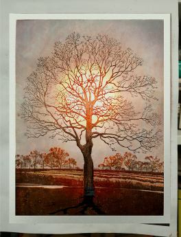
So, I took color theory back in the mists of time. I never really thought about it much and followed my intuition along with the standard color palettes that were recommended to me at the time. Later, woodblock printmaking required me to think deeper- primarily in order to simplify and make more efficient my color choices- especially using shin-hanga techniques which involve layer over layer of colors and values to emulate watercolor painting.

During the 90s, I followed the traditional ukiyo-e palette using indian yellow, vermillion, ultramarine blue, indigo,  bengal red, carmine, and sumi. This system allows for a good range of colors- what I saw was a lack of a warm, light blue, so I later integrated cerulean blue.

After discussing color with Paul Ritscher of Salinas, California, I bought Blue and Yellow Does Not Make Green by Michael Wilcox. It’s a handy book that goes into detail, but what I gleaned most from it was something that I had intuited for some time but didn’t pursue enough:  That the single Red, Blue, Yellow primary palette wasn’t nearly enough and using a split-primary system: a warm red, cool red, warm blue, cool blue, warm yellow, and a cool yellow provided cleaner and broader options.

Below is a chart that I put together to help me look at split primary interactions. I am neglecting tints (lighter hue combinations) which, in woodblock printmaking are created by weaker ink mixtures and shades (darker hue combinations) which I use a combination of compliment hue mix to darken. Payne’s Gray is made this way I believe.

splitPrimaryChart

Things above might look a bit complicated, but I think for me, charting this out helps to cement my understanding- both intuitively and rationally. It’s interesting to see that the chart isn’t ‘symmetrical’ in that the pure green isn’t on the outer end of the secondaries as the pure purple and orange is. Also, there is some ‘criss-crossing’ going on between the reds and blues. I think that this is a result combining a ‘dualistic’ system (a single color mixing with another single color) with three 2-primaries. I feel that this palette allows for solutions to common problems and produces nice reds, pure purples, a range of greens, etc.

If I had continued with the 3 primary system, in order to get a nice orange (product of a warm red and a warm yellow), I would have to compromise with producing a muddy brownish purple which would have to be a product of a warm red and a cool blue (see the swatch above “pure purple” for an approximation). Incidentally, while I was a graphic designer, I was told that “Coke” (Coca-Cola) red required a five-color printing set-up since the CMYK color system couldn’t produce the proper red from Magenta and Yellow.

In the defense of mud, I think you will agree after looking at the middle of the secondary “Y” in the chart, that there are some rather handsome subdued colors that are a product of a cool and warm combination.

“Why does a mixture of a warm and cool primary appear muddy?”

Getting Geeky

I found a nice, albeit scientific explanation to how light is reflected within the visual spectrum. At the risk of comprehending this, it appears that molecules are ‘excited’ in different ways by photons hitting them. The wavelength and amount of the reflection depends on the molecule’s ability to revert back to its normal state…

Inversely, (from what my limited understanding can gather) the molecule’s inability to ‘calm down’ results in its absorption of the color’s wavelength- maybe the vibrations are interference… Anyway, if there is absolutely no reflectiveness, then black occurs. On a side note, vantablack uses texture to not reflect light. How can you see colored velvet then?…

It follows that if a wide area of the spectrum is absorbed, then a muted color is perceived by the eye. Inversely, if a narrow part of the spectrum is reflected, then a purer and lighter version of the hue is perceived.

So , how does this relate to warm/cool combinations? It seems to me that using say, a cool blue and a warm red covers too wide of the spectrum- therefore the wider the range of color, the less the reflection, the muddier the color. Whew! my feeble brain hurts, but maybe, just maybe this makes sense. Color is a complicated endeavor fraught with emotion and many, many variables.

Other Considerations

As far as the support (in my case, mostly-white thick mulberry paper) effecting color- I was told that the advantage of using the combination of white paper and transparent inks is that light first passes through the pigment, then bounces off of the white paper, then travels back through the pigment to create an addition effect. I’ve never printed on black paper, but I think that we can imagine the results.

An interesting reference for more detailed information (it’s free to download the .pdf) is The Color Book.

Another free .pdf treatise on color palettes is from an early western woodblock artist, F. Morley Fletcher: Colour-control: the organization and control of the artist’s palette, 1936

With all of this said, I am still a ‘valueist” rather than a colorist- if you can make the values work, then the hues tend to follow.

Happy mixing, folks! Maybe you’ve got your own system that works in a different way- please respond with a message below.

Tanuki Prints has Moved Underground~

printing area1
My old and cramped printmaking hovel/office

I apologize for a lack of posts lately- we took a 3-week family camping trip to Canada which was wonderful BTW. I also found out that I had become a full professor- yea!

Since then, I’ve been working on moving my printing operation from my university office (see right) to my basement (below) before the semester starts. I had outgrown the aburdly-small office space long ago and I physically found it hard to safely navigate around all of the heaps of stuff- especially the accumulating 90+ woodblocks (soon to be 150+) for my Appalachian Trail Series.

Maybe I delayed the move to make a point to administration that we, as faculty, need some support to create art- something that is a large part of our job description. Anyway, in reality, I think that the only impression that was communicated was “What the hell is this mess”?  or “Why doesn’t this guy simply have a computer and a clean desk like everyone else”?

On the other hand, I did enjoy the occasions when a curious student would stick his or her head in and ask what I was doing. Either way, the situation was completely unsustainable and I’ve given up dealing with these limitations.

Fast forward 3 weeks: This is what my new space looks like! It’s in my basement but I think I’ll be both safer and happier using my own resources- however troglodyte-like it is.

johnWorkshop1
Printmaking bench, shelves, work table, etc. The rugs really tie the room together.

Here’s another view of the printing desk area. You will notice a foot-high printing platform with a foot well. This was inspired by what I printed on for a month at Mokuhankan- thanks to Lee-san and Dave-san for the idea. I also want to thank my wife, Margaret and son, Robert for helping with both support and muscle.

johnWorkshop2
Mixed pigments, barens, maru bake, hanga bake, printing desk on platform, sharkskin, etc. More to come!
desk
Here’s an overview of the printing desk with stool.

In another adjacent room, I have built a pigment/paste mixing brush washing, sharpening area.

johnWorkshop3
Pigments, containers, and sink. I rather suspect that things will get messy here…

Now, on to the garage for establishing a carving area next! Many trips to the dump in my future. I fully expect these areas to fill up- but until then, I’m lovin’ the space in the meantime!

Waddya think? I think that it’s time to start making prints again…

Yoshida’s “Kagurazaka Dori” Process Print Set: Take One

Flower Street After a Night Rain
Hiroshi Yoshida’s “Kagurazaka Dori”,  or “Flower Street After a Night Rain” 1929

Sometimes, unexpected things are nearer than I think. Florida State University’s Art Museum houses a 67-impression series from Hiroshi Yoshida’s (1876-1950) oban-size Kagurazaka Dori” ( the English title is “Flower Street After a Night Rain”) from 1929.

Since I am a printmaking professor, I asked the Associate Director of Collections if there were any archived images available as an academic resource. To my delight, she was very kind to send all 67 files (33 cumulative and 33 individual impressions plus a chop mark impression) to me!

I have no idea where (or when) FSU got these, but they are very, very rare. It is my understanding that this is the only set of it’s kind outside of Yoshida Studios in Toyko where Tsukasa Yoshida stores such things along with the blocks of his grandfather.

Yoshida-Kagurazaka-Dori-Process-Small
Cumulative impression animation compiled from images. Courtesy of Florida State University

From what I am told, Hiroshi Yoshida’s prints are rarely re-printed (if ever). Since the hand-written notes are in English (apparently in Hiroshi’s hand), I’ll bet that this was a keepsake gift (probably for a US army officer family during the occupation) rather than the normal instructions for printers to follow.

Despite that this is not exactly my favorite print of Hiroshi’s, I am so obsessively-interested in producing shin hanga-style prints- specifically in the Yoshida-style, that this is a real find for a geek like me.

I’ve actually seen the set once before- as a grad student, I went down to Tallahasee in 2002 and attempted to record the set by using slide film- which turned out terribly because of the low lighting. The idea was to take them to Japan where Dave Bull and I were mapping out another shin hanga-style night scene of my design, “Milton”, as part of his Surimono series. At the time, I wasn’t very ‘deep’ in such printing techniques and now I feel that I can see and glean the information much more.

milton
John Amoss, “Milton”, 2002 from Dave Bull’s Surimono Series. Photo courtesy of Mokuhankan.

I know that while looking at the animation that it’s difficult to get all of the subtleties of each cumulative layer. After looking though all of them, there are several things that quickly struck me- particularly the use of fukitori or (“wiping off”) technique. Since you can’t skip to frames in this animation, I wanted to point out the 1st image of the keyblock where the brown ink in the street lamp’s lighted areas were wiped off. In the 2nd image, the keyblock was re-printed in red (to indicate the lamps and wet street’s glare) in conjunction of where the 1st impression areas were wiped off. It’s pretty obvious that the printer (Komatsu-san?) used a stencil overlaid onto an inked block. Design-wise, using the isolated red instead of the darker brown creates an environmental effect that is… well, very effective.

As I said, there are also the other 34 individual impressions that I hope to add with notes soon.

Sets like this are like preliminary drawings for paintings- they provides a lot of insight that tends to get buried in the final product.

Side note: It’s well known that most of the Yoshida’s keyblocks were made of zinc and glycerin was mixed with pigment to adhere to the metal.

There are many more 89 year-old mysteries yet to be unfolded.

Click here to see the next entry featuring and in-depth analysis of the individual impressions

IMC2017- University of Hawaii/Manoa

I certainly am looking forward to seeing my woodblock friends at this year’s International Mokuhanga Conference starting tomorrow!

I give a presentation on Friday morning concerning the application of apprenticeship-based learning in higher education. I think that I’m prepared… I’ll take many pics and post them asap. I just wish that I could spend the rest of the week and see the whole shebang.

Tanuki Senjafudas!


I’ve always loved senjafuda. Senjafuda (in Japanese- literally “thousand shrine cards”) are taken by travelers and pilgrims where they are pasted on rafters and posts. They don’t look as junky as you might expect- much better than graffiti IMO.

Making and collecting senjafuda (some are quite spectacular) is very popular thing to do in Japan. As an artist, they’re very convenient to make- you have some left-over wood? Perfect. Some extra paper scraps? A piece here a piece there, and voilà!

I plan to use this as a demonstration and simple print for my printmaking students to start mokuhanga. The idea is to print around 200 (this test batch is only 14) to bring and give away at my IMC2017 Mokuhanga Conference talk at the University of Hawaii in late Sept. Shhh! it’s a secret surprise…

Technically, it’s obviously a 3-color print- actually 5 impressions as the red and black are over-printed. I took a hint from Mokuhankan’s print parties in Asakusa and printed the black keyblock last- that keeps the lighters colors clean! Normally, the black keyblock is printed first, but sometimes the black bleeds into the later lighter colored blocks resulting in a dingy mess.

As Thomas Edison said: “There are no rules here- we’re trying to get things done”.

Incidentally, I’m using ‘black hole’ sumi or sumi no kaori (literally “scent of carbon”?)- anyway it’s velvety-smooth-nano-vanta-fiber-crow-in-a-coalmine-event-horizon bahahalackkkk! If you’re interested in buying this glorious stuff, the only place I could find is a calligraphy shop in France of all places. See: Comptoir de Secritures

Mt. Goryu Final

mt goryu final

Well, after 200 hours of work, I seem to have finished this print before it finished me! I really don’t know the number of impressions at this point- but it’s at least 30. I have a total of 50 decent prints that I will post for sale soon. I ended up using 7 blocks- click on the image and you can see the hi-res version. Enjoy!


Split Keyblock (a good thing)

Qufu 6″x8″ proof on nishinouchi proofing paper

I started proofing my next print- “Qufu” (see right). I split the key block (outlines) into two blocks- one black sumi the other background key block is a gradation from dark blue upward to dark brown. With these proof prints, I will then use inks and brush to simulate and anticipate the additional colors. I plan to use my earlier impression tests to -try- to be as efficient as I can with the coloring while keeping in mind that the more colors, the more blocks.

It’s a real puzzle to consider the resulting combinations of overlapping colors- plus, I know that I’ll use at least 2 gray shadow blocks (nezumi-ban) in addition to the color ones. I’m trying to follow my observations from shin-hanga prints in the fact that the blacks in the key block won’t show as much contrast since it will be surrounded by dark greens, reds, yellows. The background key block will be a shift from warm to cool color blocks, so I am hoping that things will work together. One thing that I have learned is that you can’t proof too much- well, for me right now. Today’s term: “nishiki-e” meaning multi-color prints.