My Woodblock Book List #1:

Hey all- Sorry for the long wait. As I think I said before, I’m done with the printing of the Appalachian Trail Print series. I’m struggling with the binding at the moment and have discovered that I’m a much better printer (or a much poorer binder)- still in the prototype stage…

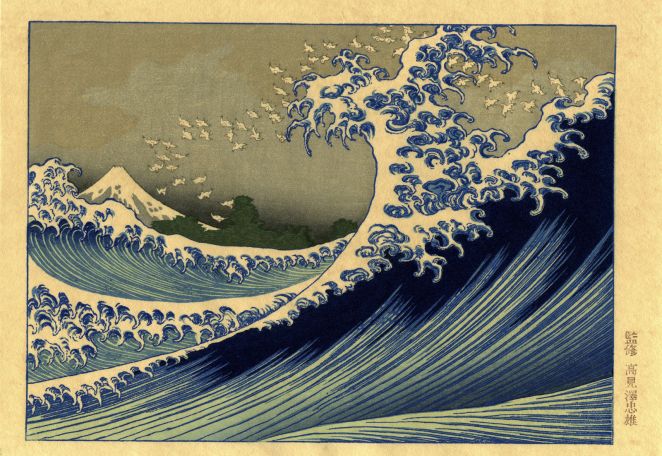
Anyway, I thought that I’d share a few of the 75 or so books I own relating to Japanese-style woodblock printmaking- the first installment concentrating on my three favorite artists: Hiroshi Yoshida, Toshi Yoshida, and Kawase Hasui.

The Yoshida Family

OK, so this is the book that starting all this nonsense 🙂

Complete Yoshida
“The Complete Woodblocks of Hiroshi Yoshida”

“The Complete Woodblocks of Hiroshi Yoshida”,

Amazon (later edition by Tuttle) ABE Publishing, 1987 203 pages, in English and Japanese

While living in Atlanta, I was perusing a local bookstore and they had a pile of these books. I couldn’t stop looking at these prints and still can’t- each page revealed a new world for me. Yoshida loved mountains as I do. I’m wary about the claim “complete” – there are several prints of Hiroshi’s out there that aren’t contained here, but the vast majority are. Beautiful accurate color and nice information.


Blakeney Yoshida
“Yoshida Hiroshi: Printmaker”

“Yoshida Hiroshi: Printmaker” by Ben Bruce Blakeney

H Yoshida Courth Lions
“Court of Lions”

Published by: Foreign Affairs Assoc. of Japan; 2nd printing (1953), in English


Three years after Hiroshi’s death, This biography was written. It includes the post-mortem frontispiece “Court of Lions, The Alhambra” which is a charming little print. A general biography with a great list of his prints and bibliography at the time.


Hiroshi Bible
“Japanese Wood-Block Printing”

“Japanese Wood-Block Printing” by Hiroshi Yoshida

Published by: Sanseido Publishing, Tokyo; 1st ed. (1939), in English ABE BOOKS


Considered the “bible” of how-to in mokuhanga- especially shin-hanga. Includes 6 hand-printed examples: a frontispiece “Cherry and Castle” and a progressive stage print of “A Junk” (see right).  This book can be accessed online through David Bull’s Woodblock Encyclopedia. I find this to be a sincere attempt (although he does leave out some details) to spread the craft to the west. Since it was published in 1939, I’m amazed how many copies (although not cheap) are still available.


junk process
“A Junk” progressive prints with alternative night version.

MOA Yoshida

“Hiroshi Yoshida Exhibition

Published by: MOA (Museum of Art, Shizuoka, Japan), 2000; 134 pages

Includes a wide-variety of Yoshida’s prints, paintings (some traditional sumi-e), drawings a a few images of carved blocks. Many of the paintings and drawings relate to later print designs. All images are in color with a list of works. In Japanese.


Yoshida Japanese 1

“Exhibition of the Wood-Block Prints by Hiroshi Yoshida

Published by: Riccar Museum, Tokyo; 1976

250 black and white reproductions and 11 in color with list of works. In Japanese and sparse English.


Yoshida Japanese 1 1

“My Yoshida Hiroshi Unpublished Manual“, by Tamio Sonoda 

Self-published, 107 pages. Yamada Shoten.

Another book I picked up in Tokyo, this one commemorating Yoshida’s 140th years since birth has been described as a “fan boy” book showing 15o illustrations of Hiroshi Yoshida’s drawing and paintings that influenced his later prints.


Yoshida Yuki
Toshi Yoshida, “Japanese Print Making”

“Japanese Print Making: A Handbook of Traditional & Modern Techniques” by Toshi Yoshida and Rei Yuki

Tuttle, 1966. 176 pages, in English. Copy signed “To: Sir Allen Brown [Australian Ambassador to Japan], 14th, Nov., 1966”

I feel confident that Hiroshi’s son, Toshi wanted this to be the contemporary version of his father’s “Japanese Wood-Block Printing” manual. The book certainly contains many experimental techniques during a time in which Toshi was full-swing in his modern phase. Like his later prints, I haven’t seen these techniques ‘catch on’. I do admire Toshi’s desire to go beyond the shin hanga genre.

An interesting note: My copy came with this flyer announcing an accompanying 28-minute movie “Japanese Print Making”. I believe that I later saw that it is in The University of Hawaii’s Art Museum collection, so apparently, it was made…

toshi movie
Toshi Yoshida’s Color Movie: “Japanese Print Making”, 1966


Toshi Varieties

“Varieties of the Japanese Print, Vol. 1” by Toshi Yoshida

Self-published, 1967Toshi Varieties page, in English. ABE Books

To accompany his”Japanese Print Making: A Handbook of Traditional & Modern Techniques” manual, this collection of prints feature 20 hand-printed woodblocks including several process prints. All of the designs reflect the contemporary experimental bent that certainly has a early-to-mid 60s feel.

I find that this information to be minimally-useful, but in the right hands, I think that someone can produce some interesting graphic work.


Kawase Hasui

Hasui Complete“Kawase Hasui: The Complete Woodblock Prints”  by Kendall Brown

Hotei Publishing, 2003 ( or 2008). Two volumes, 592 pages, in English. Amazon.com

Coming in at nearly 12 lbs, this is not the only compendium, but certainly the most exhaustive. Also includes a DVD with additional prints not included and a 42-minute documentary (in Japanese) of Hasui working two years before his death. You can see the online version on YouTube below.


hasui and others

“Kawase Hasui and His Contemporaries”  by Irwin Prachter

Emerson Museum of Art, 1986

Essays on Kobayashi Kiyochika, Shozaburo Watanabe, Hashiguchi Goyo, Kawase Hasui, and publisher’s marks.

With black and white images and 9 color plates from prominent shinhanga artists: Utagawa Kuniyoshi, Kobayashi Kiyochika, Hashiguchi Goyo, Ito Shinsui, Kawase Hasui, Hiroshi Yoshida, Kasamatsu Shiro, and Ito Takashi.


Well, that’s all, folks!

Stay tuned for the next installment of books about woodblock printmaking.

A secret holiday message may be transmitted with your decoder ring and don’t forget to drink your Ovaltine!

Some Bokashi Printing Considerations

beach takashi hiroshigeBokashi or Graduated Printing (as many of you know) is a very distinct feature of Japanese woodblock printmaking (mokuhanga) that was developed during the ukiyo-e Edo period. It can be intimidating to the beginner and it’s not the easiest thing to do as the technique involves several additional variables beyond beta (flat tone) printing. Bokashi works really well by itself, but also as an overlay on flat printing.
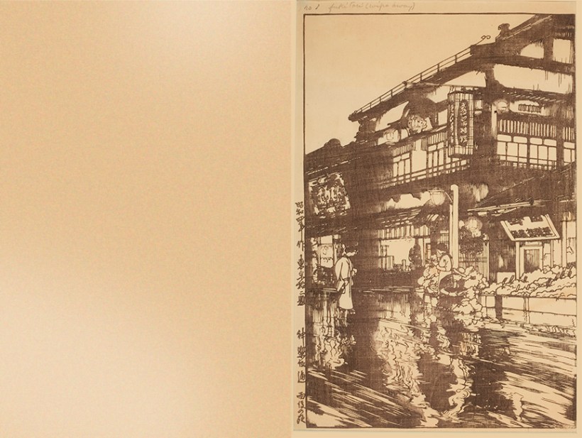
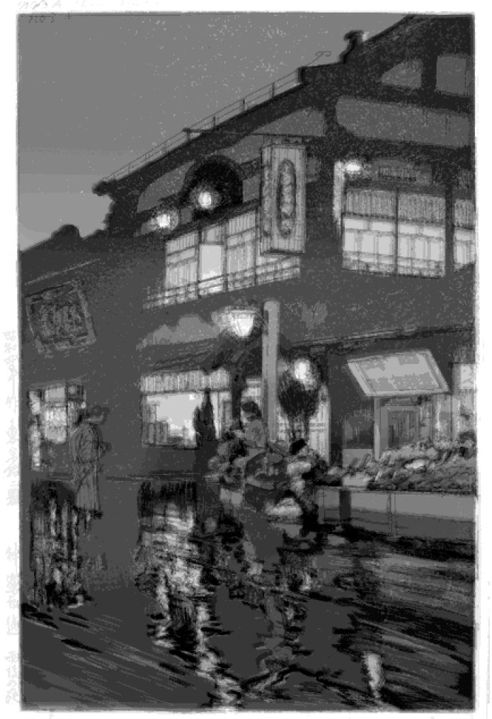
To the right are examples of bokashi in Hiroshige’s “The Beach at Takashi in Izumi Province”, 1853. The deep ultramarine blue pigment you see in the water is reminiscent of many landscapes of the ukiyo-e period. I am guessing that the central double sided bokashi band of blue you see in the bay was created from two passes- one for the top and one overlapped in the middle to create the lower gradation. There are additional bokashis (I count twelve in total): the far shoreline, near hill, far mountains, beach, two in the sky, and even on the house rooflines. Curved or irregularly-shaped bokashis are particularly difficult. I have posted an earlier entry using a jig for such an animal.

Bokashi is great to create a natural illusion of depth- so much so that it’s sometimes difficult to spot their use. However, this technique is generally more time consuming and requires extra skill and patience, but worth it!


Basic Technique

Here is a video of me explaining one way to print a gradation for my print #6 (Maryland) from my Appalachian Trail series:


Other than a hanga or maru bake (printing brush) and baren, another tool- the zokin is really handy thing to use. Translated as “rag”, a zokin is a wood block that is covered with a small piece of fabric- preferably white cotton from a t-shirt. Here’s some pictures of mine.

zokin2
Stretch the cotton fabric taut, use flat pushpins to secure. You need at least 2 layers of fabric
zokin1
Size of block 2″ x 2.5″ of wood (notice that I rounded the corners and edges) and the piece of cotton fabric 6″ x 8″
  1. The zokin is saturated with water and drawn beyond the surface of the block will be inked. The amount of water on the block should be slightly reflective- certainly not a puddle. The water helps the pigment to spread, the paste helps the pigment to remain in suspension resulting in smooth printing. The idea is that in order for the ink to be printed smoothly as a fade, there cannot be a sharp distinction between the dry and moist areas of the woodblock. Do this several times in the beginning to let the moisture penetrate the wood.
  2. Most printers apply the ink and paste in a line to the block. I do this also- especially for large gradations and it helps to gauge the correct amount of paste and ink. It is important to do this several times also before you use your good paper. The ink and paste needs to also penetrate the wood to create a smooth gradation. I use copy paper to help force the pigment/paste mixture into the wood and to get the amount of color I desire. If, after you saturate the block with ink, you see unwanted woodgrain, use a woodblock wrapped in very fine sandpaper to knock down the raised woodgrain. This really can make the printing a lot smoother!
  3. My printing brushes have a color dot on one end. That helps the printer know which end is for the paste and which end for the ink. It’s easy to get the ends reversed which can pollute both ends of the bokashi area. If this happens, you must stop and clean both the block and brush thoroughly before resuming printing. It happens to everyone and it teaches the printer’s mind not to wander.
  4. As you can see in the video, instead of adding the paste or nori (I make the paste for this kind of work quite watery, btw) and ink directly to the the block, another way is to add the paste and ink directly onto the brush. The advantage of adding the paste and ink to the brush is that I find there tends to be less tamari (accumulation of paste around the edges of the carved areas). The disadvantage with this as opposed to the adding to the block is that it is hard to see the amount of pigment and paste on the dark brush hairs.

    6MD
    Print #6 “Raven Rocks Shelter, Maryland” containing 4 bokashis.
  5. My color is pretty dark- the lighter the color used in the bokashi, the more difficult it is to be consistent. For very light pigment, use a white tile and mix a small amount of paste into the light color, then tap the color end of the brush into the mixture. Very fine and subtle effects can be created this way.
  6. In the video I am using a smaller brush than the length of the bokashi. In order to ‘extend’ the usable area of the brush, I initially tilt the brush toward the pigment end while I scrub onto the block in a slight circular motion working down and tilting toward the paste end. In my design (the tree area), I want a small amount of pigment to bleed down to the bottom. If you want the bokashi to go from pigment to completely clear paste, you might want to use a brush that is roughly the same length or greater than the length of the bokashi.

It’s really easy for the bokashi gradation to get away from you- to ‘migrate’ or change widths while you print- especially for large editions. 

It helps to use a SharpieÂŽ marker in the carved recesses (not on the printing surface!) of the block to indicate where the color range should be or at least to have a print next to you in order to compare.

Since my print is an edition of 120 copies, I feel that this ’tilting’ method has helped the gradations to be more consistent.

Either way, I hope this entry gives you some additional tips to create a nice, clean, and consistent bokashi!

ADDENDUM 6/12/19:

I have been experimenting with trying to make the smoothest bokashis– I’m not the only one, I know so I hope this adds to your idea toolbox.

Here are some additional tips to place the pigment, paste and water:

bokashi inking2
Light blue= water, light yellow= paste, medium blue= pigment. (1) To concentrate the pigment, create a pyramid (2) with a large as possible brush create sweeping motions across the grain (3) eventually, the water, paste, and pigment mix. Try to feather it very slightly and watch paste buildup (tamari) along the edges. You can clear this by lightly scrubbing up along the sides of the block shape/s.


I have also found that to get smooth printing, you need to attack the rubbing with the baren VERY quickly.

I learned this the hard way by letting the paper sit on an inked block for a couple of seconds to answer the phone- the effect is very similar to gomazuri- or blotchy “sesame seed printing”. I believe that what happens is that if the paper is placed on the wet block too long, the textured surface of the paper (which makes contact without pressure) absorbs the ink, then swells which compounds creating a textured look. I have learned to carefully place the paper into the kentos and VERY vigorously print- and print HARD.

Another consideration: I tend to print the sky blocks at one time- although this is counter to what I’ver read, ‘wet’ printing seems to make things quite smooth- the only drawback is that wet printing makes the colors appear darker because of the water content, so I tend to print slightly darker which lightens up after drying. I’ve lately waited for the paper to dry some before I print the ‘sharp’ blocks- keyblocks, etc. Once again, normally the keyblock is printed first. I like a dark keyblock and the sumi tends to bleed when overprinted. Since I do printing proofs, I’m not worried about the keyblock registration and can wait until later. In fact, it helps to wait until later since the dark keyblock tends to obscure the delicacy needed for light colors…


More from my Woodblock Print Collection

This is a continuation of posting my print collection that ranges from the woodblock periods of ukiyo-e to shin-hanga. See earlier posting #1 “A Portion of my Woodblock Print Collection”.

Please excuse the lack of printmaking content once again as I’m “knee-deep” in trying to catch up with printing my Appalachian Trail series!

print24
Utagawa Yoshiiku (a student of Kuniyoshi),“Cat Samurai” or “猫侍” c. 1865 I’m not sure if the present-day manga term “nekojin” was used back then or not…
Koitsu Hakozaki Hachimangu Temple
Koitsu “Hakozaki Hachimangu Temple” or “Hakozaki Hachimangu”, 1938
kuniyoshi shin yoshiwara
Utagawa Kuniyoshi, “Shin Yoshiwara” or “New Yoshiwara District“, from the series Toto Meisho (Famous places in the eastern capital) c. 1830. The scene portrays the famous Tokyo pleasure district after the 1657 fire. The design includes some very western rendering conventions for the day such as shadows. This piece is probably a reprint as the original is valued at $60K…
kuniyoshi nichiren
Utagawa Kuniyoshi “Monk Nichiren in Exile on Sado Island”, from the series “Illustration of Famous Monks”, 1835. The design depicts the famous monk who was banished in the 13th c. for teaching the Lotus Sutra. This is probably a 20th c. re-strike from a major publisher based on the all black kanji in the right-hand margin and differing snow pattern from known originals.
hiroshige portrait
Toyokuni III (Kunisada) “Hiroshige Portrait”, from Watanabe’s Memorial Tokaido Edition, 1918. I have this portrait (along with photos of Hiroshi Yoshida and Kawase Hasui) to watch over me as I print.
print38
Artist Unknown, “Rice Planting”- Please contact me if you know anything about this.
Takahashi Hiroaki Moon at Ishiyama
Takahashi Hiroaki (Shotei), “Moon Over Ishiyama” (石山の上の月), 1936. An unusual almost pillar-print (strong vertical) format.
print33
Artist Unknown, Kuniyoshi? – Please contact me if you know anything about this print.
hasui postcard1
Hasui “Kawaguchi” (a town north of Tokyo in the Saitama Prefecture) postcard print, c. 1930. I love how the clouds are formed with one bokashi impression.
hasui postcard2
Hasui postcard print, 1930s. Heavy goma-zuri (sesame printing) to indicate snow texture. Perhaps designed for the Christmas season.
Tsuchiya_Koitsu-No_Series-Miyajima_in_the_Rain-00028079-041022-F12
Koitsu “Night Rain at Miyajima”, war-time 1941. I’m not a huge Koitsu fan, but this print has very rich, velvety blues. Can you spot the deer?
Sailboats Morning Yoshida Hiroshi2
Hiroshi Yoshida “Sailboats Morning”, 1926. A later Yoshida Studios posthumous re-strike. Double ōban size- 21 1/2″ × 15 5/8″ and absolutely beautifully printed.
sudden shower ohashi hiroshige
Utagawa Hiroshige, “Sudden Shower Over Shin-Ōhashi Bridge and Atake (Ōhashi Atake no YĹŤdachi)”. It’s interesting that the “Atake” in the title is from the bakufu (Shogun military) battleship “Atakemaru” named after the Portuguese word “attaque” (attack). There is a present-day ‘re-creation’ of the ship in Tokyo harbor. This print is undoubtably a 20th c. re-strike, possibly by Adachi & Co.

The next 3 prints are a collaboration between Hiroshige and Kuniyoshi based on mythology from the 53 Parallels of the Tokaido Road series printed around 1843. The title can be seen written in the reversed white lettering on a black background in the top right (『五十三平行東海道』)

kuniyoshi sea monk
Utagawa Kuniyoshi: “Sea Monk (Umi Bozu)” or “Kuwana”. This woodblock print illustrates the story of the sailor Kawanaya Tokuzo, who decides to go to sea on the last day of the year, which other sailors consider unlucky. A violent storm breaks out, and the Umi Bozu appears. In a ghastly voice the apparition demands, “Name the most horrible thing you know!” Tokuzo yells back, “My profession is the most horrible thing I know!” The monster is apparently satisfied with this answer and disappears along with the storm.
kuniyoshi storm
Utagawa Hiroshige “Hiratsuka” (Station 7, Print 8) a city located in Kanagawa Prefecture. The second figure seems ‘head-over-heels’ about the storm…


kuniyoshi centipede
Utagawa Kuniyoshi: “Kusatsu” a town in Japan’s Kantō region, is known for its hot-spring resorts. Love the centipede.
the-fuji-marsh-and-ukishima-plain-near-yoshiwara-hiroshige2
Utagawa Hiroshige, Fuji Marsh and Ukishima Plain Near Yoshiwara (Station #15) From the “Pictures of Famous Places on the Fifty Three Stations” series, 1855. This is most likely a mid- 20th c. reprint.


Now, it’s back to the printing bench for me!

A Portion of My Woodblock Print Collection

“Seven days of rhomboid pain makes one weak”. Source: Wikipedia

For the second page listing my collection.

It’s been a crazy month for me: Spring Break (which was nice), then I blew out my shoulder from printing too much (I didn’t know I had rhomboid muscles… but after a week of intense pain, I sure do NOW!), and had an unrelated surgery from which I am now recouping with the help of some rather heavy meds. So, Dear Reader, I trust that I remain coherent…

Anyway, enough of that. Around 1993, before I mustered the courage to make woodblock prints, I collected them. It was great to see the prints in a reference book, but looking at the real thing has taught me a lot about color and printing techniques. As most of you know, woodblock prints are even more beautiful in the hand, the richness of the colors, embossing, and the details really come alive.

I believe these prints are first editions ranging from 1836 to 2003 and cover ukiyo-e > shin hanga > sosaku hanga movements >  the modern day. It’s admittedly heavy with Hiroshi Yoshida who’s  “My Main Man”. Don’t worry, Hasui- you’re cool too…

You KNOW dank memes are dead if Tanuki is using ’em.

So this is March’s entry. I hope the next article will have a bit more content- but until then, I do hope you enjoy the selection below.

Also, here is a link to Tanuki Print’s Pinterest Woodblock Image Encyclopedia.

ABOVE: Kawase Hasui, “Benten Shrine”, 1929 oban. I remember walking here south of Ueno Park.
ABOVE: Utagawa Kunisada “若菜姫 and 鳥山秋作 (Toriyama Akisaku and Princess Wakana)”, 1853 both oban. I was told that this looks like a typical marraige.
ABOVE: Tsukioka Yoshitoshi, “Rainy moon – Kojima Takanori”, from the series One hundred Aspects of the Moon, 1889 oban. The wiped moon is really well done.
ABOVE: Published by Isetatsu “Cat School”, Yanaka, Tokyo oban. Research told me that this was wrapping paper???
ABOVE: Katsushika Hokusai “Mikiri no Fuji” from One Hundred Views of Mount Fuji (Fugaku hyakkei),1834 chuban. Hokusai was a genius depicting Fuji in a myriad of ways.
ABOVE: Katsuyuki Nishijima, “Fuzuki: Tea House in July” 1998 ogata-chuban. We purchased this in Kyoto in 2002.
ABOVE: Tsukioka Yoshitoshi, “Minamoto no Yorimitsu Attacking a Ground Spider” from the Thirty-six Ghosts series, 1889-1892 oban. Yoshitoshi was said to be a murderer and was locked up in an insane asylum.
ABOVE: Hiroshi Yoshida, “Glipse of Ueno Park”, 1937 oban. This print required the most impressions of any of Hiroshi’s prints- a total of 100 colors!
ABOVE: Hiroshi Yoshida, “Court of the Lions, Alhambra”, 1928 or 1955 koban. An exquisite print from Ben Blakeney’s memorial book.
ABOVE: Hiroshi Yoshida, “Kameido Bridge”, 1927 oban. Horizontal baren suji in the water is a really nice touch.
ABOVE: Hiroshi Yoshida, “Plum Gateway”, 1935 oban. Love the subdued colors.
ABOVE: Hiroshi Yoshida, “In a Temple Yard”, 1935 oban. Anyone else find the proportions a bit strange?
ABOVE: Hiroshi Yoshida, “Himeji Castle”, 1928 oban. Evening version.
ABOVE: Toshi Yoshida, “Pagoda in Kyoto”, 1942 chuban. Delicate sky.
ABOVE: Toshi Yoshida, “Pine of the Friendly Garden” 1980 naga-ban. There is actually a third print missing for my set.
ABOVE: Toshi Yoshida, “Bamboo of the Friendly Garden” 1980 naga-ban. I think that there is a missing plum tree to the right.
ABOVE: Toshi Yoshida, “Myoko Hot Spring” 1955 oban. The orange sky really works IMO.
ABOVE: Kawase Hasui, “Lake Kugushi”, 1920 oban. From the from the series “Souvenirs of Travel”- a REALLY rare pre-Kanto earthquake print.
ABOVE: Katsuyuki Nishijima, “Asahi (the Morning Sun)”, 1999 slightly over-sized oban. I love the highlighted clouds.
ABOVE: Shoson (Kozon), “Wild Geese”, 1926 oban.
ABOVE: Tsukioka Yoshitoshi, “Ishiyama Moon”, 1889 oban. Another from his 100 Moons series.
ABOVE: Kiyoshi Saito, “Temple Gate”, 1955 oban. A lotta gomazuri.
ABOVE: Paul Binnie, “Torii at Miyajima” 2003 slightly over-sized oban. I got this print from Paul himself- nice guy!
ABOVE: Gekko, “Calligraphy Performance at Flower Mountain”, 1897 oban. My wife is a calligrapher, so it hangs near her desk.
ABOVE: Kiyotada Torii, “Uwanari” From Kabuki’s 18 Famous Plays, 1896 oban. I like the scary hannya above and the fearless-looking guy below.

Oh, and in case you were wondering- here’s a listing of Japanese woodblock print sizes:

Yoshida’s “Kagurazaka Dori” Process Print Set: Take Two

This is a continuation of the first entry introducing this print

Below are the individual impressions for the shin hanga print “Flower Street After the Rain” or “Kagurazaka Dori” by Hiroshi Yoshida, 1929. I hope it’s not too much of an esoteric subject, but hey, I’m a geek about this stuff.

For my (and others’) sake,  I have added some of the artist’s hand-written notes along with some of my own about what I believe each impression’s technical considerations  were and how it was designed by the artist.

Folks that are not familiar with overlapping colors may be surprised with how much stronger the impressions on the left sides (no.’s with A) appear in context with how they appear in the cumulative print on the right. This can be explained in two ways: (1) the  perception of value contrast as the solitary colors are surrounded by blank paper and (2) often colors on top of others are not absorbed into previously printed colors- especially if the paper is damp which creates somewhat of a resistance. Often the newly-printed colors merely appear to tint the previous colors rather than darken them.

OLYMPUS DIGITAL CAMERA
Detail of 3.A block showing the light “rays” using (kasure? or “faint”) carving and “fukitori”  or wiped area printing

I’ve heard that if a woodblock design or printing wasn’t going that well, a publisher would decide make it into a night scene. In this print, however, it’s clear to me that this design is all about featuring a night-time luminosity of reflections and glowing interiors.

Since I did not take these images, there may be a lot of variation in lighting value and temperature. I believe I remembered the individual color sheets to be of a lesser quality paper that has become darker that the washi used for the cumulative impressions- this makes sense cost-wise and registration is not an issue. Either way, thank you again Florida State University’s Art Collection!

1
 Left: page blank 1. Right: Keyblock in brown Notes: “fukitori (wipe away)” This refers to the lighted areas in the lamps and wet street reflections that are wiped away to make room for the reddish color in the 2nd impression- both using the same block. It looks as if the printer simply wiped these areas with his thumb and a small cloth. As I mentioned in the first entry, Yoshida’s keyblocks were generally zinc plates and the pigment was mixed with glycerin which coats the metal. Glycerin tends to give a less sharp and more mottled and painterly look than the usual wood and water style printing. I think that may be one of many reasons why Yoshida’s work differs from other shin hanga prints (like  Hasui’s).
2
1.A Left: Chinese red? impression using a stencil on keyblock’s inked block. Notes: “part of keyblock” 2. Right: overlapping effect of red to indicate glare and reduce the strength of brown keyblock.
Yoshida individual_0002_3
2.A Left: flat (beta) lemon yellow impression 3. Right: Introducing warm yellow under-printing. The next seven flat impressions establish the building’s value and hue structure.
Yoshida individual_0003_4
3.A Left: Cool gray impression using baren suji (baren marks) The darker and harder marks on the street to increase reflections- printer probably used a different, harder baren to do this. I also see evidence of wiping the lights despite the lack of notes mentioning it. It must have been a challenge for the printer to remember to wipe each spot!  I’m guessing that one reason to make this an early choice is to maximize the texture as the paper has not been flattened yet. The carving depicts rays near lights- see Detail above. 4. Right: Establishing cools and defining mid-tones Notes: “Baren marks”
Yoshida individual_0004_5
4.A Left: Flat carmine red impression 5. Right: Establishing warm tones reflecting lights and to offset cool reflections from sky
Yoshida individual_0005_6
5.A Left: purple flat tone 6. Right: Purple separates from sky and lights- keeps lights clean. Using a color mixed from the warm carmine of 4.A and blue of 3.A unifies the building.
Yoshida individual_0006_7
6.A Left: flat blue tone 7. Right: creates neutral dark shadows by introducing a dark-value compliment (blue) on top of the warmer brown keyblock base.
Yoshida individual_0007_8
7.A  Left: flat light red 8. Right: Emphasizes the glowing diffused light’s warm undertones.
Yoshida individual_0008_9
8.A Left: Flat light orange tone- bokashi or camera lighting? 9. Right: Breaks up previous red and re-enforces warm glow.
Yoshida individual_0009_10
9.A Left: strong flat red 10. Right: Creates punchy colors as a focal point.
Yoshida individual_0010_11
10.a Left: Flat med blue impression 11. Right: Introduces blue to the sky and separates from building.
Yoshida individual_0011_12
11.A Left: Flat medium red impression 12. Right: Introduces echos of red, but not that strong.
Yoshida individual_0012_13
12.A Left: Flat med cooler red. 13 Right: More subdued reds in flowers and kimono. You will notice at at this point (with the exception of 1.A and 2. A (keyblock) blocks are re-used.
Yoshida individual_0013_14
13.a Left: Yellow bokashi (gradated printing) using same block as 7a NOTES: ‘part of 7a [block]” 14. Right: Refines warm lights.
Yoshida individual_0014_15
14.A Left: flat medium/strong yellow 15. Right: selectively punches yellow.
Yoshida individual_0015_16
15.A Left: Green bokashi Notes: “part of no 3 A, shading”. There also appears to be some horizontal baren suji marks. 16. Right: Makes warm street dark and deadens it to increase reflections in puddles. The baren marks also emphasize the foreground plane’s flatness.
Yoshida individual_0016_17
16.A Left: Bokashi pinkNotes: “part of no 2 A, shading“. 17. Right: Adds richness  and volume to reds
Yoshida individual_0017_18
17.A Left: Light blue green on kimono pattern using 12A block by either selective inking or a stencil. Notes “Part of 12A” 18. Right: Adds variety
Yoshida individual_0018_19
18.A Left: Bokashi and baren suji Notes: “No 10 repeated, shading” 19. Right: Adds reflection from sky
Yoshida individual_0019_20
19.A Left: Bokashi and flat orange Notes: “part of No 2A shading”  I’m not sure if the bokashi results from wiping to be included in a single impression 20. Right: Adds a variety in reflections and consolidates flowers
Yoshida individual_0020_21
20.A Left: Blue bokashi Notes: “part of No 8 shading” also includes fukitori in the wiping of the lights. shows a good amount of goma (sesame)- a somewhat blotchy texture printing resulting from using little paste 21. Right: Pushes upper part of the house into the distance and reflects blue sky,
Yoshida individual_0021_22
21.A Left: Bokashi in gray Notes: “part of 7A, shading” 22. Right: Adds depth to flowers
Yoshida individual_0022_23
22.A Left: Medium maroon impression- this is a good example of how a dark impression on the left can appear to simply ‘tint’ the print on the right. Notes: “part of no 4A”. 23. Right: Adds a diffused light to shoji screens.
Yoshida individual_0023_24
23.A Left: medium impression with bokashi of the dark Indigo? Notes: “part of 6A, shading” 24. Right: Color and value punches man’s kimono
Yoshida individual_0024_25
24.A Left: Bokashi of light and dark purple. Notes: “part of no.4A in two colors” [values?] 25 Right: Darker colors emphasize shading and depth and leads the eye.
Yoshida individual_0025_26
25.A Left: Obokashi (wide gradation) from light blue top to warmer blue.  Areas around lights show fukitori “wiping” Notes: “no 3 repeated in two colors, fukitori (wipe away)” 26. Right: This punches the yellow further and consolidates the scene.
Yoshida individual_0026_27
26.A Left: Bokashi using Indigo? Notes: “part of no 9 shading” I think that small impressions in the next few steps were designed to allow the larger areas to ‘rest’ and absorb the previous impressions’ color.  27. Right: This serves as a reflection of the figures
Yoshida individual_0027_28
27.A Left: bokashi in pink 28 Notes: “shading, part of no 2 A“. 28. Right: I guess the flowers needed more isolated emphasis than previous16.A impression.
Yoshida individual_0028_29
28.A Left: Cool blue bokashi Notes “part of no 3A, shading” 29. Right: Blue gradation added to the sky and ties into upper building.
Yoshida individual_0029_30
29.A Flat purple impression- a good example of how a seemingly dark impression will simply tint an undercolor. Notes: “part of no2A” 30. Right: Deadens the kanban (sign)
Yoshida individual_0030_31
30.A Left: Flat purple impression- since there are no notes referring to a block being re-used for this, I have a hard time believing that this is a new block, but rather a notes omission. 31. Right: Emphasized the woman on the left’s kimono.
Yoshida individual_0031_32
31.A Left: Another blue impression with fukitori and baren suji Notes: “Baren marks and fukitori (wipe away) no 8A repeated” 32. Right: Perhaps Yoshida wanted to increase the complexity of baren marks and or he wanted the paper to ‘rest” in the previous small impressions until he hit the print with a large overall color.
Yoshida individual_0032_33
32. A Left: This is an interesting one- a round bokashi– I’m guessing using a hanga bake rather than the standard maru bake. Notes: “shading, no8 A repeated”  33. Right: This seems to push the people back since they are primarily printed in warm colors. There is not a lot of difference when comparing 32. Then again, maybe the physical print shows more effect.
Yoshida individual_0033_Layer 0
33. A Left: Artist’s chop and jizuri (“self-printed”) seal. Notes: “letters” 34. Right: The finished print- looks like the colors are much more saturated, especially in the blue sky. I believe that I can see the figures being deadened a bit more than no. 33.
small impressions BW flattened
This is where I geek out WAY too much: In Photoshop, I converted each impression to black and white and assigned each layer an opacity of 10% with layer mixing set at ‘darken’. As you see, the inside of the lamps use only 1 impression while the shadows have the most overlapping impressions- particularly in the center as a result of 32. A.. Please note that this is independent of the darkness of the impressions, but only indicates the cumulative number of layers of overlapping impressions dedicated to each area. See the two images below as it’s interesting to note that this roughly corresponds to the values of the final print.

Once again, here is an the animation from the first entry:


Yoshida-Kagurazaka-Dori-Process-Small


Yoshida’s “Kagurazaka Dori” Process Print Set: Take One

Flower Street After a Night Rain
Hiroshi Yoshida’s “Kagurazaka Dori”,  or “Flower Street After a Night Rain” 1929

Sometimes, unexpected things are nearer than I think. Florida State University’s Art Museum houses a 67-impression series from Hiroshi Yoshida’s (1876-1950) oban-size Kagurazaka Dori” ( the English title is “Flower Street After a Night Rain”) from 1929.

Since I am a printmaking professor, I asked the Associate Director of Collections if there were any archived images available as an academic resource. To my delight, she was very kind to send all 67 files (33 cumulative and 33 individual impressions plus a chop mark impression) to me!

I have no idea where (or when) FSU got these, but they are very, very rare. It is my understanding that this is the only set of it’s kind outside of Yoshida Studios in Toyko where Tsukasa Yoshida stores such things along with the blocks of his grandfather.

Yoshida-Kagurazaka-Dori-Process-Small
Cumulative impression animation compiled from images. Courtesy of Florida State University

From what I am told, Hiroshi Yoshida’s prints are rarely re-printed (if ever). Since the hand-written notes are in English (apparently in Hiroshi’s hand), I’ll bet that this was a keepsake gift (probably for a US army officer family during the occupation) rather than the normal instructions for printers to follow.

Despite that this is not exactly my favorite print of Hiroshi’s, I am so obsessively-interested in producing shin hanga-style prints- specifically in the Yoshida-style, that this is a real find for a geek like me.

I’ve actually seen the set once before- as a grad student, I went down to Tallahasee in 2002 and attempted to record the set by using slide film- which turned out terribly because of the low lighting. The idea was to take them to Japan where Dave Bull and I were mapping out another shin hanga-style night scene of my design, “Milton”, as part of his Surimono series. At the time, I wasn’t very ‘deep’ in such printing techniques and now I feel that I can see and glean the information much more.

milton
John Amoss, “Milton”, 2002 from Dave Bull’s Surimono Series. Photo courtesy of Mokuhankan.

I know that while looking at the animation that it’s difficult to get all of the subtleties of each cumulative layer. After looking though all of them, there are several things that quickly struck me- particularly the use of fukitori or (“wiping off”) technique. Since you can’t skip to frames in this animation, I wanted to point out the 1st image of the keyblock where the brown ink in the street lamp’s lighted areas were wiped off. In the 2nd image, the keyblock was re-printed in red (to indicate the lamps and wet street’s glare) in conjunction of where the 1st impression areas were wiped off. It’s pretty obvious that the printer (Komatsu-san?) used a stencil overlaid onto an inked block. Design-wise, using the isolated red instead of the darker brown creates an environmental effect that is… well, very effective.

As I said, there are also the other 34 individual impressions that I hope to add with notes soon.

Sets like this are like preliminary drawings for paintings- they provides a lot of insight that tends to get buried in the final product.

Side note: It’s well known that most of the Yoshida’s keyblocks were made of zinc and glycerin was mixed with pigment to adhere to the metal.

There are many more 89 year-old mysteries yet to be unfolded.

Click here to see the next entry featuring and in-depth analysis of the individual impressions

Traditional Mokuhanga Pigment Mixing: Using a Wooden ‘Mortar and Pestle’

pigment drawer
The pigment drawer at Mokuhankan– Asakusa, Toyko

I had the pleasure of spending a month working at Mokuhankan Studio in Asakusa, Tokyo from May to June, 2017. One of many new experiences for me was, under the direction of Natsuki Suga (who worked under Kenichi Kubota at the Adachi Institute for 5 years) to make relatively large batches of color using wood board mortars and pestles. This is to assure the pigments’ quality and to create a well-mixed supply of color paste that is ready to use later. Each color requires it’s own sanded cherry board and pestle (pine with cherry faced using epoxy glue) that was made by Lee-san.

Cherry blocks made by Lee-san to be used as a pigment griding ‘mortar and pestle’.

Like most printers, I generally use a mortar and pestle for a far too short of a time in order to grind pigments into a paste [for beginning printers, this resulting color paste is then later added by the printer to the block with varying degrees of water and nori (starch) paste while printing]. For the record, I’m pretty slack and sometimes just mix the pigment out of the bag with water (sometimes w /alcohol to break the surface tension) using only a brush/tokibo or hakobi. I am learning that mixing the colors thoroughly helps create much smoother colors and avoids a print being spoiled because of stain blotches which sometimes show up during printing from not mixing the pigments well enough.

“Warning: It takes a long time.”

This process of grinding on a board takes a long time but, unlike using a deep mortar, you can much more easily see the texture of the pigment on the flat surface.

List of colors:

pigmentChart

pigment03

Prep: Of the 5 colors, only bengara had pure ethyl (grain) alcohol added, mixed in the night before, and was allowed to sit open for the alcohol to evaporate. Also, pigments like bengara require more time to grind because the particles are coarser. You will need a wooden board, wooden pestle, a scraper (my credit card seemed to work well since it was not hard enough to damage the wood), water, jars.

Here is a .pdf from the 11th year of Meiji (1879) describing in detail Japanese pigments.

Process:

(1) Wearing a mask, add a small amount of clear (preferably distilled) water to the dry pigments in a jar and stir.

(2) Approx. one tablespoon of damp pigment is then placed onto the top of the block.

pigment05.jpg

(3) The wooden pestle is held at a slight angle away from the pigment to be ground and pushed with moderate pressure back and forth.

4) The processed portion naturally accumulates and builds up on the pestle which is then scraped off.

(5) Water is occasionally added, but Suga-san explained that too much water doesn’t allow the particles to grind against each other.

(6) After each pass, the color is then pushed back and the process is started over.

(7) The idea is to grind 4>6 times into a paste (refer to chart above it took on the average 45min. to process a tablespoon of dampened pigment). Suga-san said that the final surface should appear creamy-smooth.

(8) At the end of the grinding process, water is spread around and the residual pigment is gathered up.

pigment09.jpg

(9) After grinding, enough water is added to the paste to be pushed through a fine sieve into jars.

(10) Water is then very carefully added to the top. Over time, the water and heavier pigment naturally separate.and stored out of the light in a cool area of the studio.

(11) Each morning, the water is drained carefully off the top. New water is then carefully added again to the top of the drained paste after it’s used and returned to a cool, dark area. This process or replacing the water reportedly keeps spoilage down (presumably, by limiting exposure to air) as opposed to adding preservatives. The key is or course, not to shake or stir the jars.

pigment10

  • Additional references: Preparing powdered pigments can be found in a “Tools and Materials” section David Bull’s www.woodblock.com Encyclopedia article. The idea of keeping a selection of pigments stored in ‘paste’ form in an alcohol/water mix is discussed in ‘One-Point Lesson’ #6 in another section of the Encyclopedia.

NOTES AND OBSERVATIONS:

Mokuhankan is planning to compare this traditional method of grinding pigments with using a western-style glass muller/ glass slab combination. I suspect that this will result in less hard-won pigment being lost and may go a bit faster.

As of several days later, both the Ultramarine and the Indigo did not separate to clear water. I was a little suprised at the Ultramarine since it is a mineral pigment.

I’m also not quite sure that the step of pushing the pigment through the sieve is necessary since the ground particles are much finer than the screen.

After printing, mixing bowls are left to dry around the printing desks and are reconstituted (unless starch paste had been added) by simply adding a little water and stirring with the tokibo without apparent problems. I’ve noticed that this reconstituting doesn’t work as well with commercial tube watercolors since there is gum added and it results in a grainy texture.

pigment11

The Great Wave

When I worked at Mokuhankan in Asakusa in May, I had the honor of trading one of my prints for a painstaking re-make of  Katsushika Hokusai’s (1760 – 1849) 「富嶽三十六景 神奈川沖浪裏」 “Great Wave off Kanagawa” subtitled: “Beneath the Wave”. The print was originally designed by Hokusai c.1829 and was re-carved by Dave Bull and printed by Numabe-san. See Mokuhankan’s Great Wave Project

wave-animation
A print process animation of “The Great Wave off Kanagawa” by Katsushika Hokusai- this is from the Adachi Institute I believe.

Hokusai’s ~9-color ōban print was part of his series “Thirty-six Views of Mount Fuji”. Kanagawa is near Tokyo’s port town Yokohama- you can see Fuji-san in the background looking WNW.

golden mean wave
Overlay of the “Golden Section”/Mean/Ratio” relating to Fibonacci sequence-based proportions.
dragon hokusai
Katsushika Hokusai “Dragon Ascending Mt. Fuji” 1835
earlier wave
Katsushika Hokusai, “Oshiokuri Hato TsĹŤsen no Zu”, 1805


“The Wave”, of course, is an iconic image– likely the most recognized woodblock print in history. I am always amazed when students have never seen it. Students who recognize it think that Hokusai carved and printed it also- I sometimes clue them in to the division of labor, sometimes not.

Hokusai’s use of the golden section based on natural observation has often been noted by academics.

hokusai wave

I’ve also read that the Great Wave’s foam forms “claw-like” leading crests very similar to the way dragon claws are depicted see: Hokusai’s “Dragon Ascending Mt. Fuji” from ‘One Hundred Views of Mount Fuji’ (Fugaku hyakkei) 1835. The effect depicts an active nature’s power in the face of puny fishermen who prostrate themselves in fear.

hokusai portrait
Hokusai’s self-portrait– from a collection at the Louvre.
hokusai grave
Hokusai’s last domicile– I managed to find his grave (street view here) in Tokyo’s Motoasakusa area.

It is also interesting (at least to me) to note that Hokusai made a series of ‘proto-waves’. Shown above left is one entitled “Oshiokuri Hato TsĹŤsen no Zu,”  or “Fast Cargo Boat Battling The Waves” c. 1805. The style looks to me a bit like work from a later artist, Rockwell Kent.


Hokusai factoids:

• Although his studio and much of his work was destroyed in a fire in 1839, the artist is thought to have produced 30,000 works over the course of his lifetime

• Hokusai lived in more than 90 dwellings during the course of his life.

 “When I was 50 I had published a universe of designs, but all I have done before the age of 70 is not worth bothering with. At 75, I’ll have learned something of the pattern of nature, of animals, of plants, of trees, birds, fish and insects. When I am 80, you will see real progress. At 90, I shall have cut my way deeply into the mystery of life itself. At 100 I shall be a marvellous artist. At 110, everything I create — a dot, a line — will jump to life as never before.” He died at age 88 hoping for ten more years in order to become a “real painter”.

– Katsushika Hokusai

Gotou-san and a Baren Trove

Gotou-san stripping the cuticle from the inside of the white bamboo leaf before braiding strips.

The baren (馬連 or バハン) is the most important tool (other than hands) for a mokuhanga printmaker. As it’s well-documented, hon barens have three parts: the (1) shin, or coil that is twisted shirodake bamboo and sewn into a disc; the (2) ategawa, the disc composed of ~40 sheets of washi paper glued together with persimmon juice sealed with water-proof urushi lacquer; and the (3) takenokawa, a timber bamboo leaf covering. Barens are, as you can imagine, quite expensive as it takes upwards of 6 months for a craftsman to make and cost anywhere from US$800>$1400. The number of strands, the width of strips, and how they are braided dictate the coarseness, power, and/or finesse of the baren depending on the intended printing effect. An article from woodblock.com about hon barens and baren-making can be seen here.

I have used a number of low and medium-quality barens (murasaki, etc.) over the years, but I always felt that my equipment lacked hon (or “authentic“) barens. I experienced the advantage of using the real thing while printing at Mokuhankan in Tokyo where Dave Bull was generous enough to allow me to try many of them from his baren ‘strongbox’. Incidentally, there was fine 8-strand baren which we all politely fought over for detail work. Anyway, I found that the hon baren’s washi ategawa allows for the printer to pull on the baren sides in order to concentrate the power in several directions plus the bamboo coil really makes a perfect combination of power and finesse. I would also recommend using the standard 13 cm-size baren as it  works as an ‘outrigger’ to keep it flat on the block while printing.

“After a while, I really felt as if the natural combination of a hon baren’s coil, disc, and covering was simply an extension of my arm and fingers.”

The barens I purchased on a Japanese auction- 7 hon, a ball-bearing, and an old murasaki-style. Also two ‘free-range’ ategawa were included.
Seven hon barens and an old murasaki-like rope thingy (bottom left)

UPDATE: So I am always “trolling” Japanese auctions (Jauce.com, Yahoo.jp, etc.) for printmaking tools. I occasionally come up with jewels- last year, I purchased 32 Kintaro-brand maru bake (printing brushes). Anyway, after about 2 years of diligently looking for barens, I hit what I consider the ‘motherload’ of barens a few weeks ago- maybe a printer died 🙁 Although not cheap (especially with all of the fee$), I was able to purchase 7 hon barens! I wonder where they came from- most are very lightly used if all and one seems very old. I believe that there are (2) 16-strand, (2) 12-strand, and (2) 8-strands along with (1)a very old-looking 6-strand(?). I am patiently waiting for Hidehiko Gotou, who is purportedly the last maker of traditional hon barens, to help me identify them.

Gotou-san said that the baren coils can last a professional printer for up to 3 generations, the ategawa for up to a decade, and as you probably know, the a takenokawa covering lasts for a print or two depending.

This fall, I had the pleasure of meeting Gotou-san at the IMC 2017 conference in Manoa, Hawaii. Earlier in the year, I had ordered two kiurushi barens (here’s the link to an earlier entry) from Gotou-san and I was quite happy with them. I found Gotou-san to be a delightful person (taller than the typical Japanese) and loves printmaking as well as baren-making. He’s now 65 (doesn’t look it) and announced while in Hawaii that he now has secured an apprentice to possibly ‘pass the baton’ for future generations of printmakers. People seemed very relieved at the news.

A 16-strand coil of braided bamboo from the Geidai University, Tokyo

You can see in my Youtube video below how Gotou-san twists a 4-strand (ko) which can be then formed into any number of braiding combinations. The plant-end of the shirotake (white bamboo) leaf is cut into strips, the cuticle is stripped off (see pic above) and the strips are spliced while twisted and braided at the same time.

Some barens take around 12 meters (~36 ft.) of braid to make a single baren coil, As you can see, he is blazing-fast (no, this is not sped-up!) and amazingly consistent.

Braiding combinanations that form the 8 to 16 ko baren.

Afterwards, the 4 strands are doubled (8 ko), tripled (12 ko), or quadrupled (16 ko), and sewn together to form the flat coil. It’s then fitted to the ategawa and a softer rope is laid outside the coil to minimize ‘bumping marks’ from the sides. Gotou-san is, of course, also a master at wrapping the takenokawa around the whole enchilada. The presentation of a new baren is very clean using white bamboo to wrap (which is weak, but pretty), and a photo of the coil is included with the new baren. I have heard that it takes some time to break in a new baren. An article from woodblock.com goes into some detail- see: here

I also did a re-wrap of all of my 22? barens (hoarder?) which was good practice. Plus, I uncoiled and sewed together the old hon baren (seen in the bottom right of above picture. Pro tip: to sew a baren you have to use silk thread and tie an overhand knot in each pass through the coil by tying, winding the coil a quarter turn, tying, etc. and introducing ‘eighth pie sections’ 2/3 of the way through for stability. Very little tension is what you want in order to keep the coil really flat- which is VERY important. IMO, my final product doesn’t look that bad for a gaijin– and thus, I give myself a ‘gentleman’s “B” ‘.

If you’d like to check out Gotou’s baren webpage, here is the link. He speaks a whole lot better English than I do Japanese, but there is always Google translate. He can make a baren to order (takes some months to make and receive)- and he does now have a PayPal account- I think that I made him join! 🙂

A video I took in Hawaii showing Gotou-san twisting shirodake (special white bamboo) strips into a 4-strand (ko). Amazing!

Another baren-making site that you might be interested in is by Aiyumi Ohashi, who I had the pleasure to work with in Asakusa. She was a student of Gotou-san and has a brief how-to page of her own here.

Tanuki Senjafudas!


I’ve always loved senjafuda. Senjafuda (in Japanese- literally “thousand shrine cards”) are taken by travelers and pilgrims where they are pasted on rafters and posts. They don’t look as junky as you might expect- much better than graffiti IMO.

Making and collecting senjafuda (some are quite spectacular) is very popular thing to do in Japan. As an artist, they’re very convenient to make- you have some left-over wood? Perfect. Some extra paper scraps? A piece here a piece there, and voilĂ !

I plan to use this as a demonstration and simple print for my printmaking students to start mokuhanga. The idea is to print around 200 (this test batch is only 14) to bring and give away at my IMC2017 Mokuhanga Conference talk at the University of Hawaii in late Sept. Shhh! it’s a secret surprise…

Technically, it’s obviously a 3-color print- actually 5 impressions as the red and black are over-printed. I took a hint from Mokuhankan’s print parties in Asakusa and printed the black keyblock last- that keeps the lighters colors clean! Normally, the black keyblock is printed first, but sometimes the black bleeds into the later lighter colored blocks resulting in a dingy mess.

As Thomas Edison said: “There are no rules here- we’re trying to get things done”.

Incidentally, I’m using ‘black hole’ sumi or sumi no kaori (literally “scent of carbon”?)- anyway it’s velvety-smooth-nano-vanta-fiber-crow-in-a-coalmine-event-horizon bahahalackkkk! If you’re interested in buying this glorious stuff, the only place I could find is a calligraphy shop in France of all places. See: Comptoir de Secritures

Ben Blakeney’s 1953 Yoshida Biography


Hiroshi Yoshida is My Hero.

Ever since I picked up the book The Complete Woodblock Prints of Hiroshi Yoshida, in 1991, I have been haunted, nay gobsmacked, by his designs. In fact, I wouldn’t have quit my illustration business, gone to grad school, and taught higher education if it were not for his work. If you’re not familiar with Hiroshi Yoshida (1876-1950), check it out on Google.

Yoshida’s prints fall within the genre of shin hanga (or “new” prints)- a 20th-century movement started well after uniyo-e’s demise and provided a Renaissance of mokuhanga that lasted from roughly from the mid 1910s until the 50s. This movement was started by YoshijirĂ´ Urushibara (1888–1953) through his collaborations with western artists such as Frank Brangwyn. Other notable artists include Charles Bartlett, Elizabeth Keith, Tsuchiya Kōitsu, and many others. The idea of shin-hanga was to use traditional mokuhanga printing techniques in a watercolor effect- lessening the importance of line while layering color over color in a realistic, western manner often creating atmospheric depth.

In the 1920s, two primary shin-hanga artists arose: Hiroshi Yoshida and Kawase Hasui. Even though Hasui seems to get the most credit through his influence on anime, I’d put Hiroshi over Kawase Hasui any day.

True, old man Yoshida couldn’t draw people worth a nickel, claimed prints to be “self-printed”, and used zinc plates, but- Oh!, his Values, his Colors, his Lines!…

As one of the shin hanga heavies, I believe one reason Yoshida’s prints were so consistently superior was that he published his own work early on. Unlike the Hasui/Watanabe Shōzaburō team, I don’t see lulls in quality over his career.

I’ve had Blakeney’s book Yoshida Hiroshi: Print-maker since the 1990s and it’s very informative. It describes his background, travels, and a catalogue raisonnĂŠ.

Plus, it has a posthumously printed woodblock fronticepiece “Court of Lions, Alhambra 1928” (I have a soft spot for the subject matter since I really liked visiting the Alhambra). 

As usual, the Court of Lions is beautifully rendered and printed. The woodblock is similar to the color prints found within Yoshida’s Japanese Woodblock Printing from 1929, the classic how-to guide that I also treasure. The hand-printed examples in both books are really inspiring- especially considering the thousands of copies that must have been produced.


I’ll be in awe of this man the rest of my life.

Printing In Japan 日本での印刷: Part 3

Warning: This chapter contains a lot of geeky, technical information often going beyond the basics of Japanese-style printmaking. To add context, please refer to Woodblock.com’s extensive  Encyclopedia entries.

Bucket o’
conditioned brushes ready for work
An all-purpose profile shape

I apologize in advance if you already know these things… That said, Dave Bull would regularly remind me [paraphrased]: “There are often more ways than one to do these things- you should look, listen, and try one way and then another, and then compare the results. One advantage is to think outside the box”. And he is right as evidenced by his, and others’ work and innovations. So to that end, here are a few things to consider…

Printing Brush Prep

Printing brushes (maru and hanga bake) have stiff hairs for a reason- you need the firmness to move pigment and paste around the blocks. On the other hand, a firm, stiff hair leaves a streak. Usually, mokuhanga requires smooth pigment application, so to get the best of both worlds, the tips need to be softened by a mechanical process of rubbing along a rough surface (sharkskin, ‘dragonskin’, coarse sandpaper, etc.). I was able to compare the “pre-conditioned” brushes from Matsumura and the ones at the print studio and the latter were noticeably softer. Here, I am conditioning a maru bake.

Flattening bottom of the brush
Rounding the edges around the brush

The first step: Singeing the Brush Hair

After you get a new brush, the next step is to form it (see brush profile pic above). The traditional way is to melt the hairs using a hotplate. I made my own setup to fit on top of an electric element. It’s a pretty stinky and hot process. Some folks simply trim with scissors although I find that the melting technique is a bit quicker and easier to be consistent.

The Next Step: The Old Grind

Shark skins have unique properties and are valued by craftspeople for a number of purposes. This angel shark skin features thousands of serrated tooth-like dermal denticles [see images]. 90-grit sandpaper can also work if you don’t have access- large sanding belts provide a longer surface to use. I’ve seen folks use powered machinery, but this really isn’t that much work to me.

The technique that works best for me is to:

  1. Dampen the brush ends- I use a plate to pick up a few droplets of water.
  2. Hold the brush flat and push from the tail to the head in long strokes in North>South>East>West degrees for about 50 strokes each direction.
  3. Then on the side fins, vigorously grind the brushes in short, hard strokes pushing the hairs so that you can feel the hairs grab. It helps me to support the brush hairs from the back with my thumbs to make sure a strong contact against the sharkskin or sandpaper is made.
  4. It should produce a kinda gross brown powder build-up.
  5. If hairs protrude, it’s best to trim them with scissors rather than pulling them out since tightly-packed hairs are what’s keeping them in the brush.
A detail of the denticles
The skin texture

When I was shown the process by experience printers in Japan, I aped what I saw. I wasn’t able to get anywhere for many hours. I did successfully rip the tip of my finger open which got me a little mad, [see pic of my finger] but this also got me thinking: I needed to rip the hairs just as I did my finger.

If only i would work
as well on the brush!

After doing the ~30 initial strokes to roughen up, I finally was able to feel the hairs ‘grip’ the sharkskin- really grip them.

To consider when to stop, look for a light brown color developing on the face of the brush- an almost velvety look indicative of a well-conditioned brush. I also diagnosed the softness of the tips by rubbing it against my cheek.

Problems: The middle of the brush had a slight dip. We concluded that that area had the most contact with the sharkskin.

I asked Kubota-san why the ‘dip’ in the middle and he explained to me that I should rub the brush 50 times FLAT. He said that I should rub each brush in the following directions: North, South, East, West, 45°, 135°, 225°, 315°, the on the ‘CORNERS’ of the brush in all NSEW directions top and bottom. I’m not good at math, but this is 16 angles x 50= 800 strokes. Maybe I’m lazy, but I found that the brushes didn’t need that much attention.

Here’s a short video to get a feel of it:

A comparison of brush hair ends

So, what are we looking for microscopically? There was a bit of deliberation on the question: Are the tips of the brush tapered or ‘frizzed’? Suga-san (who worked at the Adachi Institute for 5 years) and Mr. Kenichi Kubota, master printer at Adachi discussed this. I personally was at a loss with my lack of language skills to comprehend the vast majority of what was said, but I think that ‘tapered’ won out (see diagram).

A close-up of the tapered brush hairs
A well-conditioned brush

Brush Jigs for Hanga Bake

Hanga bake
wrapped with string
Suga-san with a wrapped brush

Like I said earlier, I use my thumbs to keep the hairs from bending too much while rubbing against the skin (once again, this is a bit tricky to avoid fingers being ground). If you are sharpening a hanga bake (the more ‘paintbrush’ like tool), it’s advised to wrap the brush with a jig and twine so that only the tips are being ground. The printers wrapped them tightly using wooden strips with holes on both sides to keep things stable. If someone knows how to make a jig for maru bakes, please tell me.


Watching a Brush Maker on Asakusa Dori

I stumbled across a brush maker on Moto Asakusa near Ueno Park. I watched Mrs. Miyagawa work and the process looked relatively simple- I’m sure it’s a lot harder than it looks. Hanks of horse hair are cut and gathered,  loop light wire through holes in the wooden brush base. The hairs are threaded into the wire loop half way and the hairs are pulled into the holes. I purchased a couple of smaller maru bake brushes and she gave me a small hanga bake. Nice lady! A more in-depth report on the shop can be found here.

Mrs. Miyagawa, brush-maker
Brush-making tools
Full horse tails for brush hair
The brush-maker’s bench

Printing in Japan 日本での印刷: Part 2


This is a continuation of my time spent in May and June, 2017. See earlier part 1- Printing in Japan: 日本での印刷

A Comparison of Learning Environments: Academia and the Apprenticeship Models

Watanabe Publishing c. 1935

I personally feel very fortunate in many ways: I have have a functional, supportive family and as a university professor, I am paid to learn, along with my teaching responsibilities. I have tried to not separate learning and teaching as much as possible.

A few opportunities came up for me via woodblock printmaking to consider my role: One was casual conversations with David Bull of Mokuhankan concerning the apprenticeship model and the other is an invitation to speak at IMC2017: the International Mokuhanga Conference in Honolulu, HI this late Sept. The subject that I chose for the conference relates to Environment and Social considerations of woodblock printmaking- certainly a broad subject with a lot of latitude. I would like to concentrate on active learning within work environments and how to incorporate elements of active learning within academia. There will be a diverse crowd: artists, craftsmen, academics, professionals, and amateurs. As a teacher and commercial artist with a diverse background, I feel that I am able to compare ways of learning which I have personally felt were the most valuable to me and my students.

A little printmaking background: Since the mid-90s, I have struggled (mainly on my own) to understand what variables equate making a strong and well-made print, both in design and execution.

If you have tried mokuhanga, you know what I mean: (1) everything seems prohibitively expensive, (2) a lot of things are hard or impossible to come by, and (3) you’re not sure of what’s right/wrong since there are very few reliable sources of direct information. Some, if not most of these challenges can’t be addressed by studying books or taking classes. I have learned enough of the art that I needed to go back to Japan to feel, smell, look, hear, and absorb the process and to work alongside others who have a more developed and varied experience. I really wasn’t conscience of what I needed, it just seemed like the natural progression of things. And I got a chance to do just that this summer. Beyond the technical issues, I also was able to rediscover and consider that…

“I find that, although I have learned a great deal as a student, I have valued work and outside of academia experiences every bit as much, if not more.”

Selected Glimpses of Learning

As I stated earlier, I worked for nearly 10 years at The Atlanta Journal-Constitution starting in 1987 and later as owner of Amoss Illustration, Inc. working with many national clients.

Prudential Quarterly
cover illustration c.1998
A masthead illustration
for the 1996 Olympic
Editions of the AJC

During that period, I learned:

  • to carefully chose the questions to ask
  • to learn to teach myself
  • to watch, try, then ask
  • to be engaged
  • to be patient and open to listening to authority
  • to witness artwork being made
  • that ability was rewarded
Toshio Odate

Later, I took a week-long course in Japanese woodworking, which, to some degree exposed me to a taste of what it was like to work under a master, Toshio Odate.

I learned:

  • that, in a group, students quickly, and naturally formed a hierarchy based on skills and that there were several un-official teachers
  • that I had the choice to stay or leave
  • that the teacher only helped those students who tried all solutions first
  • that spaces are to be filled with action, rather than talk
  • that I was not very good at carpentry
Fellow printers at work- (clockwise FL>FR): me, Aiyumi-san, Suga-san, and Ishikawa-san

And to compare, I considered my experience this spring at Mokuhankan, print studio in Tokyo.

I learned that:

  • although I was a ‘competent’ printer, I was around printers who were obviously consistently better and I continuously re-defined what “quality” was
  • it was understood that all printers had to steadily improve or they were relegated to less interesting work
  • a print-shop is a team effort which allows for all to contribute
  • you are receptive to learn what you need when you need it

This begs the question:

As an educator in a public university, the question that I am posing is: How can I/we incorporate these “apprenticeship-like” modes of “deep learning” into practice?

Not to be a “downer” here, but there are many things in academia (non-technical schools) that seem to ‘conspire’ against doing so IMO:

  1. Class length: You have them for 3 months or so and even if they take the next class in succession, such as Printmaking II, it could be a year or more since they’ve thought about the subject. Sometimes the 2.5 hours a class period is too long and too short
  2. Grades: Especially in the beginning of college, students often care more about grades than learning- is this high school’s fault? parents? society? What many students are looking for is a “stamp of approval” aka a diploma (which should be important). At least in art, a good portfolio is key to getting anywhere.
  3. Class schedule- me to students: OK, guys- first we study relief printmaking, then etching, then… Some students want to continue to stick with something longer because they see its potential instead of moving on. The rationale is, of course, that they can pick it up later in their academic career to pursue what they resonate with.
  4. “Info-dumping”. Most students want the answers and if the instructor doesn’t give them all of it, then the student doesn’t feel as if they have received what they’ve paid for.

Of all the issues above, #4 seems to be the biggest deal for me. The problem of an “info dump” is that it’s artificial, consumer-based, and not very useful for anyone. I hate to say it, but the student must first find the problem in order to appreciate the answers. Art is, in my opinion, a REALLY good place to apply an active learning process based on information given within the context of need, rather than simply laying out information.

To use an analogy: As a musician, I’ve seen many a beginner buy a very expensive instruments from square-one [I liken this to having access to all of the answers aka “info-dumping”]. Although you can say that “you can’t blame the instrument anymore and it’s now up to hard work”, so many times, the ease of getting a thing overshadows creating a thing which requires a shift of thinking from a consumer to a maker. The same can be true of information- knowing is an abstraction and by “info-dump”, it doesn’t equate understanding and I think a large part of understanding comes from the physical activity of receiving the information when you can value/need it/understand the context. I’m sure I have succumbed to these strong temptations in my life many times- maybe I’m doing it right now…

However, I feel confident in this recipe for succeeding in anything:

“Do a lot of work consistently with persistence, awareness, curiosity, and purpose.”  Or, in distilled terminology:

Enough of my soapbox…

Check this out:

On apprenticeships: “In the old days that sometimes meant just hanging around sweeping the floor or helping stack wood, being a ready eager extra hand. When the carpenter was satisfied with the young students’ commitment, then he would begin to give some unimportant tasks to accomplish. Rudimentary tools and basic instruction of their use would be provided. As experience and familiarity with the tools was gained, he was allowed to approach more involved work. Generally the methods of teaching are not overt. It is said that the student must “steal” information. That is, when he has tried and failed at something, then truly ready and eager to learn, the teacher will allow an opportunity for the student to see how it should be done. But nothing is said and the student can’t just stand and watch. He must sneak a look while still busy with his designated task of the moment. Little or no pay was received until the apprentice could produce useful work.”   –Takumi Carpentry

Based on what I’ve experienced- and the system that was developed over centuries, what I would add as a teacher to my academic courses are:

  • To point out what students do and let them explain to the class how they got there frequently and well BEFORE a critique
  • To let them fail without me feeling personally responsible
  • To use silence and work as a way to reduce abstraction
  • To work in front of students as much as possible in and out of class
  • To make another printing bench so that those who show interest can work alongside me

Can you think of any other ways of “keeping things real” as they say?

NEXT: Over the next chapters I’ll discuss what I learned while in Japan about the preparation of some materials.


NEXT: More about Printing in Japan 日本での印刷: Part 3


A Peek at Hiroshi Yoshida’s “Junk”

Enter a caption Enter a captionI know the title sounds bad and I should have more respect for my heroes . However, this is an animation assembled from a hand-printed progression in Hiroshi Yoshida’s “Japanese Wood-block Printing” from 1939. I’m fortunate to have a copy of this along with his son’s two manuals. Hiroshi Yoshida was a pioneer of the shin-hanga movement and I find his examples very instructive as far as layering transparent colors. The man especially loved grays and browns which is a bit surprising for me. Each of these four progressive plates have an average of 3-4 colors per page for a total of 15 impressions:

Plate I
Black outline; outline block (I).
Blue sky; sky block (VI).
Brown sail and boat; sail block (II)
Yellow on water; water block (VII).
Indigo reflection on yellow; reflection block (IV).

Plate II

Subdued purple gradation for the sky from bottom upward. The sky block (VI) repeated.
Carmine to heighten the light; the red block (VIII).
Indigo gradation from top downward on the reflection. The reflection block repeated.
Indigo gradation on water from either side; the water block (VII) repeated to kill the red where unnecessary.

“A Junk”, night version

Brown gradation on sails from top downward; the sail block (II) repeated.
Brown over the boat; the boat block (III).
Indigo for water to heighten the light in the upper part, and also perforated in the lower part; the indigo block (IX).

Plate IV (Finished)

Indigo gradation from the top of the sky. The sky block (VI) repeated.
Grey-block (V) to darken the masts and give a shade to the boats.
Indigo gradation from the bottom upward on the water. The water block (VII) repeated for this purpose. A baren of sixteen-strand cord was used to produce the horizontal marks on the water.

At the end of the progression, he also includes a night version (left).

Don’t take this the wrong way- I think this guy’s junk looks fanfrickentastiquĂŠ!

If you are interested in buying a recently printed copy from Mokuhankan, click here.

Castle of Himeji by Toshi Yoshida

toshi-yoshida-castle-of-himeji
Toshi Yoshida, Castle of Himeji

I owe a lot to the Yoshida family, particularly Hiroshi Yoshida 1876-1950 who’s powerful color and design choices got me interested in woodblock in the early 90’s after I was struck by his work featured in The Complete Woodblock Prints of Hiroshi Yoshida. As one of the major shin-hanga artists, like Kawase Hasui 1883-1957, Hiroshi was able to take the layering of his watercolor paintings and transpose the process into woodblocks that are some of the most beautiful prints I’ve ever seen.

Below is an animated .gif I put together in Photoshop from images of a simple woodblock, Castle of Himeji, by Hiroshi’s son, Toshi Yoshida 1911-1995. From what I can tell, the impressions are as follows: (1) black keyblock, (2) light yellow sky (3) dark yellow foreground (4) med. gray architecture (5) blue/green sky, foliage (6) light gray details in sky, shadows (7) med warm green> dark cool green bokashi for trees. Note the small details, like the blue on roofs, subtle gray shadows on houses and trees. I hope to be able to print as cleanly and be as efficient in the color use someday.

toshiyoshidaseparations
Toshi Yoshida, Castle of Himeji, ca 1950. Courtesy of Japanese Arts Gallery