Tanuki’s next print design (not a woodblock print yet). These take about 2 months to make- I hope he knows what he’s doing… 🙂 From a pic of Grey’s and Torrey’s Peaks in Colorado that I climbed in the early 1980s while I was a mountaineering guide. So far, the plan requires only 9 blocks- however, probably the typical 15-20 color impressions… Stay tuned of course, hoping to be done with an edition come, say, January? I have another design at the same stage- maybe it’ll be done by March, 2022?… Let’s hope so!
I know it’s been eons since the last post.I’ve been binding and shipping my Appalachian Trail Collection books out along with teaching challenges. HOWEVER, I will have several coming within the next few days!
Here’s a new project of mine (actually a part of a new series)- at a much larger scale than I’m used to: 12″ x 16″ [30.5cm:40.5cm] . I do like how the sky’s colors are coming along. I’m about 1/2 way through the preliminary proofing. At this size, I’m kinda worried about going to the $18 a sheet washi. Anyway, I’ll post some pics of my newly-invented “Printing Turntable” in case you were wondering how I got that round bokashi…
As you may know, I’ve done printing and am now binding my Appalachian Trail series by myself. Binding bids came in in access of $22K, so instead of hiking up the price (pun intended) of the books, I’ve established Tanuki Bindery- that is, at least until Sept. when the books will be done.
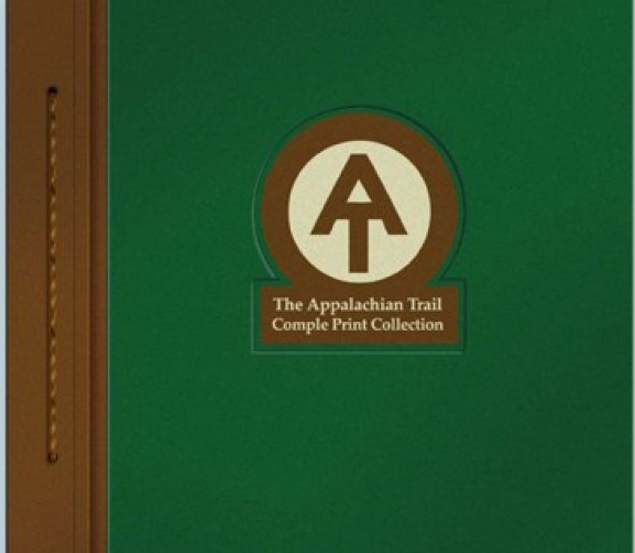
I am creating two separate editions of 110 copies each of: “The Complete A.T. Print Collection”- A 14-print edition (one print per state along the trail) and a 2-print “A. T. Terminus Collection” (prints depicting the Trail’s endpoints). There are accompanying texts about location and production notes.
Binding Planning
The first order of business was to put together some prototypes- I created 9 separate versions: some case-bound and some a hybrid stab binding. Ultimately, I went with the stab binding because of its relative simplicity.
My calculations for 220 books call for 440 book covers requiring 880 pieces of board.
Sanding the edges of each book board piece 8 edges x 880 pieces- you do the math. Very dusty regardless!
Supplies: The next phase was ordering materials: Davey board, book cloth, text paper, glassine, EVA glue, methyl cellulose, paracord, thread, endpapers, archival binding tape, book cloth tape, title labels, etc.
Machinery: Drying press, needles, gluing machine, light table, a large-format printer, sandpaper, awls, clamps, embossing tools, cloth cutters, hole saw bits, hole saw bit sharpener, paper scorer, paper trimmers, hand binding tools, and a myriad of jigs of my own design.
Starting the Production Process
I soon realized that box cutters weren’t going to “cut it” with the amount of cardboard and accuracy that I needed, so I used a combination of table saw and radial arm saw to size them. I then hand-sanded each board piece to smooth the edges.
We have had a record amount of rain during the winter here in the Southeast U.S. To reduce the “board dust”, I had to wait for good weather in order to work outside.
After the boards were cut and sanded, I positioned them onto my “hinge jig” and applied reinforced gummed acid-free tape to create a hinge connecting the two pieces of book board.
Hinging jig: 1″ wide piece of book board (left) and a 10.25″ (right) piece are joined with tape to make an inside hinge.450 covers… whew!Charting progress in thin red lines.
Dealing with Thousands (and Millions)
Comparing this project with hiking 2,100 miles is completely appropriate. Of course, I do not have to deal with the vagaries of weather here, but, unlike hiking, I’m having to balance my time with working full-time and life events.
I’d estimate the number of steps to be equal to each other. The sheer determination of keeping moving is often the order of the day. The A.T. is said to require 5 million foot steps. The number of “hand steps”, planning, physical, and mental efforts certainly seem equal to that in this 3-year project. Add to that my bout of cancer and loss of a parent and it’s certainly been a challenge.
“On occasion, I’ve felt overwhelmed by the numbers, but I have to remind myself that a lot of small things cumulatively add up to big ones.”
It’s been a help to stave off being overwhelmed by charting things out. Here’s the top 2/3 of my overall process charted out for my mental health.
There is another schedule below what you see outlining the steps of designing the 14 prints, carving the 150 blocks, and printing the 280 or so proofs. What you see marked out in red is the printing of the 1,800 prints (36,000 impressions) and above that, the approx. 30 individual binding steps for the 220 books. Even though the binding chart is pretty blank now, cumulatively, I think that I’ll make it…
Saying that, I frankly VERY much more enjoy printing than binding, but a proud end of this project is BOUND (sorry) to come!
Next: Using my gluing machine to apply 440 pieces of book cloth onto the boards, folding edges, applying spine tape, embossing fronts, applying title labels…
Gainesville artist crafting epic collection of Appalachian Trail Art
John Amoss, pictured May 28, 2019, in his home in Gainesville. Amoss traveled two times to Japan to learn his style of printing, which is similar to the famous print ‘The Great Wave’ by Katsushika Hokusai. – photo by Nick Bowman
John Amoss puts in more work before the sun rises than many do while the sun is high in the sky.
For the past 18 months, his day has often started around 2 a.m. with the march into his basement studio — trying almost obsessively to complete a project that has roots in his boyhood adventure and a unique Japanese artform.
John Amoss talks about the process of wood block print making on Tuesday, May 28, 2019, at his home in Gainesville. Amoss, an artist and teacher at the University of North Georgia, owns Tanuki Prints, a print-making business based on the Japanese ukiyo-e period. Using this method, he’s making by hand several volumes of prints based on his hike of the Appalachian Trail as a 17-year-old. – photo by Nick Bowman
Japanese art and the Appalachian Trail don’t often find themselves in the same conversation. But each day, coffee in hand, he makes the journey to his studio in Gainesville to work on his woodblock printings of 14 scenes from the famous trail — a marriage of Western scenery and Eastern art that may be the first of its kind.
“I’m just enthralled with this stuff,” Amoss said while sifting through prints of his favorite woodblock artists.
Outfitted in a floral, short-sleeved button-down shirt, oversized khaki pants, no shoes and an ink-stained apron, Amoss climbs behind his lamp-lighted work desk each day and settles in.
Prints based on John Amoss’ hike of the Appalachian Trail sit in his home office. Photo courtesy of John Amoss.
The lights are low and a mix of music is playing behind him as he prepares to take on what he calls “The Appalachian Trail Print Collection.”When his project is finished, three years will have passed and Amoss will have completed a book of illustrations from 14 scenes in states along the trail that — from the ink to the wood blocks and even the tools themselves — is almost entirely made by hand.
Photo courtesy of John Amoss
While hiking the Appalachian Trail as a 17-year-old in 1980, Amoss snapped photos along the way, preserving scenes on Kodak film.To celebrate the 40th anniversary of his trip, and to help himself and others relive their journeys along the trail, he set out to combine the hard work of hiking with the hard work of woodblock printing.
“It’s kind of interesting, because it ties in a little with the Appalachian Trail, too, because everything I’ve ever done that’s worth a damn, I didn’t know what I was doing,” Amoss said. “Had I known, I probably wouldn’t have started. So, ignorance is strength in a way.”
Woodblock printing takes a certain strength of its own. Dedication, concentration and a good bit of muscle make the art what it is. That’s also what makes it so valuable.
Unlike Kodak’s Ektachrome film in Amoss’ camera while on the trail — with colors dedicated to film with a snap of a shutter — each woodblock print is the result of hours of work in carving, coloring, printing and drying stages that must be repeated for just about every color on every print.
“I have some of these prints that have eight colors on top of each other,” Amoss said. “I find that to just be mind-blowingly fascinating. Most people, I think, would rather just tear their hair out.”
After climbing behind his desk with the block, he sprays water to dampen it so the pigment, which is a powder mixed with water and serves as the ink, prints properly. Then he dabs a little rice water onto the block, which helps the pigment transfer from the block to paper, which is dabbed in a few places next, not be absorbed by the wood. Then he brushes the rice water and pigment all over the piece of wood with a printing brush that’s not too coarse and not too soft.
He lines up a piece of mulberry paper, which has to be precisely placed with each print, and begins to rub it with a baren, a special printing pad. By pressing the paper to the block, he transfers the pigment to the paper to create a piece of his final scene.
John Amoss presses paper against an inked wood block using a tool called a baren on Tuesday, May 28, 2019, at his home in Gainesville. Just about every bit of Amoss’ print-making process is done by hand, from making the inks and pigment from dirt to the tools he uses on the bench. – photo by Nick Bowman
“The next step is to use the same sheets, different block, different color pigment and it begins to build layers until the product is finished,” Amoss said.
He is making 100 full books, which means there will be 1,400 individual prints. Each one of those prints take about 12 colors, meaning Amoss will go through the process about 16,800 times. He’s almost halfway through the project and plans to have it done by September 2020.
The full books will cost $750. He’s also selling 100 versions that will include just the first and last scenes for $150.
“It’s a ton of work, but it’s fun,” Amoss said. “And the nice thing about that is that it kind of filters a lot of people out that they don’t want to go through the trouble. And the folks that do know about this, they’re willing to pay because they know how much work it is and how rare this kind of stuff is.”
Carving tools sit on a desk in John Amoss’ home on Tuesday, May 28, 2019. Amoss makes prints using a Japanese wood block method, where reliefs are carved into wood, which is then covered in ink and used as a template to make an image. – photo by Nick Bowman
Years ago, while living in Atlanta, Amoss was in a book store and picked up “The Complete Woodblock Prints of Yoshida Hiroshi.” Amazed at the works inside the book, the artist wanted to learn how to do it himself.
“I love the mystery of it,” Amoss said. “I love the exoticism of it and the history … other people inspired me and I want to inspire other folks that want to do this. It just takes a really, really long time.”
His expertise has come after years of work and investment. He’s traveled to Japan more than once to learn from printmakers.
While flipping through the pages of Hiroshi Yoshida’s book, he said he “found the atmosphere in some of the prints to be fantastic.” He remembers thinking, “Every one of these things is just enchanting.”
“I’m a very, very curious person,” said Amoss, who’s also a printmaking professor at The University of North Georgia’s Gainesville campus. “If I’ve got some kind of juice or energy about something, I want to go to the source of it.”
His students feel that same passion while Amoss is teaching them. Magnum Brock, a junior studio art major at North Georgia, described Amoss as an “eclectic philosopher.”
“He really tries to take time and ensure that the deeper meanings and the deeper parts of the craft are really portrayed to you rather than just the result,” Brock said. “He really emphasizes the journey of art, which is something that I think really resonates with a lot of other students.”
Amoss even makes his own pigment, sometimes using dirt or clay to give color to the inks that he uses in his printing. – photo by Nick Bowman
Brock has taken two drawing classes and is about to take his third printmaking class with Amoss.
“He is that professor that you go to college to learn from,” Brock said. “He’s the professor you want when you go to college even if you don’t know it.”
Though the project is a lofty goal, Halle Castille, another one of Amoss’ students, said that’s just the type of person Amoss is.
“It doesn’t surprise me,” said Castille, a senior studio art major. “I know that he thinks this could be his defining moment as an artist, and as artists we all are searching for that one goal, so I’m glad that he’s found what he’s passionate about.
“I know that this will definitely be that moment for him.”
When Amoss first saw those prints in the book that now sits on his shelf in the basement, he had no idea he’d be doing what he is today. Once he started practicing woodblock printing, though, he knew he couldn’t let it go.
“I just knew I was hooked and it was going to take me 20 or 30 years to get good at it,” Amoss said.
Watch John Amoss demonstrate woodblock printing
By: Layne Saliba
During those years, he continued his life. He worked as a package designer, then an illustrator for the Atlanta Journal-Constitution. He broke off from his day job and started his own illustration business, then went back to school to get his masters in printmaking so he could teach.
As he was learning, he reached out to others in the woodblock printing world. Calvin Carlisle lives in Cleveland, Ohio, and has never met Amoss in person. They’ve only talked through messages on Facebook and email — typical of artists buried in their basements and studios. That doesn’t mean Carlisle doesn’t see Amoss’ passion for the project, though.
“I think you chew on these ideas and you think to yourself, ‘This would be cool to do,’” Carlisle said. “There’s just some things you can’t let go of. There’s just some things you have a love and admiration for that you say, ‘Yeah, I could spend the next 1,000 hours doing this and I’m not going to get sick of it and I’m going to love it.’”
They bounce ideas off each other, both getting better at what they do each and every time they communicate. And they support each other, which is what Carlisle plans to do more of when Amoss’ project is complete.
“I’m going to buy one of his books,” Carlisle said. “It’s not cheap, but I think somebody like me who understands … I’m looking forward to him putting them on sale because I’ll be one of the first ones in line to get one.”
And that’s Amoss’ hope with the project. He hopes, in the end, people see the work behind it and appreciate it each time they look through the book. No matter where the book ends up — on a shelf or on a coffee table — he hopes it helps all those who purchase it relive their time on the trail.
“It’s going to last a lifetime, and if somebody has thru-hiked the whole Appalachian Trail, it’s a lot of effort, and it means a lot to them, so I want to honor that,” Amoss said.
John Amoss describes the print-making process on Tuesday, May 28, 2019, at his home in Gainesville. An art teacher and designer, Amoss is making by hand several bound volumes of Japanese-style prints based on his through-hike of the Appalachian Trail as a teenager. – photo by Nick Bowman
Bokashi or Graduated Printing (as many of you know) is a very distinct feature of Japanese woodblock printmaking (mokuhanga) that was developed during the ukiyo-e Edo period. It can be intimidating to the beginner and it’s not the easiest thing to do as the technique involves several additional variables beyond beta (flat tone) printing. Bokashi works really well by itself, but also as an overlay on flat printing.
To the right are examples of bokashi in Hiroshige’s “The Beach at Takashi in Izumi Province”, 1853. The deep ultramarine blue pigment you see in the water is reminiscent of many landscapes of the ukiyo-e period. I am guessing that the central double sided bokashi band of blue you see in the bay was created from two passes- one for the top and one overlapped in the middle to create the lower gradation. There are additional bokashis (I count twelve in total): the far shoreline, near hill, far mountains, beach, two in the sky, and even on the house rooflines. Curved or irregularly-shaped bokashis are particularly difficult. I have posted an earlier entry using a jig for such an animal.
Bokashi is great to create a natural illusion of depth- so much so that it’s sometimes difficult to spot their use. However, this technique is generally more time consuming and requires extra skill and patience, but worth it!
Basic Technique
Here is a video of me explaining one way to print a gradation for my print #6 (Maryland) from my Appalachian Trail series:
Other than a hanga or maru bake (printing brush) and baren, another tool- the zokin is really handy thing to use. Translated as “rag”, a zokin is a wood block that is covered with a small piece of fabric- preferably white cotton from a t-shirt. Here’s some pictures of mine.
Stretch the cotton fabric taut, use flat pushpins to secure. You need at least 2 layers of fabricSize of block 2″ x 2.5″ of wood (notice that I rounded the corners and edges) and the piece of cotton fabric 6″ x 8″
The zokin is saturated with water and drawn beyond the surface of the block will be inked. The amount of water on the block should be slightly reflective- certainly not a puddle. The water helps the pigment to spread, the paste helps the pigment to remain in suspension resulting in smooth printing. The idea is that in order for the ink to be printed smoothly as a fade, there cannot be a sharp distinction between the dry and moist areas of the woodblock. Do this several times in the beginning to let the moisture penetrate the wood.
Most printers apply the ink and paste in a line to the block. I do this also- especially for large gradations and it helps to gauge the correct amount of paste and ink. It is important to do this several times also before you use your good paper. The ink and paste needs to also penetrate the wood to create a smooth gradation. I use copy paper to help force the pigment/paste mixture into the wood and to get the amount of color I desire. If, after you saturate the block with ink, you see unwanted woodgrain, use a woodblock wrapped in very fine sandpaper to knock down the raised woodgrain. This really can make the printing a lotsmoother!
My printing brushes have a color dot on one end. That helps the printer know which end is for the paste and which end for the ink. It’s easy to get the ends reversed which can pollute both ends of the bokashi area. If this happens, you must stop and clean both the block and brush thoroughly before resuming printing. It happens to everyone and it teaches the printer’s mind not to wander.
As you can see in the video, instead of adding the paste or nori (I make the paste for this kind of work quite watery, btw) and ink directly to the the block, another way is to add the paste and ink directly onto the brush. The advantage of adding the paste and ink to the brush is that I find there tends to be less tamari (accumulation of paste around the edges of the carved areas). The disadvantage with this as opposed to the adding to the block is that it is hard to see the amount of pigment and paste on the dark brush hairs.
My color is pretty dark- the lighter the color used in the bokashi, the more difficult it is to be consistent. For very light pigment, use a white tile and mix a small amount of paste into the light color, then tap the color end of the brush into the mixture. Very fine and subtle effects can be created this way.
In the video I am using a smaller brush than the length of the bokashi. In order to ‘extend’ the usable area of the brush, I initially tilt the brush toward the pigment end while I scrub onto the block in a slight circular motion working down and tilting toward the paste end. In my design (the tree area), I want a small amount of pigment to bleed down to the bottom. If you want the bokashi to go from pigment to completely clear paste, you might want to use a brush that is roughly the same length or greater than the length of the bokashi.
It’s really easy for the bokashi gradation to get away from you- to ‘migrate’ or change widths while you print- especially for large editions.
It helps to use a Sharpie® marker in the carved recesses (not on the printing surface!) of the block to indicate where the color range should be or at least to have a print next to you in order to compare.
Since my print is an edition of 120 copies, I feel that this ’tilting’ method has helped the gradations to be more consistent.
Either way, I hope this entry gives you some additional tips to create a nice, clean, and consistent bokashi!
ADDENDUM 6/12/19:
I have been experimenting with trying to make the smoothest bokashis– I’m not the only one, I know so I hope this adds to your idea toolbox.
Here are some additional tips to place the pigment, paste and water:
Light blue= water, light yellow= paste, medium blue= pigment. (1) To concentrate the pigment, create a pyramid (2) with a large as possible brush create sweeping motions across the grain (3) eventually, the water, paste, and pigment mix. Try to feather it very slightly and watch paste buildup (tamari) along the edges. You can clear this by lightly scrubbing up along the sides of the block shape/s.
I have also found that to get smooth printing, you need to attack the rubbing with the baren VERY quickly.
I learned this the hard way by letting the paper sit on an inked block for a couple of seconds to answer the phone- the effect is very similar to gomazuri- or blotchy “sesame seed printing”. I believe that what happens is that if the paper is placed on the wet block too long, the textured surface of the paper (which makes contact without pressure) absorbs the ink, then swells which compounds creating a textured look. I have learned to carefully place the paper into the kentos and VERY vigorously print- and print HARD.
Another consideration: I tend to print the sky blocks at one time- although this is counter to what I’ver read, ‘wet’ printing seems to make things quite smooth- the only drawback is that wet printing makes the colors appear darker because of the water content, so I tend to print slightly darker which lightens up after drying. I’ve lately waited for the paper to dry some before I print the ‘sharp’ blocks- keyblocks, etc. Once again, normally the keyblock is printed first. I like a dark keyblock and the sumi tends to bleed when overprinted. Since I do printing proofs, I’m not worried about the keyblock registration and can wait until later. In fact, it helps to wait until later since the dark keyblock tends to obscure the delicacy needed for light colors…
Now that my semester is winding down, I wanted to get some serious printing done. As you might know, I’m in the process of printing 1,600 copies of 14 designs fo my Appalachian Trail print project. Right now, I’m finishing up 200 copies of my first design, “Springer Mt”.
While I was proofing the prints earlier this year, I naturally learned a lot though trial and error plus observation. I had watched other printers use two barens before- it looked as if several simply used one (presumably the weaker baren) to smooth down the paper onto the block and following up with a stronger one for the real work.
While printing very fine-lined blocks in Japan, I noticed that it doesn’t help to always man-handle printing- fine lines (both positive and negative) need finesse unlike large flat areas. This makes sense: When printing fine and/or sparse lines, the pressure from the baren is concentrated into small areas. Too much pressure and the paper is too deeply embossed, under too much pressure, the paper tends to wrap around the inked lines causing blurred edges, etc.
So, I’ve made a video showing a good example of why printers may want to use two barens- the block I feature has both fine lines and large flat areas.
Getting thick stacks ready
In extension to the paper prep entry I posted a few weeks ago, I mention a way to allow for more ease in grabbing paper from the “to be printed stack”by slightly staggering the stack’s leading edge. To do this, gently bend the face-down stack inward in a slight “U” shape. Gently squeeze with one hand and let the sheets naturally stagger. I’ve seen the trick in China where bankers handle stacks of thousands of yuan bills to make it easier to count.
Don’t use this technique with newly-dampened sheets of paper. Dampen them and let them relax for many hours- overnight is preferable before you bend them as newly-dampened sheets tend to stick to neighboring dryer sheets.
This post kind of confirms (and consolidates) several techniques I have learned from other people in order to prepare paper for mokuhanga.
Heron and Crow- carving by David Bull
1. Go with the Grain
While I was printing in Tokyo, I was having a terrible time with registration issues while printing the “Heron and Crow” design by Koryusai (1735–1790) . Dave Bull cut to the chase and asked how I had cut the paper.
I explained to him that all I really ever considered was to be most efficient with the dimensions because of cost and mitigating waste.
I was embarrassed to hear that I should always cut the long dimension with the grain (see diagram for reasons why). Apparently, the Heron and Crow paper grain was at odds with the wood which compounded problems greatly. I also mixed and matched in that I had the grain going horizontal in some and vertical in others which amounted to insanity. Dave explained to recognize the grain direction and just “go with it” for all of the printing steps.
When prints require numerous colors- my current prints average 20 impressions, the corners that fit into the kentos (registration guides) take a beating. When I watched Dave Bull print in Ōme, Japan during Dec., 2002, he showed me a trick for printing shin-hanga– using nail polish to strengthen the corner. I use two coats of SuperDry® nail polish from the local DollarTree store- 95¢ and is DA BOMB!
I must admit that fingernail polish aroma adds a certain ‘je ne sais quoi’ to the studio.
3. Keeping Track
I also number the prints on the verso using pencil. I can’t tell you how many times this was come in handy- especially during printing the first impression which allows me to orient the paper correctly since there is no previously-printed image as a guide.
4. FLAT is Where It’s At
I have come to the conclusion that conditioned maru bake brushes are good, smoothly-ground pigments are very nice, and a good hon baren is a treasure, but second to using a quality paper- having flat woodblocks and flat paper are the key to getting smooth impressions.
Wood
About year ago, I have discovered (and extolled) the virtues of a flat wood block. An uneven or unsmoothed block allows for splotches and woodgrain (unless unintentional). In a nutshell, my prep process is as follows: (1) planing (2)rough orbital sanding- 120 grit (3) fine sanding -1500 grit (4) wet sanding (5) fine sanding-1500 grit (6) bluffing with rouge to a near-mirror finish.
drying new washi on wood boards
Paper
As a printmaking grad student, I heard about flattening the paper to prepare for printing, or, calendaring. I thought at the time that that must be a complete waste of effort. I later heard letterpress printers talking about the presses “kissing” the plate- meaning that the paper made a gentle contact with the inked block to retain sharp printing. Such finesse just couldn’t happen with a a rough paper.
To get a good impression with Japanese-style woodblock, the same is true- if not more so.
“In mokuhanga, a smooth paper is even more important.”
Apparently, washi– even the highest quality- is getting rougher as the years go on. The planks that the paper is dried on are eroding without easy replacement and instead of planing them smooth, the old, rough boards impart their rough surface to the paper.
goma-zuri from light printing with no paste on rough paper
A not-smooth paper gives a non-directional blotchiness similar to goma-zuri (sesame printing) that results from light printing and not using paste.
If you want a pronounced goma effect, you might print the goma first, then calendar the paper- although this may stretch the paper resulting in bad registration… maybe- I’ve never attempted it…
Initially, I had first smoothed the prints with a beta (clear color impression) block using a ball bearing baren. This worked OK, but really didn’t get the paper very smooth and I ran the risk of baren suji (printing marks).
While working at Mokuhankan for a month, I saw David Bull use an etching press. I tried this recently and yes, I don’t think that any human can compete with the utter silky smooth results.
Here’s a video of me calendaring paper (with a groovy trip-hop soundtrack):
The process takes a while, but unlike the ‘younger me’, I am sure that it will save time in order to get smoother impressions.
NOTE: I would also add that several folks over-size (re-coat the paper with animal glue and alum) with dosa. The present John is too chicken to do this.
Sorry that I’ve been pretty ‘mum’ about any prints lately. Since December I have been very busy designing and printing a series of hand-made fourteen 5″ x 7″ (8″x10″ paper size) shin hanga– style woodblock prints featuring an image from east state along the 2,100-mile Appalachian Trail. This is at least a 2.5 > 3-year project for me!
I was a thru-hiker back in 1980. 38 yrs later and counting, I continue to re-hike sections of the trail which conveniently starts at Springer Mountain- which is about 30 miles from my home in the North Georgia mountains.
Basically, my idea with this project is to combine two of my interests: backpacking and woodblock printmaking. I’d like to think that it mirrors other historical pilgrimage print series such as Hiroshige’s Tokaido Road.
As an added connection with the trail, I am taking soil samples from each site and integrating the actual dirt with the ink!
Proofs are in the pudding
Here are my printed proofs of the first 7 prints. I hope to finish with all 14 proofs by Dec., 2018 (fingers crossed). The remaining images to be designed and proof printed (the last half) are: NJ, NY, CT, MA, VT, NH, and ME. After all of the 14 prints are proofed, I will then print 100-200 copies of each design– no small feat as the average number of impressions for each design average around 20 colors each- the number of blocks are averaging around 11 each design. The 80+ laminated cherry blocks are stacking up already with an anticipated total number of 165 by the time I am finished. The paper is Iwano Kizuki from Kitaro Washi which will cost at least US$5,000 for the final editions…
It’s interesting to note that this printmaking process has been similar to long-distance hiking- planning is important, but mainly keeping moving with one step at a time and ignoring distractions are the key.
The final edition will be 1600 prints: 14 designs, 20 passes each which equals to 32,000 impressions! My guesstimate is that this will take around a total of 140 8-hour days to print- and at least 3 weeks to bind them- about the same number of days it took me to hike the 2,100 miles of the trail. I’m interested to see which is more difficult…
The ultimate goal is to market 100 sets of these 14 prints to hikers and trail enthusiasts- in 2019 to an institution that I hope is interested. At some point, I will make presentation cases to contain them.
As one of my friends once said “I don’t need luck, I have patience”.
It’s getting a bit more efficient and my turn-around time (while working full-time) for a design from start to proof has gone from around 3 weeks to 9 days! I’m pretty pleased at my ability to accurately print the values and coloring of my initial computer designs.
-COMPLETED PROOF PAGES & PRINTS- as of 6/15/18
Cover designTitle PageIntro letter1. Springer Mountain, Georgia2. Clingman’s Dome, North Carolina3. Roan Mt, Tennessee4. Shenandoah N.P., Virginia5. Harper’s Ferry, West Virginia6. Raven Rock Shelter, Maryland7. Lehigh Gap, Pennsylvania8. Sunfish Pond, NJ9. Bear Mt. Bridge, NY10. Great Falls, Canaan, CT11. Mt. Graylock, MA12. Killington Peak, VT13. Fanconia Notch, NH14. Mt. Katahdin, ME
at flipbook1– .pdf document similar to the animation above.
Sudden Shower Over Shin-Ohashi Bridge, Hiroshige, 1857
I’ve always wanted to to an irregular bokashi or gradation– (yes, my desires are irregular).
The classic example of such a thing is Hiroshige’s Sudden Shower Over Shin-Ohashi. The problem with irregularity is consistency of ink application within an edition.
Shimoi-san dabs sumi with a tokibo at just the right places. Photo courtesy of Yuya Shimoi.
Last week, Shimoi-san of Ukiyo-e Reproductions showed how he recreated the dark rain clouds while he was printing “Sudden Shower”. I asked him if he used a jig and he said “no, jigs didn’t work as well” and posted a few pics showing his technique of directly inking which is probably the traditional way to do it. However, I’m not good enough to trust myself with placing the pigment, brushing, and printing consistently.
This is a photo from Shimoi-san of the irregular bokashi effect. Nice job! Photo courtesy of Yuya Shimoi.
Getting jiggy
I had remembered David Bull using a jig in 2009 to create a very smooth bokashi arc for a fan print he was working on. He used a Lazy Susan to help with the brushing- I thought that was pretty ingenious.
Dave Bull’s curved bokashi jig. Photo courtesy of woodblock.com.
I cannot imagine how someone in the Edo period could brush freehand that cleanly and I’m sure there was another trick at the time. Anyway, Dave’s print really looked nice and I squirreled that information away.
The resulting impression of using Dave’s curved bokashi jig. Photo courtesy of woodblock.com.
My jig
I am printing a third print of a series of 14 (much more on that much later) and wanted to capture a rainstorm in the mountains.
You can see the similar effect as in Sudden Shower that I am looking for: A dark, foreboding cloud just as the rain has started, but not as undulating as Hiroshige’s design.
For this print, I am using 11 blocks with 17 impressions in the shin-hanga style. The rain, incidentally, is printed with gofun, or Chinese white. The rain is my first attempt of Kyoto-style printing: Unlike the Tokyo/Edo ukiyo-e transparent style (like the rest of the print), opaque pigments require more pigment- under very light baren pressure. In this case, it’s the last thing to print.
I’m at the proofing process and wanted to get everything ‘just so’ for a much larger edition. I know how gradations tend to ‘creep’ over time- a little or too much there cumulatively can lead to a little or a lot too much there. So, to that end, any fluctuations in the bokashi would render the edition too variable and I wanted some help.
I remembered Dave’s jig and made one of my own, albeit not as clever.
Here’s a few pics:
The jig- basically, 3 pieces of wood with an “L” shape on the left to fit around the block’s corner.Here’s the backside of the jig.The jig in action- the idea is for the hanga bake (printing brush) moves along the jig’s irregular contour. I normally would use my left hand to held it in place, but I needed it to take the pic.
Given using the zokin, nori, and hanga bake correctly (note in the above photo, the black dot indicating which side of the brush is loaded with sumi), the jig worked well- I had to keep the brush at a consistent angle, but overall, I’m quite pleased with the relative consistency!


 Bokashi or Graduated Printing (as many of you know) is a very distinct feature of Japanese woodblock printmaking (mokuhanga) that was developed during the ukiyo-e Edo period. It can be intimidating to the beginner and it’s not the easiest thing to do as the technique involves several additional variables beyond beta (flat tone) printing. Bokashi works really well by itself, but also as an overlay on flat printing.