Yoshida’s “Kagurazaka Dori” Process Print Set: Take Two

This is a continuation of the first entry introducing this print

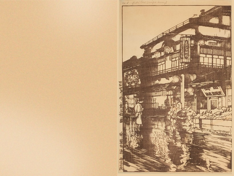
Below are the individual impressions for the shin hanga print “Flower Street After the Rain” or “Kagurazaka Dori” by Hiroshi Yoshida, 1929. I hope it’s not too much of an esoteric subject, but hey, I’m a geek about this stuff.

For my (and others’) sake,  I have added some of the artist’s hand-written notes along with some of my own about what I believe each impression’s technical considerations  were and how it was designed by the artist.

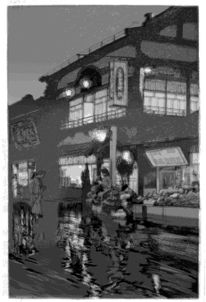
Folks that are not familiar with overlapping colors may be surprised with how much stronger the impressions on the left sides (no.’s with A) appear in context with how they appear in the cumulative print on the right. This can be explained in two ways: (1) the  perception of value contrast as the solitary colors are surrounded by blank paper and (2) often colors on top of others are not absorbed into previously printed colors- especially if the paper is damp which creates somewhat of a resistance. Often the newly-printed colors merely appear to tint the previous colors rather than darken them.

OLYMPUS DIGITAL CAMERA
Detail of 3.A block showing the light “rays” using (kasure? or “faint”) carving and “fukitori”  or wiped area printing

I’ve heard that if a woodblock design or printing wasn’t going that well, a publisher would decide make it into a night scene. In this print, however, it’s clear to me that this design is all about featuring a night-time luminosity of reflections and glowing interiors.

Since I did not take these images, there may be a lot of variation in lighting value and temperature. I believe I remembered the individual color sheets to be of a lesser quality paper that has become darker that the washi used for the cumulative impressions- this makes sense cost-wise and registration is not an issue. Either way, thank you again Florida State University’s Art Collection!

1
 Left: page blank 1. Right: Keyblock in brown Notes: “fukitori (wipe away)” This refers to the lighted areas in the lamps and wet street reflections that are wiped away to make room for the reddish color in the 2nd impression- both using the same block. It looks as if the printer simply wiped these areas with his thumb and a small cloth. As I mentioned in the first entry, Yoshida’s keyblocks were generally zinc plates and the pigment was mixed with glycerin which coats the metal. Glycerin tends to give a less sharp and more mottled and painterly look than the usual wood and water style printing. I think that may be one of many reasons why Yoshida’s work differs from other shin hanga prints (like  Hasui’s).
2
1.A Left: Chinese red? impression using a stencil on keyblock’s inked block. Notes: “part of keyblock” 2. Right: overlapping effect of red to indicate glare and reduce the strength of brown keyblock.
Yoshida individual_0002_3
2.A Left: flat (beta) lemon yellow impression 3. Right: Introducing warm yellow under-printing. The next seven flat impressions establish the building’s value and hue structure.
Yoshida individual_0003_4
3.A Left: Cool gray impression using baren suji (baren marks) The darker and harder marks on the street to increase reflections- printer probably used a different, harder baren to do this. I also see evidence of wiping the lights despite the lack of notes mentioning it. It must have been a challenge for the printer to remember to wipe each spot!  I’m guessing that one reason to make this an early choice is to maximize the texture as the paper has not been flattened yet. The carving depicts rays near lights- see Detail above. 4. Right: Establishing cools and defining mid-tones Notes: “Baren marks”
Yoshida individual_0004_5
4.A Left: Flat carmine red impression 5. Right: Establishing warm tones reflecting lights and to offset cool reflections from sky
Yoshida individual_0005_6
5.A Left: purple flat tone 6. Right: Purple separates from sky and lights- keeps lights clean. Using a color mixed from the warm carmine of 4.A and blue of 3.A unifies the building.
Yoshida individual_0006_7
6.A Left: flat blue tone 7. Right: creates neutral dark shadows by introducing a dark-value compliment (blue) on top of the warmer brown keyblock base.
Yoshida individual_0007_8
7.A  Left: flat light red 8. Right: Emphasizes the glowing diffused light’s warm undertones.
Yoshida individual_0008_9
8.A Left: Flat light orange tone- bokashi or camera lighting? 9. Right: Breaks up previous red and re-enforces warm glow.
Yoshida individual_0009_10
9.A Left: strong flat red 10. Right: Creates punchy colors as a focal point.
Yoshida individual_0010_11
10.a Left: Flat med blue impression 11. Right: Introduces blue to the sky and separates from building.
Yoshida individual_0011_12
11.A Left: Flat medium red impression 12. Right: Introduces echos of red, but not that strong.
Yoshida individual_0012_13
12.A Left: Flat med cooler red. 13 Right: More subdued reds in flowers and kimono. You will notice at at this point (with the exception of 1.A and 2. A (keyblock) blocks are re-used.
Yoshida individual_0013_14
13.a Left: Yellow bokashi (gradated printing) using same block as 7a NOTES: ‘part of 7a [block]” 14. Right: Refines warm lights.
Yoshida individual_0014_15
14.A Left: flat medium/strong yellow 15. Right: selectively punches yellow.
Yoshida individual_0015_16
15.A Left: Green bokashi Notes: “part of no 3 A, shading”. There also appears to be some horizontal baren suji marks. 16. Right: Makes warm street dark and deadens it to increase reflections in puddles. The baren marks also emphasize the foreground plane’s flatness.
Yoshida individual_0016_17
16.A Left: Bokashi pinkNotes: “part of no 2 A, shading“. 17. Right: Adds richness  and volume to reds
Yoshida individual_0017_18
17.A Left: Light blue green on kimono pattern using 12A block by either selective inking or a stencil. Notes “Part of 12A” 18. Right: Adds variety
Yoshida individual_0018_19
18.A Left: Bokashi and baren suji Notes: “No 10 repeated, shading” 19. Right: Adds reflection from sky
Yoshida individual_0019_20
19.A Left: Bokashi and flat orange Notes: “part of No 2A shading”  I’m not sure if the bokashi results from wiping to be included in a single impression 20. Right: Adds a variety in reflections and consolidates flowers
Yoshida individual_0020_21
20.A Left: Blue bokashi Notes: “part of No 8 shading” also includes fukitori in the wiping of the lights. shows a good amount of goma (sesame)- a somewhat blotchy texture printing resulting from using little paste 21. Right: Pushes upper part of the house into the distance and reflects blue sky,
Yoshida individual_0021_22
21.A Left: Bokashi in gray Notes: “part of 7A, shading” 22. Right: Adds depth to flowers
Yoshida individual_0022_23
22.A Left: Medium maroon impression- this is a good example of how a dark impression on the left can appear to simply ‘tint’ the print on the right. Notes: “part of no 4A”. 23. Right: Adds a diffused light to shoji screens.
Yoshida individual_0023_24
23.A Left: medium impression with bokashi of the dark Indigo? Notes: “part of 6A, shading” 24. Right: Color and value punches man’s kimono
Yoshida individual_0024_25
24.A Left: Bokashi of light and dark purple. Notes: “part of no.4A in two colors” [values?] 25 Right: Darker colors emphasize shading and depth and leads the eye.
Yoshida individual_0025_26
25.A Left: Obokashi (wide gradation) from light blue top to warmer blue.  Areas around lights show fukitori “wiping” Notes: “no 3 repeated in two colors, fukitori (wipe away)” 26. Right: This punches the yellow further and consolidates the scene.
Yoshida individual_0026_27
26.A Left: Bokashi using Indigo? Notes: “part of no 9 shading” I think that small impressions in the next few steps were designed to allow the larger areas to ‘rest’ and absorb the previous impressions’ color.  27. Right: This serves as a reflection of the figures
Yoshida individual_0027_28
27.A Left: bokashi in pink 28 Notes: “shading, part of no 2 A“. 28. Right: I guess the flowers needed more isolated emphasis than previous16.A impression.
Yoshida individual_0028_29
28.A Left: Cool blue bokashi Notes “part of no 3A, shading” 29. Right: Blue gradation added to the sky and ties into upper building.
Yoshida individual_0029_30
29.A Flat purple impression- a good example of how a seemingly dark impression will simply tint an undercolor. Notes: “part of no2A” 30. Right: Deadens the kanban (sign)
Yoshida individual_0030_31
30.A Left: Flat purple impression- since there are no notes referring to a block being re-used for this, I have a hard time believing that this is a new block, but rather a notes omission. 31. Right: Emphasized the woman on the left’s kimono.
Yoshida individual_0031_32
31.A Left: Another blue impression with fukitori and baren suji Notes: “Baren marks and fukitori (wipe away) no 8A repeated” 32. Right: Perhaps Yoshida wanted to increase the complexity of baren marks and or he wanted the paper to ‘rest” in the previous small impressions until he hit the print with a large overall color.
Yoshida individual_0032_33
32. A Left: This is an interesting one- a round bokashi– I’m guessing using a hanga bake rather than the standard maru bake. Notes: “shading, no8 A repeated”  33. Right: This seems to push the people back since they are primarily printed in warm colors. There is not a lot of difference when comparing 32. Then again, maybe the physical print shows more effect.
Yoshida individual_0033_Layer 0
33. A Left: Artist’s chop and jizuri (“self-printed”) seal. Notes: “letters” 34. Right: The finished print- looks like the colors are much more saturated, especially in the blue sky. I believe that I can see the figures being deadened a bit more than no. 33.
small impressions BW flattened
This is where I geek out WAY too much: In Photoshop, I converted each impression to black and white and assigned each layer an opacity of 10% with layer mixing set at ‘darken’. As you see, the inside of the lamps use only 1 impression while the shadows have the most overlapping impressions- particularly in the center as a result of 32. A.. Please note that this is independent of the darkness of the impressions, but only indicates the cumulative number of layers of overlapping impressions dedicated to each area. See the two images below as it’s interesting to note that this roughly corresponds to the values of the final print.

Once again, here is an the animation from the first entry:


Yoshida-Kagurazaka-Dori-Process-Small


2 thoughts on “Yoshida’s “Kagurazaka Dori” Process Print Set: Take Two

  1. This is some incredibly wonderful educational material. How come I didn’t encounter your blog before. Thank you so much!

Leave a Reply

This site uses Akismet to reduce spam. Learn how your comment data is processed.