A few people were asking about how I inked and printed a new print that I’ve started, so I’m posting a quick description of my newest “jig-thingie”. I know it’s unusual, but it REALLY helps!
Please note the intro tune is from Wheel. of. Fortune! 🙂
Transcription
John: So normally where I print is this traditional bench I made about 20 years ago where I sit down at it and I really enjoy using it, but for this print I’m making, I had to create a jig because of this circular fade or bokashi. So what I came up with is th
There are 8 circular bokashis: yellow, red, and blue in the background; red and brown on the tree keyblock; red and brown in the tree; redish on the background trees…
is rotating or say, lazy Susan-style jig. And when I go over a couple of features that I find interesting, I hope you do too.
So here we have this block and I’ve got it so that it is secured by these wedges and a pretty good job. And then I got this lock here and that will keep it from rotating– if I don’t want it to. But right now, I do want it to rotate because I’m going to add some bright orange in the middle to this. So. I’m eyeballing this on this particular impression here, because accuracy isn’t quite as important as, say, the background was earlier. But, you know, I can wipe things, I can ink things in a circular motion. If I when I get to the point of wanting to print, I’d then lock it up like this and go and get some paper and…
You can see the bokashi fade here. The really wide one that I’ve been doing right now, which is proved to be a challenge, but this thing is really helping a lot. So I fit it in the kentos and I’m able to print standing and I’ve kind of been enjoying printing on the standing up. You get a good amount of leverage. I’ve never done this before, but I know a lot of people do. All right. So let’s look and see what this guy looks like. So that’s the circular impression of the tree. This isn’t exactly final, but you get this idea of what it’s supposed to look like eventually. Now, when I’m doing the outer area, the background, it requires a lot more accuracy and I want to make sure everything looks very consistent. And so this arm really helps with that. I have listed where these colors start and end. Some of them overlap with each other, but that way, I can hold a brush and spin this thing around. You get more or less a pretty consistent edition for all these three really large bokashis here. So anyway, I hope you like my gizmo and thanks for watching!
About 25 years ago, I started ordering decent-quality tools to help my woodblock printing. As you probably know, there are so many variables and learning this stuff takes a lot of faith and delayed satisfaction.
One of the things that really discouraged me was when one of my maru bake brushes started to develop cracks which leads to the inevitable and dreaded mange.
The obvious problem was that the wood expanded with the water (as wood does) and where the hair holes and hanging eyelets lie, the cracks tended to develop.
Maru bake and hanga bake brush rack in order of size (top to bottom) and color (left to right).
The most simple way to minimize this is to let the brushes dry with the wood handle UP- if the hair side is up, the water tends to settle in the holes.
The second (and I can’t remember who showed me this) to prevent cracks from happening is to bind them with twine (I prefer polyester twine- around 1/2 mm thick) that you can pick up at a local hardware store) and seal them with marine varnish.
When I was printing in Tokyo, a veteran printer looked at my ‘bound and sealed’ brushes and said “sugoi!” which meant ‘impressive!’ 🙂
Heres the steps:
Use an awl to make a hole on one end for the hanging eyelet.
Thread the twine into the hole.
Screw in the eyelet while capturing the end of the twine..
Wrap the twine 5-7 times around the brush as tight as you can. The groves on both sides of the brush helps to keep the twine stable.
Tie two half hitches around the eyelet.
Apply the varnish generously.
In addition, paint on the underside of the brush’s wood, but avoid getting any varnish on the hairs.
Sand and repeat varnishing.
This looks OK to me!
Dehumidifier with mesh shelves.
At the end, I dry on top of a dehumidifier. Incidentally, I also use this to dry my brushes after I have cleaned them out with soap and water.
Since doing these things, I haven’t had a brush crack… I did notice that Woodlike Matsumura is now carrying plywood maru bake brushes which are cheaper and claim not to split… If anyone finds out about these, please tell Tanuki!
Notice that I also put a color dot sticker on the brushes to identify them. I have brushes in order of Black, Red, Orange, Yellow, Green, Blue, and Purple.
Hey all- Sorry for the long wait. As I think I said before, I’m done with the printing of the Appalachian Trail Print series. I’m struggling with the binding at the moment and have discovered that I’m a much better printer (or a much poorer binder)- still in the prototype stage…
Anyway, I thought that I’d share a few of the 75 or so books I own relating to Japanese-style woodblock printmaking- the first installment concentrating on my three favorite artists: Hiroshi Yoshida, Toshi Yoshida, and Kawase Hasui.
The Yoshida Family
OK, so this is the book that starting all this nonsense 🙂
“The Complete Woodblocks of Hiroshi Yoshida”
“The Complete Woodblocks of Hiroshi Yoshida”,
Amazon (later edition by Tuttle) ABE Publishing, 1987 203 pages, in English and Japanese
While living in Atlanta, I was perusing a local bookstore and they had a pile of these books. I couldn’t stop looking at these prints and still can’t- each page revealed a new world for me. Yoshida loved mountains as I do. I’m wary about the claim “complete” – there are several prints of Hiroshi’s out there that aren’t contained here, but the vast majority are. Beautiful accurate color and nice information.
“Yoshida Hiroshi: Printmaker”
“Yoshida Hiroshi: Printmaker” by Ben Bruce Blakeney
“Court of Lions”
Published by: Foreign Affairs Assoc. of Japan; 2nd printing (1953), in English
Three years after Hiroshi’s death, This biography was written. It includes the post-mortem frontispiece “Court of Lions, The Alhambra” which is a charming little print. A general biography with a great list of his prints and bibliography at the time.
“Japanese Wood-Block Printing”
“Japanese Wood-Block Printing” by Hiroshi Yoshida
Published by: Sanseido Publishing, Tokyo; 1st ed. (1939), in English ABE BOOKS
Considered the “bible” of how-to in mokuhanga- especially shin-hanga. Includes 6 hand-printed examples: a frontispiece “Cherry and Castle” and a progressive stage print of “A Junk” (see right). This book can be accessed online through David Bull’s Woodblock Encyclopedia. I find this to be a sincere attempt (although he does leave out some details) to spread the craft to the west. Since it was published in 1939, I’m amazed how many copies (although not cheap) are still available.
“A Junk” progressive prints with alternative night version.
“Hiroshi Yoshida Exhibition“
Published by: MOA (Museum of Art, Shizuoka, Japan), 2000; 134 pages
Includes a wide-variety of Yoshida’s prints, paintings (some traditional sumi-e), drawings a a few images of carved blocks. Many of the paintings and drawings relate to later print designs. All images are in color with a list of works. In Japanese.
“Exhibition of the Wood-Block Prints by Hiroshi Yoshida“
Published by: Riccar Museum, Tokyo; 1976
250 black and white reproductions and 11 in color with list of works. In Japanese and sparse English.
“My Yoshida Hiroshi Unpublished Manual“, by Tamio Sonoda
Another book I picked up in Tokyo, this one commemorating Yoshida’s 140th years since birth has been described as a “fan boy” book showing 15o illustrations of Hiroshi Yoshida’s drawing and paintings that influenced his later prints.
Toshi Yoshida, “Japanese Print Making”
“Japanese Print Making: A Handbook of Traditional & Modern Techniques”by Toshi Yoshida and Rei Yuki
Tuttle, 1966. 176 pages, in English. Copy signed “To: Sir Allen Brown [Australian Ambassador to Japan], 14th, Nov., 1966”
I feel confident that Hiroshi’s son, Toshi wanted this to be the contemporary version of his father’s “Japanese Wood-Block Printing” manual. The book certainly contains many experimental techniques during a time in which Toshi was full-swing in his modern phase. Like his later prints, I haven’t seen these techniques ‘catch on’. I do admire Toshi’s desire to go beyond the shin hanga genre.
An interesting note:My copy came with this flyer announcing an accompanying 28-minute movie “Japanese Print Making”. I believe that I later saw that it is in The University of Hawaii’s Art Museum collection, so apparently, it was made…
Toshi Yoshida’s Color Movie: “Japanese Print Making”, 1966
“Varieties of the Japanese Print, Vol. 1” by Toshi Yoshida
To accompany his”Japanese Print Making: A Handbook of Traditional & Modern Techniques” manual, this collection of prints feature 20 hand-printed woodblocks including several process prints. All of the designs reflect the contemporary experimental bent that certainly has a early-to-mid 60s feel.
I find that this information to be minimally-useful, but in the right hands, I think that someone can produce some interesting graphic work.
Kawase Hasui
“Kawase Hasui: The Complete Woodblock Prints” by Kendall Brown
Hotei Publishing, 2003 ( or 2008). Two volumes, 592 pages, in English. Amazon.com
Coming in at nearly 12 lbs, this is not the only compendium, but certainly the most exhaustive. Also includes a DVD with additional prints not included and a 42-minute documentary (in Japanese) of Hasui working two years before his death. You can see the online version on YouTube below.
“Kawase Hasui and His Contemporaries” by Irwin Prachter
Emerson Museum of Art, 1986
Essays on Kobayashi Kiyochika, Shozaburo Watanabe, Hashiguchi Goyo, Kawase Hasui, and publisher’s marks.
With black and white images and 9 color plates from prominent shinhanga artists: Utagawa Kuniyoshi, Kobayashi Kiyochika, Hashiguchi Goyo, Ito Shinsui, Kawase Hasui, Hiroshi Yoshida, Kasamatsu Shiro, and Ito Takashi.
Well, that’s all, folks!
Stay tuned for the next installment of books about woodblock printmaking.
Maru bake (left) and Hanga or Edo Bake (note dot for ‘pigment end’)
Hi again and sorry for the state of incommunicado- we’ve had some family-related things to take care of. In the meantime, I’m finishing up my last design (#14: Mt. Katahdin/ impression #28,000+) and have been having pretty good success with bokashis.
A zokin- an old t-shirt tightly wrapped around a block of wood secured w/pushpins
Make the Paper and Wood Smooth
As I described before, I make sure that I print a beta ban block (smooth uniform printing)- in this case using only paste to calendar the paper [entry about my old way of using a press to calendar]. This makes the surface and the resulting impression smoother. I suspect the reason for this is as the paper is placed into the block, there is a few seconds in which the paper makes contact with the pigment/paste mixture before pressure is applied. I think that the paper’s texture can create a blotchy effect as a result. I’ve found that it’s best to calendar the paper right before the bokashis are printed. If the damp paper is stored for any length of time (preferably in a fridge), the paper ‘poofs’ back into it’s previous more-textured state. Also, if you see any woodgrain or re-occurring texture, it’s a good idea to wet sand the block with emery paper.
Scrub!
Also, I have been very vigorously scrubbing the hanga bake to create a really smooth bokashi. Like REALLY smooth! Once again, add just enough water to the mix to be able to push the pigment/paste around- no more, no less. I also REALLY PRESS using a medium/heavy baren. I also try to print the keyblock days before taking care not to use too much pigment or sumi ink as this can bleed into the nice delicate sky bokashi.
The proof on left to compare with what was printed.
Comparison Copy
You’ll also notice that I have a proof print (on copy paper) taped on the outside of the printed pile. This has become very helpful to me in order to become more consistent by comparing the amount of pigment and where the bokashi ends. Without this, it’s really easy for the gradation to ‘creep’ up or down.
The next gradation will be a rose color in the upper sky. I will re-order the ‘to be printed’ stack so that the image will be face up. This will allow me to ink the block so that the two color will hopefully meet in the middle- a challenge by anyone’s standards!
For a play-by-play of the video:
The paper was calendared in a recent impression
Block was dampened with zokin- look for slight reflection with moisture
Applied a bit of paste (medium consistency) onto hanga bake
Inked a corner of the hanga bake with pigment on white ceramic tile- it’s a lot easier to make the amount of pigment consistently the same. Also, I have a dot on the pigment side of the hanga bake brush to remember to keep the clean side clean
Vigorous scrubbed the brush across block’s area to print
Bokashis smoother than David Niven’s vermouth.
Placed in the printed stack, compared with previous ‘proof’ print: Need less/more ink? Is the bokashi creeping up/down?
Rinse and repeat
Troubleshooting:
Blotchy? This is a hard one to diagnose- could be too much water and not enough paste OR if the spots are consistent, then the block needs to be wet-sanded. Sometimes the wood has features that don’t allow the pigment to be absorbed consistently (I don’t know of much that can be done for that…) If the blotches resemble the paper texture, you may need to put more pressure on the calendaring.
Streaks? This could mean too much paste- is there tamari (accumulation around edges of the carved areas) seen elsewhere? This could also be that the brush’s hair tips are not softened with sandpaper or sharkskin. Also, take a little more time looking at the inked block’s surface’s reflection- can you still see streaks? If so, VERY gently feather the last few strokes. I’ve been told that a mere wisp of a stroke is enough. It’s also a good idea to slightly vary the direction of the strokes.
Unsightly hard edges in the bokashi? Use more moisture in the zokin and check the reflection on the block.
Accidentally charge the wrong side of the brush with pigment? This happens to the best of printers. Wash it out, dry it and start with a clean brush. It helps to have a dot on the brush to remind you.
The bokashi creeps too wide or narrow? Often the zokin will erase most of it, if not, wipe the area with a clean cloth and start it over.
Pigment fills in holes, shallow carving? Try to use less pressure inking and less paste if possible (look for signs of tamari). If you want to clear holes that have filled up, tap your brush hard and the brush hairs should pick up most of it.
Picking up ‘chatter’ on either end of the bokashi? Try to carve more on both sides of the woodblock- since you have to sweep back and forth with the brush, more care needs to be taken to clear on both sides.
Proof it! Be sure to use a piece of copy paper to proof before you use the good paper. Copy paper doesn’t have any sizing, so print and pull it off your block quickly or it will stick to your block. When you get a good impression, save the proof for reprinting.
Still not smooth? Try using pre-mixed watercolor or gouache- sometimes dry pigments are not mulled enough.
Bio: Jennifer Worsley is a graduate of Boston University School for the Arts, Boston with a MA and BFA, 1996; a Hudson River Fellow, New York, NY. 2009; and attended The New York Academy of Art, New York, NY. 1998-1999. She works in drawing, pastel, and woodblock prints.
Her prints have earned many “Best of Show” awards and is an active exhibitor in the West and Northwest United States.
EDITOR’S INTRODUCTION:I’m particularly excited (and would imagine all mokuhanga printers would also be) to know how the heck she plans the impressions that result in her prints’ striking realistic and beautiful hues and values. Tanuki Prints goes where the chips fall with Jennifer Worsley…
Salt Lake Valley with Snow- mokuhanga, 13″ x 23″
[Tanuki Asks]: First of all, I understand that you work reductively which can hold both advantages and challenges. Do you also use multiple blocks? How do you decide what strategy a print requires?
[Jennifer] Thanks very much! One of the reasons I enjoy working with a reduction process is the fact that there is no going back- it limits the process of making a design in a way I find helpful. Most of my prints (especially larger ones) are reduction prints.
When I do a multiple block print, the number of variables that go with changing each color and the way colors will overlap, tends to lead to it never feeling “finished”. I can experiment endlessly with colors and textures and all the variables in the printing process, but– unfortunately I tend to lose my way in all of these meanderings, when I have many separate blocks.
White Rim at Sunset-mokuhanga, 8″ x 12″
One of my multiple block excursions, “Coastline Madrona Trees”, (see below) started as a reduction print using a single carved block. I worked from light to dark in the design, which makes for a fairly straightforward process of deciding on colors for each step of the process. It was successful as a reduction print, and the final stage of that reduced block, from which I printed the darkest color, had a nice linear skeleton of the design of the image. So I thought I would use that skeleton of the reduction print as the key block, for a new, multiple block version.
I carved five other blocks with the key block as the basis for the design, and with the reduction print as the jumping off point for the color choices. I thought that would make the print a bit easier to work out, but no. Even with a long process of testing colors, the overlapping of each just causes so much variation with each small change in the color, and I feel like I have never gotten it right.
I do have other multiple block prints that have worked out well- and those are uniquely satisfying. Coordinating many blocks is its own difficult puzzle for sure. (I generally only try it with small prints now.) A reduction print, by contrast, has a clear path, and a definite end stage: when most of the block is gone. It may or may not be successful, but if its not– I can let it go and move on to a new project. It also, of course, simplifies registration, since often there is no need to line up one block with another.
Images of “Coastline Madrona Trees”- mouse over for captions
Reduction version
Multiple block version
After visiting your website, I noticed that you draw and paint outside quite a bit. Do these develop into later prints? Do you also use photo reference? Do you emphasize or ‘improve’ on reality? Do you use Photoshop, painting, or another tool to help visualize the end product and, if so, do you match the color to some reference?
The Waterfall- mokuhanga, 17″ x 24″
When I draw and paint outside, I do try to capture reality- but at the same time distill it. Working quickly on the spot means having to balance those two goals. I enjoy using pastels because they are linear (a distilling process on its own) and a fast, portable medium. I usually am attracted to fleeting light effects, especially ones that you can’t capture in a photo (like moving water or vividness of a sunset). I very much enjoy making some of these pastels into prints in the studio, especially if the pastel ends up with a strong design, with clear definite shapes.
One of the reasons I became interested in woodblock printmaking was the fact that its by nature a studio process. Many other mediums seem to lose their magic when I am not using them directly in front of my subject, on location: whenever I bring pastel, oil, or watercolor into the studio, to work from a drawing, photo reference, or mental idea- all of those mediums just die for me. I need to be in front of my subject to do anything worthwhile (definitely a personal limitation).
The River in Spring- mokuhanga, 15″ x 21″
“A woodblock print, by contrast, takes on a life of its own whether the subject is there or not. I use photo reference for some, and drawing or pastel reference for others, but it always ends up with qualities unique to itself.”
What specific technical challenges do you have to keep in mind while printing? (example: ink can dry lighter, etc).
Ink drying lighter is a big one. I always have several test sheets, that I will print my latest color on, and then dry to see how it looks. I have been using opaque white recently, and it especially will cause a color I mix it in to dry differently than I would expect.
Lately I have been doing a lot of experimenting with ink transparency and opacity. In art school, painting with oil, I always enjoyed layers of transparent and opaque paint and how they interacted, and I have been trying to bring some elements of that to layering colors in my prints. What I am liking right now is to start with the transparent warm colors during the first stages, working in layers from light to dark, before moving to cool colors–going from deep dark blues to lighter opaque cool colors in the subsequent layers. Then after that adding the last darkest darks.
Another big issue for me is that I tend to keep my stack of paper wet for such a long time, when I am in the process of making a reduction print, that the sizing in the paper breaks down and causes problems. I believe this is a big culprit for colors “sinking in” to the paper– this tends to happen quite a bit in a print I keep damp for a long time (more than a couple of weeks in the fridge.) I also find I need to add interleaving sheets between each piece of paper so there isn’t color bleeding through to the next print underneath it in the stack, and I think the breakdown of sizing contributes to that.
I don’t find that sumi ink, especially the ink that comes in a green bottle from the US -based art supply stores, has that tendency to “sink in” to the paper as much– and on researching it, I learned it has shellac in it! So now, one of the experiments I am going to try is to use ink with a bit of shellac.
Who were your teachers and which printmakers do you admire?
I have taken two workshops with Matt Brown that were fantastic, and learned a huge amount from him. His approach to mokuhanga makes it very approachable for someone who might not use strictly Japanese materials and methods- he doesn’t design with a key block, generally, and prints on a Western paper (Rives Heavyweight, which is the main paper I use.) These modifications of the techniques have definitely been helpful for me, and made it more accessible.
Of course, I have also learned a great deal from Dave Bull, through his online presence. His generosity with sharing his working processes never ceases to amaze me. When I read about your [Tanuki Print’s John Amoss] month-long stay at his shop in Tokyo where you could be part of his printing workshop there, I was so envious!
I had never seen a Western (non-Japanese) mokuhanga print before coming across Elaine Chandler’s print “Early One Morning” in the catalog for McClain’s Printmaking Supplies in 2005 . That print was what inspired me to learn how to do mokuhanga— I just loved the image so much and still do.
Is there is something that you’d like to know more how to do, and if so, what would that/those thing/s be?
I would like to learn how to be more methodical. Please tell me, does anyone teach a workshop in that? I would also like to learn some methods for handling larger prints- printing mokuhanga with larger sheets of paper and the logistics of that.
How do you communicate to the public about what you do?
My favorite way is to take my work to art fairs and festivals, where I set up my booth along with 100-200 other artists and crafters. Printmaking is often its own separate category at those events, and there are very few other printmakers, so we always stand out. I always get lots of fascinating feedback and questions about my process, and people buy my work there too!
Here’s a ‘softball question’: What is it about mokuhanga that you love? What aspects of yourself attracts you to this difficult process?
I love the elegance of it. All the natural qualities of wood, water, and paper work together to make it happen, with very simple materials but with incredible nuance. It’s such an especially good medium for depicting atmosphere in landscape images- the way a simple bokashi can create a sky full of depth and light, for example.
I do have a lot of reverence for the traditional mokuhanga methods, although I myself have only learned a bit. I would love to learn in depth from a Japanese craftsman or from Dave Bull in Tokyo. However, I also love the fact that it allows for non-traditional experimentation and a lot of individual expression. I am the kind of person that questions “the way things are done” generally, and I always love to find new ways that suit me better. Mokuhanga, for all its difficulties and trickiness, does allow this. Maybe that is even one aspect of its elegance!
Are there any other questions that you would ask of yourself?
If I asked myself what directions I think my prints will take in the future: right now, I think I would like to move towards bigger, simpler images, with just a single reduced carved block. I don’t know that for sure though- I am happy to go in any direction that mokuhanga wants to take me.
Road Through the Palouse- mokuhanga, 8″ x 23″
A BIG thanks to Jennifer for being Tanuki Print’s first interviewee and for sharing her great work with us! strikingly.com and squareup.com
Bokashi or Graduated Printing (as many of you know) is a very distinct feature of Japanese woodblock printmaking (mokuhanga) that was developed during the ukiyo-e Edo period. It can be intimidating to the beginner and it’s not the easiest thing to do as the technique involves several additional variables beyond beta (flat tone) printing. Bokashi works really well by itself, but also as an overlay on flat printing.
To the right are examples of bokashi in Hiroshige’s “The Beach at Takashi in Izumi Province”, 1853. The deep ultramarine blue pigment you see in the water is reminiscent of many landscapes of the ukiyo-e period. I am guessing that the central double sided bokashi band of blue you see in the bay was created from two passes- one for the top and one overlapped in the middle to create the lower gradation. There are additional bokashis (I count twelve in total): the far shoreline, near hill, far mountains, beach, two in the sky, and even on the house rooflines. Curved or irregularly-shaped bokashis are particularly difficult. I have posted an earlier entry using a jig for such an animal.
Bokashi is great to create a natural illusion of depth- so much so that it’s sometimes difficult to spot their use. However, this technique is generally more time consuming and requires extra skill and patience, but worth it!
Basic Technique
Here is a video of me explaining one way to print a gradation for my print #6 (Maryland) from my Appalachian Trail series:
Other than a hanga or maru bake (printing brush) and baren, another tool- the zokin is really handy thing to use. Translated as “rag”, a zokin is a wood block that is covered with a small piece of fabric- preferably white cotton from a t-shirt. Here’s some pictures of mine.
Stretch the cotton fabric taut, use flat pushpins to secure. You need at least 2 layers of fabricSize of block 2″ x 2.5″ of wood (notice that I rounded the corners and edges) and the piece of cotton fabric 6″ x 8″
The zokin is saturated with water and drawn beyond the surface of the block will be inked. The amount of water on the block should be slightly reflective- certainly not a puddle. The water helps the pigment to spread, the paste helps the pigment to remain in suspension resulting in smooth printing. The idea is that in order for the ink to be printed smoothly as a fade, there cannot be a sharp distinction between the dry and moist areas of the woodblock. Do this several times in the beginning to let the moisture penetrate the wood.
Most printers apply the ink and paste in a line to the block. I do this also- especially for large gradations and it helps to gauge the correct amount of paste and ink. It is important to do this several times also before you use your good paper. The ink and paste needs to also penetrate the wood to create a smooth gradation. I use copy paper to help force the pigment/paste mixture into the wood and to get the amount of color I desire. If, after you saturate the block with ink, you see unwanted woodgrain, use a woodblock wrapped in very fine sandpaper to knock down the raised woodgrain. This really can make the printing a lotsmoother!
My printing brushes have a color dot on one end. That helps the printer know which end is for the paste and which end for the ink. It’s easy to get the ends reversed which can pollute both ends of the bokashi area. If this happens, you must stop and clean both the block and brush thoroughly before resuming printing. It happens to everyone and it teaches the printer’s mind not to wander.
As you can see in the video, instead of adding the paste or nori (I make the paste for this kind of work quite watery, btw) and ink directly to the the block, another way is to add the paste and ink directly onto the brush. The advantage of adding the paste and ink to the brush is that I find there tends to be less tamari (accumulation of paste around the edges of the carved areas). The disadvantage with this as opposed to the adding to the block is that it is hard to see the amount of pigment and paste on the dark brush hairs.
My color is pretty dark- the lighter the color used in the bokashi, the more difficult it is to be consistent. For very light pigment, use a white tile and mix a small amount of paste into the light color, then tap the color end of the brush into the mixture. Very fine and subtle effects can be created this way.
In the video I am using a smaller brush than the length of the bokashi. In order to ‘extend’ the usable area of the brush, I initially tilt the brush toward the pigment end while I scrub onto the block in a slight circular motion working down and tilting toward the paste end. In my design (the tree area), I want a small amount of pigment to bleed down to the bottom. If you want the bokashi to go from pigment to completely clear paste, you might want to use a brush that is roughly the same length or greater than the length of the bokashi.
It’s really easy for the bokashi gradation to get away from you- to ‘migrate’ or change widths while you print- especially for large editions.
It helps to use a Sharpie® marker in the carved recesses (not on the printing surface!) of the block to indicate where the color range should be or at least to have a print next to you in order to compare.
Since my print is an edition of 120 copies, I feel that this ’tilting’ method has helped the gradations to be more consistent.
Either way, I hope this entry gives you some additional tips to create a nice, clean, and consistent bokashi!
ADDENDUM 6/12/19:
I have been experimenting with trying to make the smoothest bokashis– I’m not the only one, I know so I hope this adds to your idea toolbox.
Here are some additional tips to place the pigment, paste and water:
Light blue= water, light yellow= paste, medium blue= pigment. (1) To concentrate the pigment, create a pyramid (2) with a large as possible brush create sweeping motions across the grain (3) eventually, the water, paste, and pigment mix. Try to feather it very slightly and watch paste buildup (tamari) along the edges. You can clear this by lightly scrubbing up along the sides of the block shape/s.
I have also found that to get smooth printing, you need to attack the rubbing with the baren VERY quickly.
I learned this the hard way by letting the paper sit on an inked block for a couple of seconds to answer the phone- the effect is very similar to gomazuri- or blotchy “sesame seed printing”. I believe that what happens is that if the paper is placed on the wet block too long, the textured surface of the paper (which makes contact without pressure) absorbs the ink, then swells which compounds creating a textured look. I have learned to carefully place the paper into the kentos and VERY vigorously print- and print HARD.
Another consideration: I tend to print the sky blocks at one time- although this is counter to what I’ver read, ‘wet’ printing seems to make things quite smooth- the only drawback is that wet printing makes the colors appear darker because of the water content, so I tend to print slightly darker which lightens up after drying. I’ve lately waited for the paper to dry some before I print the ‘sharp’ blocks- keyblocks, etc. Once again, normally the keyblock is printed first. I like a dark keyblock and the sumi tends to bleed when overprinted. Since I do printing proofs, I’m not worried about the keyblock registration and can wait until later. In fact, it helps to wait until later since the dark keyblock tends to obscure the delicacy needed for light colors…
This entry is basic but also can provide some advanced printing and design considerations.
Pressure points are very important for the printer– both in the tools used and how they can be used.
Take for instance the baren. The baren shin, or contact surface, features little ‘bumps’ that concentrate pressure from the hand to the printing surface. The fewer the bumps, the more coarse the baren is because more pressure is concentrated into fewer points of contact.
Diagram 1: It’s a bit of an inverse effect as the baren pressure, the smaller the surface area, the less pressure is needed to print. For large areas, a stronger baren (fewer points for concentrated pressure) is required. Since there are fewer points, there needs to be more ‘scrubbing’ to cover the whole large area to be printed.
Incidentally, a thin paper is much easier to print with since a thick paper dissipates pressure applied through it.
Let’s apply the same concepts to areas to be printed on a block (see right):
A fine line will require less pressure and therefore, a weaker baren with more bumps works well.
Large tsubushi (flat color) block areas require more pressure, so a coarse baren with fewer bumps is necessary- this requires additional strength and more ‘scrubbing’ to cover the area with fewer contact points.
When I print, I sometimes use two barensfor the same impression: One for fine lines and one for large shapes. I also press harder in the middle of large shapes- (see diagram 2 below) sometimes requiring the force of two hands.
Diagram 2: An illustration of the edges around a large shape concentrate the pressure the closer to the edge, especially if the baren isn’t held completely flat. A printer has to concentrate more power and strokes in the middle.
Diagram 3: Heron and Crow keyblock fine lines required careful inking and very light pressure with a ‘weak’ 4-strand baren.
When David Bull graciously allowed me to reprint Koryusai’s Heron and Crow (diagram 3), I had issues with inking (a subject for another day), but I was also ‘manhandling’ the fine areas with too much pressure. This tended to fill in the fine detail.
Too Much Pressure -CAN- (albeit rarely)
Be a Good Thing
Diagram 4: “Roan Mt, TN”Diagram 6 (left): Light pressure to print opaque titanium white pigment for raindrops. Note the thin lines. Diagram 7 (right): Same amount of enlargement and the same carving width as the thinner raindrops above. Over-pressure ‘squishes’ the paper around the carved lines to produce more transparency and a thicker line.
Diagram 5: Ideally, using slight pressure (left) works best to print thin lines. By over-pressing (right), you can thicken the lines, but at a cost of clarity and opacity in this case.
To break some rules, I have noticed interesting and useful effects of using way too much pressure on fine detail. While recently printing opaque titanium white on “Roan Mountain, NC” (Diagram 4: part of my Appalachian Trail Print Collection), I noticed that I could ‘taper’ the rain lines depending on pressure: At the top of the design, I would just barely apply pressure (Diagram 6). Near the bottom, I applied a lot (diagram 7). This ‘over pressing’ seemed to wrap the paper around the edges of the carved block shapes (see diagram 5) which increased the contact with the ink resulting in thicker and more transparent lines.
Pressure, Shape, and Design Considerations
The principle of pressure requirements can effect the design of the print: One block is designated for fine lines using lighter pressure while another of the same color for larger shapes requiring more pressure.
You can often see a fine keyblock printed in a dark gray- let’s say one those classic ukiyo-e geisha designs that include fine hairlines on a head (diagram 8).
Using moderate pressure, the hairlines print well, but the interior of the hair tends to print weakly since the printer doesn’t want to use too much pressure and ‘squish’ the paper into the areas between fine lines.
Diagram 8: One fine block for fine lines, another block containing larger shapes requiring a stronger baren.
To print a clean black for the rest of the hair, another black block with less detail is overprinted so that a more pressure can be applied. The effect of the two black blocks produces both clean thin lines and strongly-printed large, dark areas.
Now that my semester is winding down, I wanted to get some serious printing done. As you might know, I’m in the process of printing 1,600 copies of 14 designs fo my Appalachian Trail print project. Right now, I’m finishing up 200 copies of my first design, “Springer Mt”.
While I was proofing the prints earlier this year, I naturally learned a lot though trial and error plus observation. I had watched other printers use two barens before- it looked as if several simply used one (presumably the weaker baren) to smooth down the paper onto the block and following up with a stronger one for the real work.
While printing very fine-lined blocks in Japan, I noticed that it doesn’t help to always man-handle printing- fine lines (both positive and negative) need finesse unlike large flat areas. This makes sense: When printing fine and/or sparse lines, the pressure from the baren is concentrated into small areas. Too much pressure and the paper is too deeply embossed, under too much pressure, the paper tends to wrap around the inked lines causing blurred edges, etc.
So, I’ve made a video showing a good example of why printers may want to use two barens- the block I feature has both fine lines and large flat areas.
Getting thick stacks ready
In extension to the paper prep entry I posted a few weeks ago, I mention a way to allow for more ease in grabbing paper from the “to be printed stack”by slightly staggering the stack’s leading edge. To do this, gently bend the face-down stack inward in a slight “U” shape. Gently squeeze with one hand and let the sheets naturally stagger. I’ve seen the trick in China where bankers handle stacks of thousands of yuan bills to make it easier to count.
Don’t use this technique with newly-dampened sheets of paper. Dampen them and let them relax for many hours- overnight is preferable before you bend them as newly-dampened sheets tend to stick to neighboring dryer sheets.
This post kind of confirms (and consolidates) several techniques I have learned from other people in order to prepare paper for mokuhanga.
Heron and Crow- carving by David Bull
1. Go with the Grain
While I was printing in Tokyo, I was having a terrible time with registration issues while printing the “Heron and Crow” design by Koryusai (1735–1790) . Dave Bull cut to the chase and asked how I had cut the paper.
I explained to him that all I really ever considered was to be most efficient with the dimensions because of cost and mitigating waste.
I was embarrassed to hear that I should always cut the long dimension with the grain (see diagram for reasons why). Apparently, the Heron and Crow paper grain was at odds with the wood which compounded problems greatly. I also mixed and matched in that I had the grain going horizontal in some and vertical in others which amounted to insanity. Dave explained to recognize the grain direction and just “go with it” for all of the printing steps.
When prints require numerous colors- my current prints average 20 impressions, the corners that fit into the kentos (registration guides) take a beating. When I watched Dave Bull print in Ōme, Japan during Dec., 2002, he showed me a trick for printing shin-hanga– using nail polish to strengthen the corner. I use two coats of SuperDry® nail polish from the local DollarTree store- 95¢ and is DA BOMB!
I must admit that fingernail polish aroma adds a certain ‘je ne sais quoi’ to the studio.
3. Keeping Track
I also number the prints on the verso using pencil. I can’t tell you how many times this was come in handy- especially during printing the first impression which allows me to orient the paper correctly since there is no previously-printed image as a guide.
4. FLAT is Where It’s At
I have come to the conclusion that conditioned maru bake brushes are good, smoothly-ground pigments are very nice, and a good hon baren is a treasure, but second to using a quality paper- having flat woodblocks and flat paper are the key to getting smooth impressions.
Wood
About year ago, I have discovered (and extolled) the virtues of a flat wood block. An uneven or unsmoothed block allows for splotches and woodgrain (unless unintentional). In a nutshell, my prep process is as follows: (1) planing (2)rough orbital sanding- 120 grit (3) fine sanding -1500 grit (4) wet sanding (5) fine sanding-1500 grit (6) bluffing with rouge to a near-mirror finish.
drying new washi on wood boards
Paper
As a printmaking grad student, I heard about flattening the paper to prepare for printing, or, calendaring. I thought at the time that that must be a complete waste of effort. I later heard letterpress printers talking about the presses “kissing” the plate- meaning that the paper made a gentle contact with the inked block to retain sharp printing. Such finesse just couldn’t happen with a a rough paper.
To get a good impression with Japanese-style woodblock, the same is true- if not more so.
“In mokuhanga, a smooth paper is even more important.”
Apparently, washi– even the highest quality- is getting rougher as the years go on. The planks that the paper is dried on are eroding without easy replacement and instead of planing them smooth, the old, rough boards impart their rough surface to the paper.
goma-zuri from light printing with no paste on rough paper
A not-smooth paper gives a non-directional blotchiness similar to goma-zuri (sesame printing) that results from light printing and not using paste.
If you want a pronounced goma effect, you might print the goma first, then calendar the paper- although this may stretch the paper resulting in bad registration… maybe- I’ve never attempted it…
Initially, I had first smoothed the prints with a beta (clear color impression) block using a ball bearing baren. This worked OK, but really didn’t get the paper very smooth and I ran the risk of baren suji (printing marks).
While working at Mokuhankan for a month, I saw David Bull use an etching press. I tried this recently and yes, I don’t think that any human can compete with the utter silky smooth results.
Here’s a video of me calendaring paper (with a groovy trip-hop soundtrack):
The process takes a while, but unlike the ‘younger me’, I am sure that it will save time in order to get smoother impressions.
NOTE: I would also add that several folks over-size (re-coat the paper with animal glue and alum) with dosa. The present John is too chicken to do this.
‘Tenjo?’ nagura (sharpening stone). Traditionally used with water to knock down wood grain.
As a continuation in my quest to print the smoooothest color I can, I am turning to wet sanding blocks as a part of the prepping process. Keeping in mind that traditional Japanese artisans use yamazakuraor mountain cherry (preferably hand-planed) which has a much more tight grain than the black cherry from the US I am using. However, I want to make the best with what is at hand.
Recap- In case you have not seen my earlier entries on block prep, here they are:
OK, so until about two months ago, I would simply laminate the 1/4″ cherry to 1/2″ birch plywood, plane, sand, and buff using polishing rouge. This produced a
Start by soaking blocks face-down for ~10 minutes.
almost mirror finish. When I printed, the smoothness went away somewhat and I had to resort to using a #5000-grit nagura stone to polish the wet block when the wood grain started to appear. This can be tricky as it’s easy for the corners of the stone to wear the edges of carved areas of the woodblock- plus is makes a little slurry.
So, I thought-What’s this non-sense? Why don’t I wet-sand while prepping the blocks?
I was familiar with wet sanding- the idea is to raise the grain with water and sand it smooth so that when a finish is applied, the wood grain will expand again and as the finish dries from the outside in, the surface will be locked into a smoother surface.
Now woodblock printmaking is a different animal, but the re-introducing of water during the process (in woodblock, it’s the printing) is similar in a way.
My New Way
Once again, my earlier process of block prep concentrated on judging the smoothness of a block while it was dry. I now decided that I need to judge the smoothness of a wet one since that is the condition of the wood while printing.
Here’s a diagram that may communicate better visuallyTo re-iterate: After the block’s grain has been ‘knocked down’, the dried block surface will not appear smooth until water is re-introduced while printing. I have always charge my blocks with pigment and covered with a wet towel for at least 5 minutes. It allows the pigment to soak into the wood which produces a much more clean and consistent result. I have found that if I follow this, it really does limit the number of those early bad impressions.
Dave Bull had mentioned to me years ago that Woodlike Matsumura’s very smooth laminated blocks were sanded -underwater-. Instead of imagining guys in scuba gear, this concept led me to wet-sanding by hand using fine #800 and #1200- grit emery paper with a block submerged in a developing tray. This is OK- a little awkward, but for the present series I am working on, (80 blocks done, 80 to go) this is too much for a wimp like me, so I decided to buy a wet orbital sander designed for car refinishing.
Wet sander and a un-sanded block. You can see the raised grain pattern that is soon to be ‘knocked-down’.
It works pretty well- a water feed from a bucket (blue hose) allows for a steady stream of water. It’s powered by an air hose from a compressor.
Half of the 12 blocks needed for the next print.
The blocks are then washed off and dried. I learned the hard way once- don’t stack wet blocks as they will mold!
Drying blocks overnight with a fan
OK, so I had pretty good results printing using this latest block prep technique. You of course don’t need fancy equipment- the key concept, IMO, is that knocking down raised grain is a good idea if you’re into smoooooth impressions.
Below are the individual impressions for the shin hanga print “Flower Street After the Rain” or “Kagurazaka Dori” by Hiroshi Yoshida, 1929. I hope it’s not too much of an esoteric subject, but hey, I’m a geek about this stuff.
For my (and others’) sake, I have added some of the artist’s hand-written notes along with some of my own about what I believe each impression’s technical considerations were and how it was designed by the artist.
Folks that are not familiar with overlapping colors may be surprised with how much stronger the impressions on the left sides (no.’s with A) appear in context with how they appear in the cumulative print on the right. This can be explained in two ways: (1) the perception of value contrast as the solitary colors are surrounded by blank paper and (2) often colors on top of others are not absorbed into previously printed colors- especially if the paper is damp which creates somewhat of a resistance. Often the newly-printed colors merely appear to tint the previous colors rather than darken them.
Detail of 3.A block showing the light “rays” using (kasure? or “faint”) carving and “fukitori” or wiped area printing
I’ve heard that if a woodblock design or printing wasn’t going that well, a publisher would decide make it into a night scene. In this print, however, it’s clear to me that this design is all about featuring a night-time luminosity of reflections and glowing interiors.
Since I did not take these images, there may be a lot of variation in lighting value and temperature. I believe I remembered the individual color sheets to be of a lesser quality paper that has become darker that the washi used for the cumulative impressions- this makes sense cost-wise and registration is not an issue. Either way, thank you again Florida State University’s Art Collection!
Left: page blank 1. Right: Keyblock in brown Notes: “fukitori (wipe away)” This refers to the lighted areas in the lamps and wet street reflections that are wiped away to make room for the reddish color in the 2nd impression- both using the same block. It looks as if the printer simply wiped these areas with his thumb and a small cloth. As I mentioned in the first entry, Yoshida’s keyblocks were generally zinc plates and the pigment was mixed with glycerin which coats the metal. Glycerin tends to give a less sharp and more mottled and painterly look than the usual wood and water style printing. I think that may be one of many reasons why Yoshida’s work differs from other shin hanga prints (like Hasui’s).1.A Left: Chinese red? impression using a stencil on keyblock’s inked block. Notes: “part of keyblock”2. Right: overlapping effect of red to indicate glare and reduce the strength of brown keyblock.2.A Left: flat (beta) lemon yellow impression 3. Right: Introducing warm yellow under-printing. The next seven flat impressions establish the building’s value and hue structure.3.A Left: Cool gray impression using baren suji (baren marks) The darker and harder marks on the street to increase reflections- printer probably used a different, harder baren to do this. I also see evidence of wiping the lights despite the lack of notes mentioning it. It must have been a challenge for the printer to remember to wipe each spot! I’m guessing that one reason to make this an early choice is to maximize the texture as the paper has not been flattened yet. The carving depicts rays near lights- see Detail above. 4. Right: Establishing cools and defining mid-tones Notes: “Baren marks”4.A Left: Flat carmine red impression 5. Right: Establishing warm tones reflecting lights and to offset cool reflections from sky5.A Left: purple flat tone 6.Right: Purple separates from sky and lights- keeps lights clean. Using a color mixed from the warm carmine of 4.A and blue of 3.A unifies the building.6.A Left: flat blue tone 7. Right: creates neutral dark shadows by introducing a dark-value compliment (blue) on top of the warmer brown keyblock base.7.A Left: flat light red 8.Right: Emphasizes the glowing diffused light’s warm undertones.8.A Left: Flat light orange tone- bokashi or camera lighting? 9. Right: Breaks up previous red and re-enforces warm glow.9.A Left: strong flat red 10. Right: Creates punchy colors as a focal point.10.a Left: Flat med blue impression 11. Right: Introduces blue to the sky and separates from building.11.A Left: Flat medium red impression 12. Right: Introduces echos of red, but not that strong.12.A Left: Flat med cooler red. 13 Right: More subdued reds in flowers and kimono. You will notice at at this point (with the exception of 1.A and 2. A (keyblock) blocks are re-used.13.a Left: Yellow bokashi (gradated printing) using same block as 7a NOTES: ‘part of 7a [block]” 14. Right:Refines warm lights.14.A Left: flat medium/strong yellow 15. Right: selectively punches yellow.15.A Left: Green bokashi Notes: “part of no 3 A, shading”. There also appears to be some horizontal baren suji marks. 16. Right: Makes warm street dark and deadens it to increase reflections in puddles. The baren marks also emphasize the foreground plane’s flatness.16.A Left:Bokashi pinkNotes: “part of no 2 A, shading“. 17. Right: Adds richness and volume to reds17.A Left: Light blue green on kimono pattern using 12A block by either selective inking or a stencil. Notes “Part of 12A” 18. Right: Adds variety18.A Left:Bokashi and baren suji Notes: “No 10 repeated, shading”19. Right: Adds reflection from sky19.A Left:Bokashi and flat orange Notes: “part of No 2A shading” I’m not sure if the bokashi results from wiping to be included in a single impression 20. Right: Adds a variety in reflections and consolidates flowers20.A Left: Blue bokashi Notes: “part of No 8 shading” also includes fukitori in the wiping of the lights. shows a good amount of goma (sesame)- a somewhat blotchy texture printing resulting from using little paste 21. Right: Pushes upper part of the house into the distance and reflects blue sky,21.A Left:Bokashi in gray Notes: “part of 7A, shading”22. Right: Adds depth to flowers22.A Left: Medium maroon impression- this is a good example of how a dark impression on the left can appear to simply ‘tint’ the print on the right. Notes: “part of no 4A”. 23. Right: Adds a diffused light to shoji screens.23.A Left: medium impression with bokashi of the dark Indigo? Notes: “part of 6A, shading” 24. Right: Color and value punches man’s kimono24.A Left:Bokashi of light and dark purple. Notes: “part of no.4A in two colors” [values?] 25 Right: Darker colors emphasize shading and depth and leads the eye.25.A Left: Obokashi (wide gradation) from light blue top to warmer blue. Areas around lights show fukitori “wiping” Notes: “no 3 repeated in two colors, fukitori (wipe away)”26. Right: This punches the yellow further and consolidates the scene.26.A Left:Bokashi using Indigo? Notes: “part of no 9 shading” I think that small impressions in the next few steps were designed to allow the larger areas to ‘rest’ and absorb the previous impressions’ color. 27. Right: This serves as a reflection of the figures27.A Left:bokashi in pink 28 Notes: “shading, part of no 2 A“. 28. Right: I guess the flowers needed more isolated emphasis than previous16.A impression.28.A Left: Cool blue bokashi Notes “part of no 3A, shading”29. Right: Blue gradation added to the sky and ties into upper building.29.A Flat purple impression- a good example of how a seemingly dark impression will simply tint an undercolor. Notes: “part of no2A”30. Right: Deadens the kanban (sign)30.A Left: Flat purple impression- since there are no notes referring to a block being re-used for this, I have a hard time believing that this is a new block, but rather a notes omission. 31. Right: Emphasized the woman on the left’s kimono.31.A Left: Another blue impression with fukitori and baren suji Notes: “Baren marks and fukitori (wipe away) no 8A repeated” 32. Right: Perhaps Yoshida wanted to increase the complexity of baren marks and or he wanted the paper to ‘rest” in the previous small impressions until he hit the print with a large overall color.32. A Left: This is an interesting one- a round bokashi– I’m guessing using a hanga bake rather than the standard maru bake. Notes: “shading, no8 A repeated”33. Right: This seems to push the people back since they are primarily printed in warm colors. There is not a lot of difference when comparing 32. Then again, maybe the physical print shows more effect.33. A Left: Artist’s chop and jizuri (“self-printed”) seal. Notes: “letters”34. Right: The finished print- looks like the colors are much more saturated, especially in the blue sky. I believe that I can see the figures being deadened a bit more than no. 33.This is where I geek out WAY too much: In Photoshop, I converted each impression to black and white and assigned each layer an opacity of 10% with layer mixing set at ‘darken’. As you see, the inside of the lamps use only 1 impression while the shadows have the most overlapping impressions- particularly in the center as a result of 32. A.. Please note that this is independent of the darkness of the impressions, but only indicates the cumulative number of layers of overlapping impressions dedicated to each area. See the two images below as it’s interesting to note that this roughly corresponds to the values of the final print.
Number of impressions (lightest = least, darkest = most)
Final print
Once again, here is an the animation from the first entry:
Hiroshi Yoshida’s “Kagurazaka Dori”, or “Flower Street After a Night Rain” 1929
Sometimes, unexpected things are nearer than I think. Florida State University’s Art Museum houses a 67-impression series from Hiroshi Yoshida’s (1876-1950) oban-size “Kagurazaka Dori” ( the English title is “Flower Street After a Night Rain”) from 1929.
Since I am a printmaking professor, I asked the Associate Director of Collections if there were any archived images available as an academic resource. To my delight, she was very kind to send all 67 files (33 cumulative and 33 individual impressions plus a chop mark impression) to me!
I have no idea where (or when) FSU got these, but they are very, very rare. It is my understanding that this is the only set of it’s kind outside of Yoshida Studios in Toyko where Tsukasa Yoshida stores such things along with the blocks of his grandfather.
Cumulative impression animation compiled from images.Courtesy of Florida State University
From what I am told, Hiroshi Yoshida’s prints are rarely re-printed (if ever). Since the hand-written notes are in English (apparently in Hiroshi’s hand), I’ll bet that this was a keepsake gift (probably for a US army officer family during the occupation) rather than the normal instructions for printers to follow.
Despite that this is not exactly my favorite print of Hiroshi’s, I am so obsessively-interested in producing shin hanga-style prints- specifically in the Yoshida-style, that this is a real find for a geek like me.
I’ve actually seen the set once before- as a grad student, I went down to Tallahasee in 2002 and attempted to record the set by using slide film- which turned out terribly because of the low lighting. The idea was to take them to Japan where Dave Bull and I were mapping out another shin hanga-style night scene of my design, “Milton”, as part of his Surimono series. At the time, I wasn’t very ‘deep’ in such printing techniques and now I feel that I can see and glean the information much more.
John Amoss, “Milton”, 2002 from Dave Bull’s Surimono Series. Photo courtesy of Mokuhankan.
I know that while looking at the animation that it’s difficult to get all of the subtleties of each cumulative layer. After looking though all of them, there are several things that quickly struck me- particularly the use of fukitori or (“wiping off”) technique. Since you can’t skip to frames in this animation, I wanted to point out the 1st image of the keyblock where the brown ink in the street lamp’s lighted areas were wiped off. In the 2nd image, the keyblock was re-printed in red (to indicate the lamps and wet street’s glare) in conjunction of where the 1st impression areas were wiped off. It’s pretty obvious that the printer (Komatsu-san?) used a stencil overlaid onto an inked block. Design-wise, using the isolated red instead of the darker brown creates an environmental effect that is… well, very effective.
As I said, there are also the other 34 individual impressions that I hope to add with notes soon.
Sets like this are like preliminary drawings for paintings- they provides a lot of insight that tends to get buried in the final product.
Side note: It’s well known that most of the Yoshida’s keyblocks were made of zinc and glycerin was mixed with pigment to adhere to the metal.
There are many more 89 year-old mysteries yet to be unfolded.
If you’re looking at this site, you’re probably familiar with the use of paste (nori) in mokuhanga: It allows the pigment to stay in suspension and produces a smoother color impression. I go through it pretty quickly lately.
paste in the past (love the smell)- it’s apparently made of tapioca starch and the ‘word on the street’ is that it sometimes makes printed areas shrink while prints dry which can buckle the paper.
I’ve also made my own paste from a variety of flours (rice primarily) before working each day, but it’s nice to have a ready-made supply on hand.
While printing in Japan, I was introduced to Ashipen shoji screen glue. Suga-san and Ayumi-san of Mokuhanakan didn’t know what it was made from. They were generous enough to translate the ingredients for me and we found out that it is made from potato starch! The price of this shoji glue for westerners via Amazon.jp is steep-$27.51! Luckily, I was able to buy 2 containers in Tokyo for next to nothing ~$2US ea. It’s amazing to see the markup on esoteric things.
So, as I watched my precious supply of Asahipen nori dwindle, I considered doing some experiments to make and package my own batch nori with a long shelf-life for med.>long-term use.
Supplies:
I recalled my early backpacking days and bought 4 fill-able camping squeeze tubes from REI with my member rebate (price- about $2.50 ea.).
I also purchased an 8 oz. bottle of preservative (Germaben II) on eBay for $15 which is used for cosmetics production. I did some layman’s research about preservatives- apparently, a high or low pH is an attribute for most natural preservatives. Germaben II however, has a neutral pH (~7) which is important for archival reasons and multiple websites state that it is the best choice among non-toxic preservatives. It rates especially high on the anti-fungal chart- another concern for print-makers.
For the nori, I also bought Bob’s Red Mill Potato Starch which was a bout $6 at a local health food store. It’s pure potato starch. All of these ingredients should supply my nori needs for 5 years if the moths don’t get to the starch.
1. I used the following recipe to make a lot (around 1/2 gallon) of the stuff:
2 quarts water (~2 liters)
1 cup starch (~240 ml)
1/2 teaspoon (~2.5 ml) Germaben II preservative (I think I did the math roughly to the recommended .5>1% concentration).
2. I mixed the starch and cold water together and mixed it VERY well.
3. I used medium heat and stirred, stirred, and stirred.
I can’t emphasize constant stirring enough.
The starch will settle and cause lumps if you don’t!
Starch and cold water mixture before heating
4. I heated it until the mixture becomes translucent- right before it boils. The process is called gelatinization. I initially used 1.5 liters of water and added .5 liters later.
Right before the mixture is translucent
5. I let it cool for about 20 minutes and added 1/2 teaspoon of preservative (the online directions warned against adding to anything too hot) which equates to the recommended 1% solution. I stirred it thoroughly. It has a pleasant smell and the aroma and strangely reminded me of Halloween makeup from the late 60s… it’s weird how smells haunt the memory.
6. While the nori was still warm, I filled the squeeze tubes and the two empty Asahipen containers. I still had about 2 more containers worth that I chucked outside.
After sealing the tube with the crimper and inverting, I tapped the tube a bit to let any bubbles rise. I then opened the cap and let any air escape.
7. If you use the squeeze tubes, fill them about 2/3 of the way to keep the excess nori from squeezing out when you put the crimper on.
The cool end-result should look like a clearish, semi-firm gel (the retrogradation of the starches).
I think I have about a year’s supply of TanukiBrand® Nori. I trust that it’ll keep for several months or years. If things go bad in the far future, I’ll be the first to tell you!
Either way, this could save me a bundle!
Thanks again to Suga-san and Ayumi-san for turning me onto potato starch!
Sudden Shower Over Shin-Ohashi Bridge, Hiroshige, 1857
I’ve always wanted to to an irregular bokashi or gradation– (yes, my desires are irregular).
The classic example of such a thing is Hiroshige’s Sudden Shower Over Shin-Ohashi. The problem with irregularity is consistency of ink application within an edition.
Shimoi-san dabs sumi with a tokibo at just the right places. Photo courtesy of Yuya Shimoi.
Last week, Shimoi-san of Ukiyo-e Reproductions showed how he recreated the dark rain clouds while he was printing “Sudden Shower”. I asked him if he used a jig and he said “no, jigs didn’t work as well” and posted a few pics showing his technique of directly inking which is probably the traditional way to do it. However, I’m not good enough to trust myself with placing the pigment, brushing, and printing consistently.
This is a photo from Shimoi-san of the irregular bokashi effect. Nice job! Photo courtesy of Yuya Shimoi.
Getting jiggy
I had remembered David Bull using a jig in 2009 to create a very smooth bokashi arc for a fan print he was working on. He used a Lazy Susan to help with the brushing- I thought that was pretty ingenious.
Dave Bull’s curved bokashi jig. Photo courtesy of woodblock.com.
I cannot imagine how someone in the Edo period could brush freehand that cleanly and I’m sure there was another trick at the time. Anyway, Dave’s print really looked nice and I squirreled that information away.
The resulting impression of using Dave’s curved bokashi jig. Photo courtesy of woodblock.com.
My jig
I am printing a third print of a series of 14 (much more on that much later) and wanted to capture a rainstorm in the mountains.
You can see the similar effect as in Sudden Shower that I am looking for: A dark, foreboding cloud just as the rain has started, but not as undulating as Hiroshige’s design.
For this print, I am using 11 blocks with 17 impressions in the shin-hanga style. The rain, incidentally, is printed with gofun, or Chinese white. The rain is my first attempt of Kyoto-style printing: Unlike the Tokyo/Edo ukiyo-e transparent style (like the rest of the print), opaque pigments require more pigment- under very light baren pressure. In this case, it’s the last thing to print.
I’m at the proofing process and wanted to get everything ‘just so’ for a much larger edition. I know how gradations tend to ‘creep’ over time- a little or too much there cumulatively can lead to a little or a lot too much there. So, to that end, any fluctuations in the bokashi would render the edition too variable and I wanted some help.
I remembered Dave’s jig and made one of my own, albeit not as clever.
Here’s a few pics:
The jig- basically, 3 pieces of wood with an “L” shape on the left to fit around the block’s corner.Here’s the backside of the jig.The jig in action- the idea is for the hanga bake (printing brush) moves along the jig’s irregular contour. I normally would use my left hand to held it in place, but I needed it to take the pic.
Given using the zokin, nori, and hanga bake correctly (note in the above photo, the black dot indicating which side of the brush is loaded with sumi), the jig worked well- I had to keep the brush at a consistent angle, but overall, I’m quite pleased with the relative consistency!
When I traveled to the IMC2017 conference in Hawaii, I had the pleasure of talking shop with the Scottish printer Mr. Paul Binnie. If you aren’t aware of his work, please do yourself a favor and check it out. His prints had always been very inspiring to me on many levels- and even more so in person. We quickly ‘got into the weeds’ technically. He’s a great guy- very humble, warm, and helpful, and seemed to be excited to talk about my prints and the processes he uses. While going through his portfolio, I pointed out that his colors were especially vibrant and his large print registration was -dead- on.
1. Staggering prints to distribute moisture. Photo credit: David Bull from woodblock.com
I asked him question after question about choice of pigments, paper, etc., but one technical difference struck with me the most: Instead of keeping his printing stack damp throughout the edition, Paul would print a color, then dry the prints, then re-wet them before the next impression.
Moisture control is the name of the game IMO-especially in shin hanga which requires many overlapping impressions and large areas of printing. I also observed that Ayumi-san, at Tokyo’s Mokuhankan, would ‘start over’ her shin hanga moisture process by drying the printed sheets at some point and re-wet them within the middle of her edition (see pic #2).
2. Ayumi-san printing Hasui’s “Rain on the Arakawa River” Photo credit: David Bull from woodblock.com
My process is, up to now, to print (with each impression adding moisture to the areas printed), to stagger the prints in order to distribute the moisture within the stack- see photo#1 (this is sometimes impossible to allow the newly-printed areas from overlapping), and throwing the stack in plastic into the fridge or freezer overnight to help further distribute the moisture within the stack.
This keeping the stack damp works “OK”, but I have found that it’s difficult to truly distribute moisture overall- plus the condensation of a cold paper stack can add water to the top and bottom. I also feel that the printed pigment doesn’t get a chance to become fully absorbed into the paper. Either way, keeping that proper dampness just right is very difficult. I also feel that Paul Binnie’s vivid color is partially a product of drying and re-wetting.
I was intrigued about drying and re-wetting during an edition (I hope to print 200 soon). In order to dry the prints, I have simply been interleaving them with chipboard underneath a weight and letting them sit overnight. I found that occasionally, the prints took more than 12 hours to dry completely. This could slow down future production EEEK!
So, What is a Printmaker to Do?
So, in an earlier entry,I described using my hand-made press to glue/laminate cherry onto birch blocks. I searched online for various ways that other printmakers dry prints and came across Crown Point Press’ forced air print dryer. It uses corrugated cardboard (I bought a stack from ULINE) that channels warmed forced air through the stack with pressure. So while designing my press, I kept this in mind as a secondary purpose for the press as a forced air print dryer. Please keep in mind the direction of the corrugation when you purchase the cardboard!
Front (outflow) side
All-in-one laminator and print dryer
I then re-purposed a marine fan I was given by my parents and enclosed its electronics within a wood frame. It started to look a bit like a middle school science fair model of an engine block…
Initially, I was a bit concerned about how the air flowed length-wise through the 10″ x 15″ stack (under light pressure) along the corrugations and decided to direct the airflow to draw through the press rather than blowing through it. To aid in drying, I also interleaved the prints as follows: blotter paper, damp print, corrugated cardboard, blotter, print, cardboard, etc., etc. Also, I did not add the heating element as does Crown Point, but could easily add a ceramic heater on the intake side of the stack.
After loading the press, I positioned the fan snug against the cardboard stack and gave it a whirl- the airflow seemed to work well passing though the corrugations suprizingly well.
“Within an hour, I had a very flat, VERY dry stack of prints!”
I removed the prints and let the fan run for another hour to dry the blotters and cardboard. The arrangement surpassed my expectations and I believe that will greatly expedite the process. I believe that this press can dry 50 small prints at a time- 100 if doubled up each hour. Maybe by adding a heater, this can be even quicker!
A big thanks to standing on the shoulders of Mr. Paul Binnie, David Bull, Ayumi Miyashita, and Crown Point Press!
I earlier went over the process of sanding and finishing blocks in “ONE BLOCK AT A TIME”.
I have since both built a press which I am also using as a forced-air print dryer (more details at a later date). In addition to making drying more efficient, I am looking at making the process of making cherry blocks more efficiently- both in material, time, and money. As I’ve mentioned on Facebook, I order 1/4″ thick, 6″ x 24″ black cherry thin stock from Green Valley Wood Products. Some cherry plywood blocks available online have only 1/8″ thick cherry veneer- too thin for my tastes…
In order to become more efficient, I have looked at material dimensions of the wood and paper first, then designed my prints accordingly.
As you probably know, the kento registration system is great, but there is wasted wood around the margins and it’s very difficult for me to clear the margins in order to create a clean area around the carving. You can see a keyblock separation and the finished block from one of my latest prints in production below.
Instead of using a printing jig, I have been laminating separate pieces of cherry for the printed area and where the kentos will be carved. It takes some precision, but as you can see on the keyblock, I allow for a large margin of error by cutting the cherry oversized by around 1/2″ in case things are off a bit.
The design with locations for image area and kentos. I used this as a template to make a cardboard jig so that I can scribe onto the wood to position the cherry pieces.The resulting block with1/4″ cherry ‘islands’ laminated onto a 3/8″ birch backing board. As long as the pieces are laminated ‘close enough’ and the design with kentos are transferred to the block together, it works well.
The Process
I start by cutting the thin stock cherry. You can see me using a “stop” on the radial arm saw. I also cut 1.5″ x 1.25″ little cherry blocks for the kentos– 2 for each block.
Cutting the 1/4″ cherry- note the stop clamp for consistent lengthCutting the birch plywood to sizeI use a cardboard template to scribe onto the birch plywood where to glue the cherry pieces- it is VERY important to line this positioning jig along the edge of the block!
Scribing where the kentos should goI also cut some freezer paper a bit larger than the blocks in case the glue runs over during clamping.I use waterproof Titebond III wood glue and a coarse-textured mini paint roller. Please use waterproof glue or epoxy- of not, the blocks will pop off while printing with water. I’ll mention the salt packets later.I also use a piece of cardboard to coat the 3/8″ birch plywood backing. As opposed to the roller, this helps control the glue in the areas I want. Note: Don’t press too hard, just enough to spread a good coat as the wood will absorb a lot of the glue. Note the ‘anti-doofus’ check-marks where the glue should go- my mind can wander 🙂Coating the kento areas on the birch plywood backing board with glue.It’s necessary for both sides (birch backing and cherry) to be glued. I find that the mini-roller works well here.This is a good view of the amount of glue coverage I am looking for. Also, the ‘dimple’ texture from the coarse roller helps it stick to the birch.If I worry about the boards slipping out of position while glueing-up and pressing (it has happened), I add a VERY small pinch of salt. I only used about a half-packet for all 12 blocks. The salt creates a little texture that helps the pieces stay in place and the salt will melt when the glue is drying. It’s an old-timey way to cut down on slippage and, according to my research, the sodium doesn’t interfere with the glue strength… so far.The cherry glued to the backing board. If there is a little glue around the sides, that’s good.- I really don’t think I have glued these up yet, but you get the idea of the positioning.As the boards are glued, I put them into a press that I made recently. It’s a good idea to hurry the process as much as possible when you’re doing a lot of blocks in case the glue starts to dry and without pressure, the introduction of moisture in the glue will sometimes make the thinner stock warp away from the block.12 blocks glued up and interleaved with freezer paper. After 24 hrs., I will sand, wet-sand, and polish them and they’ll be ready for the next step!
1. blocks 2. water and misc. brushes 3.printing brushes (maru bake) 4. pigment storage 5. more blocks 6. pigment pots 7. barens 8. carving tools 9. bamboo skins takenokawa. Not shown: sharkskin, washi, print drying press
I have very limited space to print as you can see. It’s doubles as my office at the university and is a mess most of the time. I hope that someday soon, I can locate to a studio where I am not falling over stuff- or stuff falling on top of me.
As you can see, I have pretty much all I need except space and time… I am presently building a forced-air print drying press (from a conversation I had in Hawaii with the gracious Paul Binnie)- details to come on that [UPDATE: here is the print dryer post]…
I had the pleasure of spending a month working at Mokuhankan Studio in Asakusa, Tokyo from May to June, 2017. One of many new experiences for me was, under the direction of Natsuki Suga (who worked under Kenichi Kubota at the Adachi Institute for 5 years) to make relatively large batches of color using wood board mortars and pestles. This is to assure the pigments’ quality and to create a well-mixed supply of color paste that is ready to use later. Each color requires it’s own sanded cherry board and pestle (pine with cherry faced using epoxy glue) that was made by Lee-san.
Cherry blocks made by Lee-san to be used as a pigment griding ‘mortar and pestle’.
Like most printers, I generally use a mortar and pestle for a far too short of a time in order to grind pigments into a paste [for beginning printers, this resulting color paste is then later added by the printer to the block with varying degrees of water and nori (starch) paste while printing]. For the record, I’m pretty slack and sometimes just mix the pigment out of the bag with water (sometimes w /alcohol to break the surface tension) using only a brush/tokibo or hakobi. I am learning that mixing the colors thoroughly helps create much smoother colors and avoids a print being spoiled because of stain blotches which sometimes show up during printing from not mixing the pigments well enough.
“Warning: It takes a long time.”
This process of grinding on a board takes a long time but, unlike using a deep mortar, you can much more easily see the texture of the pigment on the flat surface.
List of colors:
Prep: Of the 5 colors, only bengara had pure ethyl (grain) alcohol added, mixed in the night before, and was allowed to sit open for the alcohol to evaporate. Also, pigments like bengara require more time to grind because the particles are coarser. You will need a wooden board, wooden pestle, a scraper (my credit card seemed to work well since it was not hard enough to damage the wood), water, jars.
(1) Wearing a mask, add a small amount of clear (preferably distilled) water to the dry pigments in a jar and stir.
(2) Approx. one tablespoon of damp pigment is then placed onto the top of the block.
(3) The wooden pestle is held at a slight angle away from the pigment to be ground and pushed with moderate pressure back and forth.
4) The processed portion naturally accumulates and builds up on the pestle which is then scraped off.
(5) Water is occasionally added, but Suga-san explained that too much water doesn’t allow the particles to grind against each other.
(6) After each pass, the color is then pushed back and the process is started over.
(7) The idea is to grind 4>6 times into a paste (refer to chart above it took on the average 45min. to process a tablespoon of dampened pigment). Suga-san said that the final surface should appear creamy-smooth.
(8) At the end of the grinding process, water is spread around and the residual pigment is gathered up.
(9) After grinding, enough water is added to the paste to be pushed through a fine sieve into jars.
(10) Water is then very carefully added to the top. Over time, the water and heavier pigment naturally separate.and stored out of the light in a cool area of the studio.
(11) Each morning, the water is drained carefully off the top. New water is then carefully added again to the top of the drained paste after it’s used and returned to a cool, dark area. This process or replacing the water reportedly keeps spoilage down (presumably, by limiting exposure to air) as opposed to adding preservatives. The key is or course, not to shake or stir the jars.
Additional references: Preparing powdered pigments can be found in a “Tools and Materials” section David Bull’s www.woodblock.com Encyclopedia article. The idea of keeping a selection of pigments stored in ‘paste’ form in an alcohol/water mix is discussed in ‘One-Point Lesson’ #6 in another section of the Encyclopedia.
NOTES AND OBSERVATIONS:
Mokuhankan is planning to compare this traditional method of grinding pigments with using a western-style glass muller/ glass slab combination. I suspect that this will result in less hard-won pigment being lost and may go a bit faster.
As of several days later, both the Ultramarine and the Indigo did not separate to clear water. I was a little suprised at the Ultramarine since it is a mineral pigment.
I’m also not quite sure that the step of pushing the pigment through the sieve is necessary since the ground particles are much finer than the screen.
After printing, mixing bowls are left to dry around the printing desks and are reconstituted (unless starch paste had been added) by simply adding a little water and stirring with the tokibo without apparent problems. I’ve noticed that this reconstituting doesn’t work as well with commercial tube watercolors since there is gum added and it results in a grainy texture.
Gotou-san stripping the cuticle from the inside of the white bamboo leaf before braiding strips.
The baren(馬連 or バレン) is the most important tool (other than hands) for a mokuhanga printmaker. As it’s well-documented, honbarens have three parts: the (1) shin, or coil that is twisted shirodake bamboo and sewn into a disc; the (2) ategawa, the disc composed of ~40 sheets of washi paper glued together with persimmon juice sealed with water-proof urushi lacquer; and the (3) takenokawa, a timber bamboo leaf covering. Barens are, as you can imagine, quite expensive as it takes upwards of 6 months for a craftsman to make and cost anywhere from US$800>$1400. The number of strands, the width of strips, and how they are braided dictate the coarseness, power, and/or finesse of the baren depending on the intended printing effect. An article from woodblock.com about hon barens and baren-making can be seen here.
I have used a number of low and medium-quality barens (murasaki, etc.) over the years, but I always felt that my equipment lacked hon (or “authentic“) barens. I experienced the advantage of using the real thing while printing at Mokuhankan in Tokyo where Dave Bull was generous enough to allow me to try many of them from his baren ‘strongbox’. Incidentally, there was fine 8-strand baren which we all politely fought over for detail work. Anyway, I found that the hon baren’s washi ategawa allows for the printer to pull on the baren sides in order to concentrate the power in several directions plus the bamboo coil really makes a perfect combination of power and finesse. I would also recommend using the standard 13 cm-size baren as it works as an ‘outrigger’ to keep it flat on the block while printing.
“After a while, I really felt as if the natural combination of a hon baren’s coil, disc, and covering was simply an extension of my arm and fingers.”
The barens I purchased on a Japanese auction- 7 hon, a ball-bearing, and an old murasaki-style. Also two ‘free-range’ ategawa were included.Seven hon barens and an old murasaki-like rope thingy (bottom left)
UPDATE: So I am always “trolling” Japanese auctions (Jauce.com,Yahoo.jp, etc.) for printmaking tools. I occasionally come up with jewels- last year, I purchased 32 Kintaro-brand maru bake (printing brushes). Anyway, after about 2 years of diligently looking for barens, I hit what I consider the ‘motherload’ of barens a few weeks ago- maybe a printer died 🙁 Although not cheap (especially with all of the fee$), I was able to purchase 7 hon barens! I wonder where they came from- most are very lightly used if all and one seems very old. I believe that there are (2) 16-strand, (2) 12-strand, and (2) 8-strands along with (1)a very old-looking 6-strand(?). I am patiently waiting for Hidehiko Gotou, who is purportedly the last maker of traditional hon barens, to help me identify them.
Gotou-san said that the baren coils can last a professional printer for up to 3 generations, the ategawa for up to a decade, and as you probably know, the a takenokawa covering lasts for a print or two depending.
This fall, I had the pleasure of meetingGotou-san at the IMC 2017 conference in Manoa, Hawaii. Earlier in the year, I had ordered two kiurushibarens (here’s the link to an earlier entry)from Gotou-san and I was quite happy with them. I found Gotou-san to be a delightful person (taller than the typical Japanese) and loves printmaking as well as baren-making. He’s now 65 (doesn’t look it) and announced while in Hawaii that he now has secured an apprentice to possibly ‘pass the baton’ for future generations of printmakers. People seemed very relieved at the news.
A 16-strand coil of braided bamboo from the Geidai University, Tokyo
You can see in my Youtube video below how Gotou-san twists a 4-strand (ko) which can be then formed into any number of braiding combinations. The plant-end of the shirotake (white bamboo) leaf is cut into strips, the cuticle is stripped off (see pic above) and the strips are spliced while twisted and braided at the same time.
Some barens take around 12 meters (~36 ft.) of braid to make a single baren coil, As you can see, he is blazing-fast (no, this is not sped-up!) and amazingly consistent.
Braiding combinanations that form the 8 to 16 ko baren.
Afterwards, the 4 strands are doubled (8 ko), tripled (12 ko), or quadrupled (16 ko), and sewn together to form the flat coil. It’s then fitted to the ategawa and a softer rope is laid outside the coil to minimize ‘bumping marks’ from the sides. Gotou-san is, of course, also a master at wrapping the takenokawa around the whole enchilada. The presentation of a new baren is very clean using white bamboo to wrap (which is weak, but pretty), and a photo of the coil is included with the new baren. I have heard that it takes some time to break in a new baren. An article from woodblock.com goes into some detail- see: here
I also did a re-wrap of all of my 22? barens (hoarder?) which was good practice. Plus, I uncoiled and sewed together the old hon baren (seen in the bottom right of above picture. Pro tip: to sew a baren you have to use silk thread and tie an overhand knot in each pass through the coil by tying, winding the coil a quarter turn, tying, etc. and introducing ‘eighth pie sections’ 2/3 of the way through for stability. Very little tension is what you want in order to keep the coil really flat- which is VERY important. IMO, my final product doesn’t look that bad for a gaijin– and thus, I give myself a ‘gentleman’s “B” ‘.
If you’d like to check out Gotou’s baren webpage, here is the link. He speaks a whole lot better English than I do Japanese, but there is always Google translate. He can make a baren to order (takes some months to make and receive)- and he does now have a PayPal account- I think that I made him join! 🙂
A video I took in Hawaii showing Gotou-san twisting shirodake (special white bamboo) strips into a 4-strand (ko). Amazing!
Another baren-making site that you might be interested in is by Aiyumi Ohashi, who I had the pleasure to work with in Asakusa. She was a student of Gotou-san and has a brief how-to page of her own here.
This process animation is from publisher Shōzaburō Watanabe “The Process of Color-Block Printing”, printed in 1935 from an Utagawa Hiroshige (1797-1858) design “Hamamatsu”, no. 30 from the series Fifty-three Stations of the Tokaido, 1850.
I’ve always loved senjafuda.Senjafuda (in Japanese- literally “thousand shrine cards”) are taken by travelers and pilgrims where they are pasted on rafters and posts. They don’t look as junky as you might expect- much better than graffiti IMO.
Making and collecting senjafuda (some are quite spectacular) is very popular thing to do in Japan. As an artist, they’re very convenient to make- you have some left-over wood? Perfect. Some extra paper scraps? A piece here a piece there, and voilà!
I plan to use this as a demonstration and simple print for my printmaking students to start mokuhanga. The idea is to print around 200 (this test batch is only 14) to bring and give away at my IMC2017 Mokuhanga Conference talk at the University of Hawaii in late Sept. Shhh! it’s a secret surprise…
Technically, it’s obviously a 3-color print- actually 5 impressions as the red and black are over-printed. I took a hint from Mokuhankan’s print parties in Asakusa and printed the black keyblock last- that keeps the lighters colors clean! Normally, the black keyblock is printed first, but sometimes the black bleeds into the later lighter colored blocks resulting in a dingy mess.
As Thomas Edison said: “There are no rules here- we’re trying to get things done”.
Incidentally, I’m using ‘black hole’ sumi or sumi no kaori (literally “scent of carbon”?)- anyway it’s velvety-smooth-nano-vanta-fiber-crow-in-a-coalmine-event-horizon bahahalackkkk! If you’re interested in buying this glorious stuff, the only place I could find is a calligraphy shop in France of all places. See: Comptoir de Secritures
Ever since I picked up the book The Complete Woodblock Prints of Hiroshi Yoshida, in 1991, I have been haunted, nay gobsmacked, by his designs. In fact, I wouldn’t have quit my illustration business, gone to grad school, and taught higher education if it were not for his work. If you’re not familiar with Hiroshi Yoshida (1876-1950), check it out on Google.
Yoshida’s prints fall within the genre of shin hanga (or “new” prints)- a 20th-century movement started well after uniyo-e’s demise and provided a Renaissance of mokuhanga that lasted from roughly from the mid 1910s until the 50s. This movement was started by Yoshijirô Urushibara (1888–1953) through his collaborations with western artists such as Frank Brangwyn. Other notable artists include Charles Bartlett, Elizabeth Keith, Tsuchiya Kōitsu, and many others. The idea of shin-hanga was to use traditional mokuhanga printing techniques in a watercolor effect- lessening the importance of line while layering color over color in a realistic, western manner often creating atmospheric depth.
In the 1920s, two primary shin-hanga artists arose: Hiroshi Yoshida and Kawase Hasui. Even though Hasui seems to get the most credit through his influence on anime, I’d put Hiroshi over Kawase Hasui any day.
True, old man Yoshida couldn’t draw people worth a nickel, claimed prints to be “self-printed”, and used zinc plates, but- Oh!, his Values, his Colors, his Lines!…
As one of the shin hanga heavies, I believe one reason Yoshida’s prints were so consistently superior was that he published his own work early on. Unlike the Hasui/Watanabe Shōzaburō team, I don’t see lulls in quality over his career.
I’ve had Blakeney’s book Yoshida Hiroshi: Print-maker since the 1990s and it’s very informative. It describes his background, travels, and a catalogue raisonné.
Plus, it has a posthumously printed woodblock fronticepiece “Court of Lions, Alhambra 1928” (I have a soft spot for the subject matter since I really liked visiting the Alhambra).
As usual, the Court of Lions is beautifully rendered and printed. The woodblock is similar to the color prints found within Yoshida’s Japanese Woodblock Printing from 1929, the classic how-to guide that I also treasure. The hand-printed examples in both books are really inspiring- especially considering the thousands of copies that must have been produced.
exploring the Japanese Alps from Hakuba (the site of the 1998 Winter Olympics). On my first day, just before the sun went down, there was a nice scene featuring alpenglow where the tops of the mountains (in this case, Mt. Goryu) caught the last of the sun’s red glow. Here’s the photo- obviously, I did a good bit of editing of the colors and scene.
I tried to capture this using shin hanga techniques.
I’m using 7 blocks- not sure of the number of impressions, but here’s an estimate:
(1) beta ban- light yellow overall (2) mountain keyblock (3) tree/frame keyblock (4) pink cloud bokashi (5) blue/neutral clouds (6) yellow bokashi in sky (7) yellow/neutral mountains (8) light gray mountain detail (9) light blue at base of far mountain (10) orange bokashi mountain detail (11) red bokashi on peak of mountain (12) mid mountain med. blue (13) mid mountain detail (14) near mountain green (15) near mountain overprint (16) near mountain detail green (17) side trees dark green (18) overprint side trees (19) middle tree warmer dark green (20) overprint middle tree warmer dark green
I plan to make 50 copies in the next few weeks. I look forward to seeing them all laid out.
“Moon Rabbit”, mokuhanga (water-based woodblock), 13.5″ x 9.5″, 2017
Part of my time in Japan was spent producing my “Moon Rabbit” print 13.5″ x 9.5″. I’ll admit the image is creepy, but intentionally so as I like the “beauty in ugliness” so-to-speak of things. Although I do love the idyllic scenes often associated with Japanese woodblock, I feel as if I have to “cleanse my pallette” occasionally and push what I think can be done- similar to some yokai, or ghost/demon print themes. What better cutesy animal to flay than a rabbit?
This connection of the moon and the rabbit goes way back in oriental culture- we in the West see a man in the moon- others in China, Japan, Kora, Vietnam, native americans, etc., see a rabbit- resting under a tree or pounding a pestle.
The print itself consists of 6 blocks on shina plywood: (1)dark keyblock (2) red, (3) yellow, (4) slate blue, (5) background, and (6) moon details.
Rabbit in the Moon
The color impressions are as follows: (1) dark keyblock, (2) yellow, (3) red body, (4) blue body, (5) moon details bokashi, (6) green background, (7) green background overprint, (8) bokashi top, (9) bokashi bottom, (10) red cartouche, (11) bokashi on cartouche.
Warning: This chapter contains a lot of geeky, technical information often going beyond the basics of Japanese-style printmaking. To add context, please refer to Woodblock.com’s extensive Encyclopedia entries.
Bucket o’ conditioned brushes ready for work An all-purpose profile shape
I apologize in advance if you already know these things… That said, Dave Bull would regularly remind me [paraphrased]: “There are often more ways than one to do these things- you should look, listen, and try one way and then another, and then compare the results. One advantage is to think outside the box”. And he is right as evidenced by his, and others’ work and innovations. So to that end, here are a few things to consider…
Printing Brush Prep
Printing brushes (maru and hanga bake) have stiff hairs for a reason- you need the firmness to move pigment and paste around the blocks. On the other hand, a firm, stiff hair leaves a streak. Usually, mokuhanga requires smooth pigment application, so to get the best of both worlds, the tips need to be softened by a mechanical process of rubbing along a rough surface (sharkskin, ‘dragonskin’, coarse sandpaper, etc.). I was able to compare the “pre-conditioned” brushes from Matsumura and the ones at the print studio and the latter were noticeably softer. Here, I am conditioning a maru bake.
Flattening bottom of the brush Rounding the edges around the brush
The first step: Singeing the Brush Hair
After you get a new brush, the next step is to form it (see brush profile pic above). The traditional way is to melt the hairs using a hotplate. I made my own setup to fit on top of an electric element. It’s a pretty stinky and hot process. Some folks simply trim with scissors although I find that the melting technique is a bit quicker and easier to be consistent.
The Next Step: The Old Grind
Shark skins have unique properties and are valued by craftspeople for a number of purposes. This angel shark skin features thousands of serrated tooth-like dermal denticles [see images]. 90-grit sandpaper can also work if you don’t have access- large sanding belts provide a longer surface to use. I’ve seen folks use powered machinery, but this really isn’t that much work to me.
The technique that works best for me is to:
Dampen the brush ends- I use a plate to pick up a few droplets of water.
Hold the brush flat and push from the tail to the head in long strokes in North>South>East>West degrees for about 50 strokes each direction.
Then on the side fins, vigorously grind the brushes in short, hard strokes pushing the hairs so that you can feel the hairs grab. It helps me to support the brush hairs from the back with my thumbs to make sure a strong contact against the sharkskin or sandpaper is made.
It should produce a kinda gross brown powder build-up.
If hairs protrude, it’s best to trim them with scissors rather than pulling them out since tightly-packed hairs are what’s keeping them in the brush.
A detail of the denticles The skin texture
When I was shown the process by experience printers in Japan, I aped what I saw. I wasn’t able to get anywhere for many hours. I did successfully rip the tip of my finger open which got me a little mad, [see pic of my finger] but this also got me thinking: I needed to rip the hairs just as I did my finger.
If only i would work as well on the brush!
After doing the ~30 initial strokes to roughen up, I finally was able to feel the hairs ‘grip’ the sharkskin- really grip them.
To consider when to stop, look for a light brown color developing on the face of the brush- an almost velvety look indicative of a well-conditioned brush. I also diagnosed the softness of the tips by rubbing it against my cheek.
Problems: The middle of the brush had a slight dip. We concluded that that area had the most contact with the sharkskin.
I asked Kubota-san why the ‘dip’ in the middle and he explained to me that I should rub the brush 50 times FLAT. He said that I should rub each brush in the following directions: North, South, East, West, 45°, 135°, 225°, 315°, the on the ‘CORNERS’ of the brush in all NSEW directions top and bottom. I’m not good at math, but this is 16 angles x 50= 800 strokes. Maybe I’m lazy, but I found that the brushes didn’t need that much attention.
Here’s a short video to get a feel of it:
A comparison of brush hair ends
So, what are we looking for microscopically?There was a bit of deliberation on the question: Are the tips of the brush tapered or ‘frizzed’? Suga-san (who worked at the Adachi Institute for 5 years) and Mr. Kenichi Kubota, master printer at Adachi discussed this. I personally was at a loss with my lack of language skills to comprehend the vast majority of what was said, but I think that ‘tapered’ won out (see diagram).
A close-up of the tapered brush hairs A well-conditioned brush
Brush Jigs for Hanga Bake
Hanga bake wrapped with string Suga-san with a wrapped brush
Like I said earlier, I use my thumbs to keep the hairs from bending too much while rubbing against the skin (once again, this is a bit tricky to avoid fingers being ground). If you are sharpening a hanga bake (the more ‘paintbrush’ like tool), it’s advised to wrap the brush with a jig and twine so that only the tips are being ground. The printers wrapped them tightly using wooden strips with holes on both sides to keep things stable. If someone knows how to make a jig for maru bakes, please tell me.
Watching a Brush Maker on Asakusa Dori
I stumbled across a brush maker on Moto Asakusa near Ueno Park. I watched Mrs. Miyagawa work and the process looked relatively simple- I’m sure it’s a lot harder than it looks. Hanks of horse hair are cut and gathered, loop light wire through holes in the wooden brush base. The hairs are threaded into the wire loop half way and the hairs are pulled into the holes. I purchased a couple of smaller maru bake brushes and she gave me a small hanga bake. Nice lady! A more in-depth report on the shop can be found here.
Mrs. Miyagawa, brush-maker Brush-making tools Full horse tails for brush hair The brush-maker’s bench
A Comparison of Learning Environments: Academia and the Apprenticeship Models
Watanabe Publishing c. 1935
I personally feel very fortunate in many ways: I have have a functional, supportive family and as a university professor, I am paid to learn, along with my teaching responsibilities. I have tried to not separate learning and teaching as much as possible.
A few opportunities came up for me via woodblock printmaking to consider my role: One was casual conversations with David Bull of Mokuhankan concerning the apprenticeship model and the other is an invitation to speak at IMC2017: the International Mokuhanga Conference in Honolulu, HI this late Sept. The subject that I chose for the conference relates to Environment and Social considerations of woodblock printmaking- certainly a broad subject with a lot of latitude. I would like to concentrate on active learning within work environments and how to incorporate elements of active learning within academia. There will be a diverse crowd: artists, craftsmen, academics, professionals, and amateurs. As a teacher and commercial artist with a diverse background, I feel that I am able to compare ways of learning which I have personally felt were the most valuable to me and my students.
A little printmaking background: Since the mid-90s, I have struggled (mainly on my own) to understand what variables equate making a strong and well-made print, both in design and execution.
If you have tried mokuhanga, you know what I mean: (1) everything seems prohibitively expensive, (2) a lot of things are hard or impossible to come by, and (3) you’re not sure of what’s right/wrong since there are very few reliable sources of direct information. Some, if not most of these challenges can’t be addressed by studying books or taking classes. I have learned enough of the art that I needed to go back to Japan to feel, smell, look, hear, and absorb the process and to work alongside others who have a more developed and varied experience. I really wasn’t conscience of what I needed, it just seemed like the natural progression of things. And I got a chance to do just that this summer. Beyond the technical issues, I also was able to rediscover and consider that…
“I find that, although I have learned a great deal as a student, I have valued work and outside of academia experiences every bit as much, if not more.”
Selected Glimpses of Learning
As I stated earlier, I worked for nearly 10 years at The Atlanta Journal-Constitution starting in 1987 and later as owner of Amoss Illustration, Inc. working with many national clients.
Prudential Quarterly cover illustration c.1998 A masthead illustration for the 1996 Olympic Editions of the AJC
During that period, I learned:
to carefully chose the questions to ask
to learn to teach myself
to watch, try, then ask
to be engaged
to be patient and open to listening to authority
to witness artwork being made
that ability was rewarded
Toshio Odate
Later, I took a week-long course in Japanese woodworking, which, to some degree exposed me to a taste of what it was like to work under a master, Toshio Odate.
I learned:
that, in a group, students quickly, and naturally formed a hierarchy based on skills and that there were several un-official teachers
that I had the choice to stay or leave
that the teacher only helped those students who tried all solutions first
that spaces are to be filled with action, rather than talk
that I was not very good at carpentry
Fellow printers at work- (clockwise FL>FR): me, Aiyumi-san, Suga-san, and Ishikawa-san
And to compare, I considered my experience this spring at Mokuhankan, print studio in Tokyo.
I learned that:
although I was a ‘competent’ printer, I was around printers who were obviously consistently better and I continuously re-defined what “quality” was
it was understood that all printers had to steadily improve or they were relegated to less interesting work
a print-shop is a team effort which allows for all to contribute
you are receptive to learn whatyou need whenyou need it
This begs the question:
As an educator in a public university, the question that I am posing is: How can I/we incorporate these “apprenticeship-like” modes of “deep learning” into practice?
Not to be a “downer” here, but there are many things in academia (non-technical schools) that seem to ‘conspire’ against doing so IMO:
Class length: You have them for 3 months or so and even if they take the next class in succession, such as Printmaking II, it could be a year or more since they’ve thought about the subject. Sometimes the 2.5 hours a class period is too long and too short
Grades: Especially in the beginning of college, students often care more about grades than learning- is this high school’s fault? parents? society? What many students are looking for is a “stamp of approval” aka a diploma (which should be important). At least in art, a good portfolio is key to getting anywhere.
Class schedule- me to students: OK, guys- first we study relief printmaking, then etching, then… Some students want to continue to stick with something longer because they see its potential instead of moving on. The rationale is, of course, that they can pick it up later in their academic career to pursue what they resonate with.
“Info-dumping”. Most students want the answers and if the instructor doesn’t give them all of it, then the student doesn’t feel as if they have received what they’ve paid for.
Of all the issues above, #4 seems to be the biggest deal for me. The problem of an “info dump” is that it’s artificial, consumer-based, and not very useful for anyone. I hate to say it, but the student must first find the problem in order to appreciate the answers. Art is, in my opinion, a REALLY good place to apply an active learning process based on information given within the context of need, rather than simply laying out information.
To use an analogy: As a musician, I’ve seen many a beginner buy a very expensive instruments from square-one [I liken this to having access to all of the answers aka “info-dumping”]. Although you can say that “you can’t blame the instrument anymore and it’s now up to hard work”, so many times, the ease of getting a thing overshadows creating a thing which requires a shift of thinking from a consumer to a maker. The same can be true of information- knowing is an abstraction and by “info-dump”, it doesn’t equate understanding and I think a large part of understanding comes from the physical activity of receiving the information when you can value/need it/understand the context. I’m sure I have succumbed to these strong temptations in my life many times- maybe I’m doing it right now…
However, I feel confident in this recipe for succeeding in anything:
“Do a lot of work consistently with persistence, awareness, curiosity, and purpose.” Or, in distilled terminology:
Enough of my soapbox…
Check this out:
On apprenticeships: “In the old days that sometimes meant just hanging around sweeping the floor or helping stack wood, being a ready eager extra hand. When the carpenter was satisfied with the young students’ commitment, then he would begin to give some unimportant tasks to accomplish. Rudimentary tools and basic instruction of their use would be provided. As experience and familiarity with the tools was gained, he was allowed to approach more involved work. Generally the methods of teaching are not overt. It is said that the student must “steal” information. That is, when he has tried and failed at something, then truly ready and eager to learn, the teacher will allow an opportunity for the student to see how it should be done. But nothing is said and the student can’t just stand and watch. He must sneak a look while still busy with his designated task of the moment. Little or no pay was received until the apprentice could produce useful work.” –Takumi Carpentry
Based on what I’ve experienced- and the system that was developed over centuries, what I would add as a teacher to my academic courses are:
To point out what students do and let them explain to the class how they got there frequently and well BEFORE a critique
To let them fail without me feeling personally responsible
To use silence and work as a way to reduce abstraction
To work in front of students as much as possible in and out of class
To make another printing bench so that those who show interest can work alongside me
Can you think of any other ways of “keeping things real” as they say?
NEXT: Over the next chapters I’ll discuss what I learned while in Japan about the preparation of some materials.
Hagia Sophia (now the Ayasofya Müzesi) in Istanbul’s Old City
It has been nearly a month since I was in Japan for 30 days from May 9> June 10, 2017. After allowing myself to ‘digest’ everything, I have concluded that it was, simply, the ideal adventure in terms of learning through experiencing and doing. I did allow some time for frivolities, but for the most part, it was self-imposed work: printing, prepping tools and material, teaching a little, and further unfolding the ‘onion’ that is Japanese mokuhanga. Here’s a bit of what I’d like to share.
My 44-hour flight with Turkish Airlines had a 10-hour layover at Attatürk Airport which allowed me to get into the old town of Istanbul.
Hagia Sophia interior
One of my ‘bucket-list’ items since the early 80s was to see the Hagia Sophia– a center of Roman Byzantium built in 522CE under the emperor Justinian and converted into a mosque by the Ottomans in the mid-1400s. It felt relatively airy, yet chunky as one would imagine with construction of the time. Representational mosaics of Jesus and Mary, along with seraphim were left. Another surprise was that cats were allowed to roam free inside.
I found it pretty easy to get around Istanbul and would recommend that, despite media paranoia, get on a train, tram, or bus and enjoy the friendly folks and fascinating history.
Turkish catiphate
Becoming Re-acquainted with Japan
Elementary school kids with enviable leather backpacks.
On the second leg of my trip, I arrived at Narita airport and made my way to the apartment in Taito (in the s.w. corner of the once-famous Yoshiwara red-light district).
I really enjoyed waking up to the daily life of the neighborhood where grannies swept storefronts, people stepping around pet turtles, and very young kids walking or riding their bikes on sidewalks by themselves without any apparent worries (or negative consequences).
Pet turtles.
Mokuhankan in Asakusa, Tokyo
I eagerly walked the 8 blocks south to Asakusa via the Sensō-ji temple complex, to Mokuhankan– a print studio run by long-time printer, David Bull who has been living in the Tokyo area for over 30 years. He was just as friendly and energetic as I remembered and I felt as if the 15 years since I had worked with him at his home in Ome was a week ago. FYI, from 1996, Dave became the largest conduit of information for westerners trying to learn Japanese-style woodblock printmaking and was responsible for me to turn from being a commercial illustrator to going to grad school and devoting my career to teaching and practicing printmaking.
Since last time we met, he has been quite busy building upon his vision of being a major woodblock publisher- and by all accounts- he’s succeeded with Mokuhankan!
My head swum while he gave me a tour of the compact, but well-run facilities. I was introduced to the staff- here’s a picture of the print showroom with Mr. Toshikazu Doi who is a major shin-hanga print collector who also works part-time during retirement from Asahi Beer Co.
Doi-san manning the shop
As you can see in the picture to the right, the studio’s street-front entrance leads upstairs to the print showroom on the second floor where “print parties” (hands-on educational introductions to the printing process) are held for a small fee.
The third floor is set up for production and, as promised, was one out of four printing benches that had been reserved for me for the month (note: the picture below was taken after I had a chance to mess things up or to “customize” my workspace).
Initially, it felt a bit weird to ‘fill’ a space, but as each printer came and introduced themselves and started working, I felt a little bit like a part of a print factory. I had brought enough printing equipment and pre-carved blocks to start which worked quite well in retrospect.
As you might expect, the regular staff was also a bit apprehensive (who is this new guy?, what does he want?, etc.), but, after a while, we found creative ways to goof off, we transcended language barriers with humor, and let ourselves get to know each other.
My little corner of heaven
I am ‘OK’ as a printer, but I do know my place. Everyone showed me a lot of respect through helping me see the subtleties of printing. Along with previous experiences, I did also gain a bit of understanding how people learn. In late Sept., I have been asked to present a talk at the International Mokuhanga Conference in Honolulu concerning Environmental and Social issues and I plan to talk about the introduction of the apprenticeship model in higher education later…
Anyway, everyone associated with the print studio (staff, academic visitors, public) was exceedingly nice and personable and I do miss being a part of the scene. I also certainly receiveda lotfrom everyone there and I do hope that I added to Mokuhankan in some measure.
I am going to be showing my work at the SGCI Conference in Atlanta this Saturday (3/18) in the Ellington Ballroom in the Loews Hotel during the third open portfolio sessions. Frankly, it’s my favorite part of the conference.
I hope to see you there. I will be selling my prints- either way, say you saw this entry and get your free Tanuki sticker! Session 1.
Qufu spread out and ready to dealMy Qufu print is finished! Ater proofing, I printed an edition of about 40 on Iwano washi- I will cull the odd “less than perfect” mistakes (I say that with some sorrow, but I’ve committed to offering only the best of the batch and cull even small blemishes, etc.).
In total, the print required eleven blocks and about 14 impressions. I will post a detail after they’re finished drying. Using the overlapping shin-hanga printing style was a challenge. It was interesting to print complementary colors (on opposite sides of the color wheel) to create neutrals such as shadows. This experience will certainly help me to plan the next prints.
I plan to have both the Django and Qufu prints (along with some etchings) at the SGCI conference in Atlanta.
The final color proof of Qufu- 10 blocks, 14+ impressionsSo, after 10 carved blocks, and several more color impressions, here is a proof of the Qufu block. I am pleased with it, the colors are more vibrant than you see here. The first two impressions were the color gradation in the house exterior printed twice, then a shadow, the interior shadow, then the pavement, then the yellow sunshine, then another shadow block, the interior green, interior yellow, interior red, then the interior shadow bokashi. I hope to start the actual printing on Iwano washi soon- maybe next week!
To start the process of creating new prints, I make my own cherry plywood. The process starts with selecting wood that has little figuration and no ‘sap-wood’ and gluing the two 1/4″ thin cut cherry around a birch core with waterproof (Titebond III) glue. After letting the glue dry for 24 hrs. under clamp pressure, I wet-sand with #400 and #800-grit sandpaper and let them dry. This raises the grain just like when they get during printing. After dry, I sand again, trim the sides, and buff to a very smooth and shiny surface with a wool bonnet and polishing rouge. The result is a very shiny block that prints smoothly. Only 10 more blocks to prep before things really get started…
Photo I took in 2014, my scanned ink drawing on right.
I taught in China almost 3 years ago and had the pleasure
of visiting the Kong (Confucius) family compound in Qufu that originally dates from 500BC (I’m not sure how old this structure is- nowhere near that, I’m sure).
I’ve always been a sucker for doorways and framing, so I thought I’d try my hand at a shin hanga-style small print. The image on the left is a photo after waiting for the tourists to pass- I was attracted to the worn smooth paving stones and rough weathered wood. The image on the right is an ink drawing on vellum. Not sure what to call this print yet, but I’m sure it will reveal itself to me. In terms of printing, I hope to utilize some goma-zuri (pigment without paste) to allow for a mottled look in the stones. I’m also thinking about splitting this keyblock into two: one dark foreground, one light background. I don’t know- like a good novel, I plan to keep “reading” to find out how this ends…
Enter a caption Enter a captionI know the title sounds bad and I should have more respect for my heroes . However, this is an animation assembled from a hand-printed progression in Hiroshi Yoshida’s “Japanese Wood-block Printing” from 1939. I’m fortunate to have a copy of this along with his son’s two manuals. Hiroshi Yoshida was a pioneer of the shin-hanga movement and I find his examples very instructive as far as layering transparent colors. The man especially loved grays and browns which is a bit surprising for me. Each of these four progressive plates have an average of 3-4 colors per page for a total of 15 impressions:
Plate I
Black outline; outline block (I).
Blue sky; sky block (VI).
Brown sail and boat; sail block (II)
Yellow on water; water block (VII).
Indigo reflection on yellow; reflection block (IV).
Plate II
Subdued purple gradation for the sky from bottom upward. The sky block (VI) repeated.
Carmine to heighten the light; the red block (VIII).
Indigo gradation from top downward on the reflection. The reflection block repeated.
Indigo gradation on water from either side; the water block (VII) repeated to kill the red where unnecessary.
“A Junk”, night version
Brown gradation on sails from top downward; the sail block (II) repeated.
Brown over the boat; the boat block (III).
Indigo for water to heighten the light in the upper part, and also perforated in the lower part; the indigo block (IX).
Plate IV (Finished)
Indigo gradation from the top of the sky. The sky block (VI) repeated.
Grey-block (V) to darken the masts and give a shade to the boats.
Indigo gradation from the bottom upward on the water. The water block (VII) repeated for this purpose. A baren of sixteen-strand cord was used to produce the horizontal marks on the water.
At the end of the progression, he also includes a night version (left).
Don’t take this the wrong way- I think this guy’s junk looks fanfrickentastiqué!
For Christmas, I shamelessly ordered for myself two hand-made barens from Mr. Hidehiko Gotou (below), from Kanagawa, Japan. Barens are the traditional “hand
Mr. Gotou
printing pads” that a printers use, along with elbow grease, instead of a mechanical press. Mr. Gotou is the only craftsman in the world who still produces real hand-made barens. The one I am holding in my right hand (to your left) with a white dot is a 8-strand coil baren, and the other is a 16-strand bamboo coil baren. I’m already using the heck out of them. The coils are hand-braided out of bamboo strips- very time consuming work. I ordered them from Mr. Gotou and after 2 months of labor,
Happy customer
he sent them to me before receiving payment. I was impressed by his craftsmanship and his trusting nature.
Below is a detail of the inner coil which is usually not visible without its outer bamboo leaf covering (takenokawa) that holds the coil (shin- see below) along with the black back pad (ategawa). Gotou-san has a website (in Japanese) if you want your own- just tell him that I sent you!
A detail of the hand-braided coils inside the barens. (Photo courtesy of Barenforum.org)
No, this is not ‘art’ per se. In woodblock there are so many, many variables- really too many to list here! So I have decided to winnow my pigment choices to 3 and traditional sumi. Also, in order to establish a library of resources for coming prints, I created this first of several color swatch charts based on 7 colors using 3 primary watercolor tubes: Windsor Yellow, Windsor Blue, and Permanent Rose from which I mixed 3 secondary colors: green, orange, purple, and 1 neutral gray. The right side and bottom are pure single impressions. The lighter horizontals were printed first, then the darker verticals. I hope to do others: dark on light, dark on dark. I am hoping that these will be a good source of matching colors to order! Either way, it was good printing practice.
I owe a lot to the Yoshida family, particularly Hiroshi Yoshida 1876-1950 who’s powerful color and design choices got me interested in woodblock in the early 90’s after I was struck by his work featured in The Complete Woodblock Prints of Hiroshi Yoshida. As one of the major shin-hanga artists, like Kawase Hasui 1883-1957, Hiroshi was able to take the layering of his watercolor paintings and transpose the process into woodblocks that are some of the most beautiful prints I’ve ever seen.
Below is an animated .gif I put together in Photoshop from images of a simple woodblock, Castle of Himeji, by Hiroshi’s son, Toshi Yoshida 1911-1995. From what I can tell, the impressions are as follows: (1) black keyblock, (2) light yellow sky (3) dark yellow foreground (4) med. gray architecture (5) blue/green sky, foliage (6) light gray details in sky, shadows (7) med warm green> dark cool green bokashi for trees. Note the small details, like the blue on roofs, subtle gray shadows on houses and trees. I hope to be able to print as cleanly and be as efficient in the color use someday.
Toshi Yoshida, Castle of Himeji, ca 1950. Courtesy of Japanese Arts Gallery

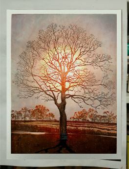


 , in English.
  “Kawase Hasui: The Complete Woodblock Prints” by Kendall Brown


 Bio: Jennifer Worsley is a graduate of Boston University School for the Arts, Boston with a MA and BFA, 1996; a Hudson River Fellow, New York, NY. 2009; and attended The New York Academy of Art, New York, NY. 1998-1999. She works in drawing, pastel, and woodblock prints.
 EDITOR’S INTRODUCTION: I’m particularly excited (and would imagine all mokuhanga printers would also be) to know how the heck she plans the impressions that result in her prints’ striking realistic and beautiful hues and values. Tanuki Prints goes where the chips fall with Jennifer Worsley…


 Bokashi or Graduated Printing (as many of you know) is a very distinct feature of Japanese woodblock printmaking (mokuhanga) that was developed during the ukiyo-e Edo period. It can be intimidating to the beginner and it’s not the easiest thing to do as the technique involves several additional variables beyond beta (flat tone) printing. Bokashi works really well by itself, but also as an overlay on flat printing.


 To re-iterate: After the block’s grain has been ‘knocked down’, the dried block surface will not appear smooth until water is re-introduced while printing. I have always charge my blocks with pigment and covered with a wet towel for at least 5 minutes. It allows the pigment to soak into the wood which produces a much more clean and consistent result. I have found that if I follow this, it really does limit the number of those early bad impressions.


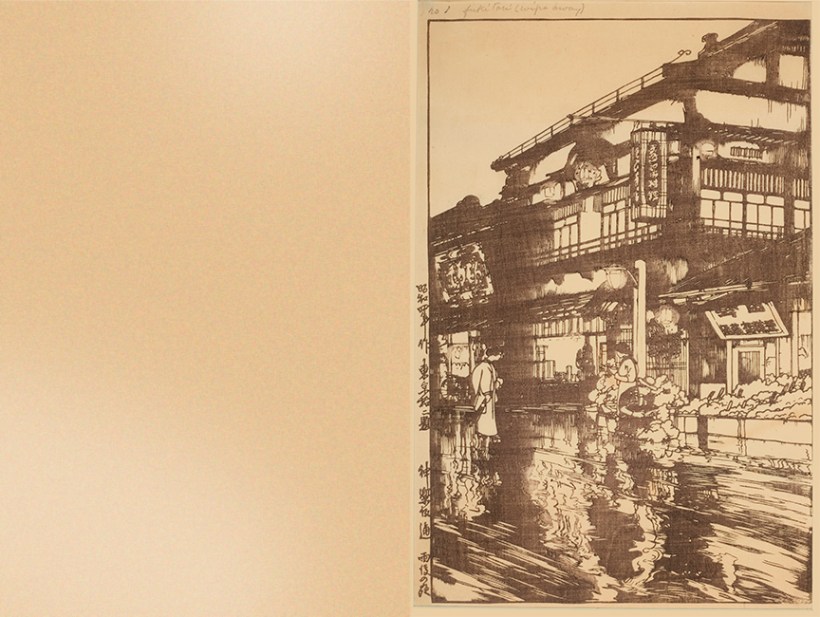


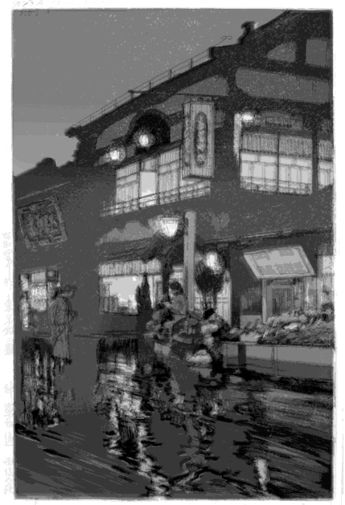


 I think I have about a year’s supply of Tanuki Brand® Nori. I trust that it’ll keep for several months or years. If things go bad in the far future, I’ll be the first to tell you!


![0P0A0471[1]](https://i0.wp.com/tanukiprints.com/wp-content/uploads/2018/01/0p0a047111.jpg?resize=307%2C640&ssl=1)
![0P0A0453[1]](https://i0.wp.com/tanukiprints.com/wp-content/uploads/2018/01/0p0a04531.jpg?resize=820%2C547&ssl=1)
![0P0A0454[1]](https://i0.wp.com/tanukiprints.com/wp-content/uploads/2018/01/0p0a04541.jpg?resize=820%2C547&ssl=1)
![0P0A0456[1]](https://i0.wp.com/tanukiprints.com/wp-content/uploads/2018/01/0p0a04561-e1515878018153.jpg?resize=820%2C736&ssl=1)


 Enter a caption Enter a captionI know the title sounds bad and I should have more respect for my heroes
  . However, this is an animation assembled from a hand-printed progression in Hiroshi Yoshida’s “Japanese Wood-block Printing” from 1939. I’m fortunate to have a copy of this along with his son’s two manuals. Hiroshi Yoshida was a pioneer of the shin-hanga movement and I find his examples very instructive as far as layering transparent colors. The man especially loved grays and browns which is a bit surprising for me. Each of these four progressive plates have an average of 3-4 colors per page for a total of 15 impressions:


